Shawarma & Shrac Brand Design
We built a scalable badge-style identity for Shawarma & Shrac, a Jordanian shawarma concept, that sets the brand apart from the repetitive visual systems common across Mediterranean fast-casual.
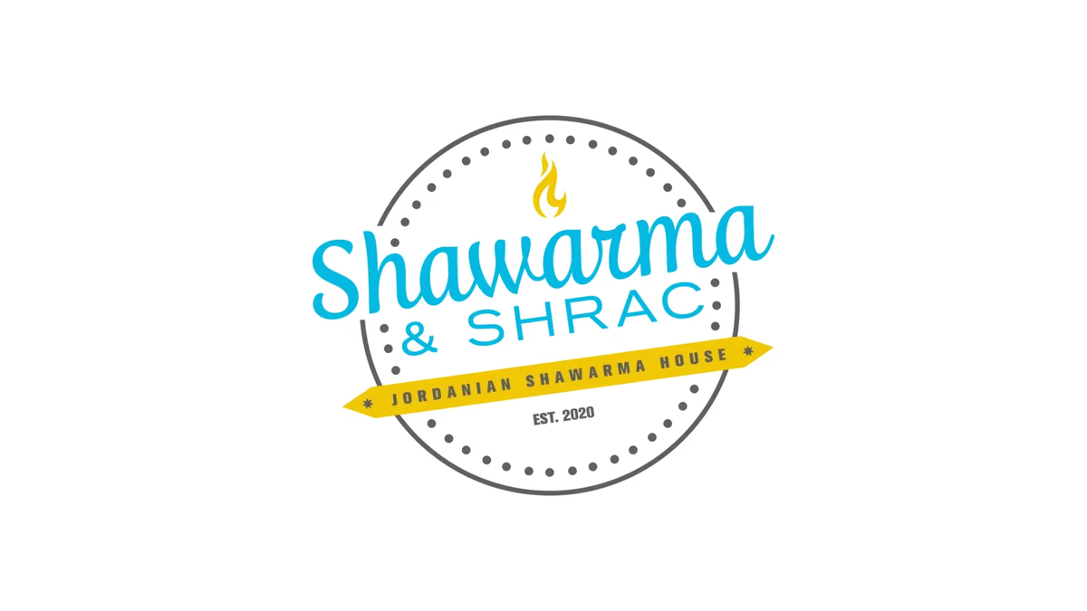
Table of Contents
Overview
Shawarma & Shrac was a Jordanian shawarma restaurant concept that needed a visual identity capable of standing apart from the heavily templated branding common throughout the Mediterranean fast-casual space. The goal was to feel modern and energetic while remaining approachable and recognizable within the category.
The project centered on building a complete identity system that could scale across storefront signage, menus, packaging, apparel, social media, and food delivery platforms. Every element needed to hold up at small sizes and against the visual noise of a busy delivery app grid.
Challenges
The central challenge was differentiation. Mediterranean and shawarma restaurants frequently rely on the same set of visual cues: traditional script fonts, ornate cultural motifs, generic food photography, and dated badge aesthetics. Those patterns cause brands in the category to blur together, especially in the thumbnail context of delivery apps where first impressions are decisive.
Balancing cultural authenticity with modern commercial appeal was equally important. The identity needed to feel rooted in the category without being trapped by its conventions. Early exploration phases pushed through literal approaches, including crossed utensils, shawarma wrap geometry, and rotating spit iconography, but many of those directions lacked the long-term flexibility the brand required.
Objectives
- Create a memorable, scalable restaurant identity that reads clearly at any size
- Differentiate the brand from generic Mediterranean competitors
- Build a visual system suited to both physical and digital environments
- Maintain strong readability across signage and delivery platforms
- Develop a modern but approachable brand personality
- Build flexibility through multiple logo colorways and applications
- Establish recognition through silhouette and typography
Solutions
The final identity is built around a circular badge composition paired with approachable custom typography and a simplified flame icon. The badge structure is a well-established format in food branding, but the execution here avoids the typical ornate overload. Clean geometry, a bold cyan and yellow palette, and restrained iconography give the mark a character that reads as current without looking out of category.
Monochromatic colorways in black, grey, and white were developed alongside the full-color version to ensure the system works across embroidery, vinyl, low-cost print, and simplified digital contexts. The result is a flexible identity that does not require workarounds or redraws to fit a new application.
Logo exploration
The exploration phase tested several directions before settling on the badge approach. Each concept was evaluated on scalability, uniqueness, and whether it could carry the brand long term without becoming a liability.
The brand identity
The final logo system combines the full-color badge with a complete set of monochromatic colorways. Having the mark work in blue, yellow, black, grey, and white gives the business practical flexibility across print, embroidery, packaging, and digital applications without needing custom redraws for each context.
Primary full-color lockup on light ground.
Deliverables
- Primary logo design
- Brand identity system
- Full-color primary lockup
- Monochromatic colorways (blue, yellow, black, grey, white)
- Color palette development
- Typography system
- Logo exploration concepts
- Vector asset exports
- Social media ready assets
Results
The identity system gave Shawarma & Shrac a commercially viable presence built around a clear silhouette and a consistent color story. The badge format held up across signage, apparel, packaging, social media, and delivery platform contexts without adaptation work.
The full set of colorways meant the business could apply the mark to low-cost print, embroidery, and digital surfaces using a single, unified asset system. The identity read as modern and energetic while staying clearly within the shawarma category, which was the core goal of the project.
Assessment
This project is a good example of how the right level of abstraction makes the difference in food and beverage branding. Moving away from literal utensil and spit imagery in favor of a bold badge structure and a tight color system gave the brand a longer shelf life and a more ownable visual identity than most competitors in the space.
We approach brand projects in the food and beverage category with the same logic: the mark has to work commercially before it can work emotionally. You can read more about how we build those systems in our piece on visual brand language and our guide to brand voice and messaging, or explore the full scope of our brand design services. For other food and beverage identity work, see our case studies for Arena Cafe and 2 Phat Bastard Pies.
Related Projects
Sabor Tapatio Brand and Website Design
We built Sabor Tapatio a bold, merchandise-ready visual identity and mobile-first website for a Texas food truck specializing in traditional Jalisco-style birria tacos.
Arena Cafe Brand Design
We gave Arena Cafe a cohesive visual identity and print system that unified every customer touchpoint inside a Houston commercial office building, turning a fragmented cafeteria into a recognizable, welcoming workplace fixture.
Sapa and Co Brand and Website Design
We took Sapa and Co from a restaurant condiment to a shelf-ready culinary brand, building a full identity system, bottle label suite, and a custom interactive website that positioned the Houston-based sweet soy sauce as a modern food product.