Sabor Tapatio Brand and Website Design
We built Sabor Tapatio a bold, merchandise-ready visual identity and mobile-first website for a Texas food truck specializing in traditional Jalisco-style birria tacos.
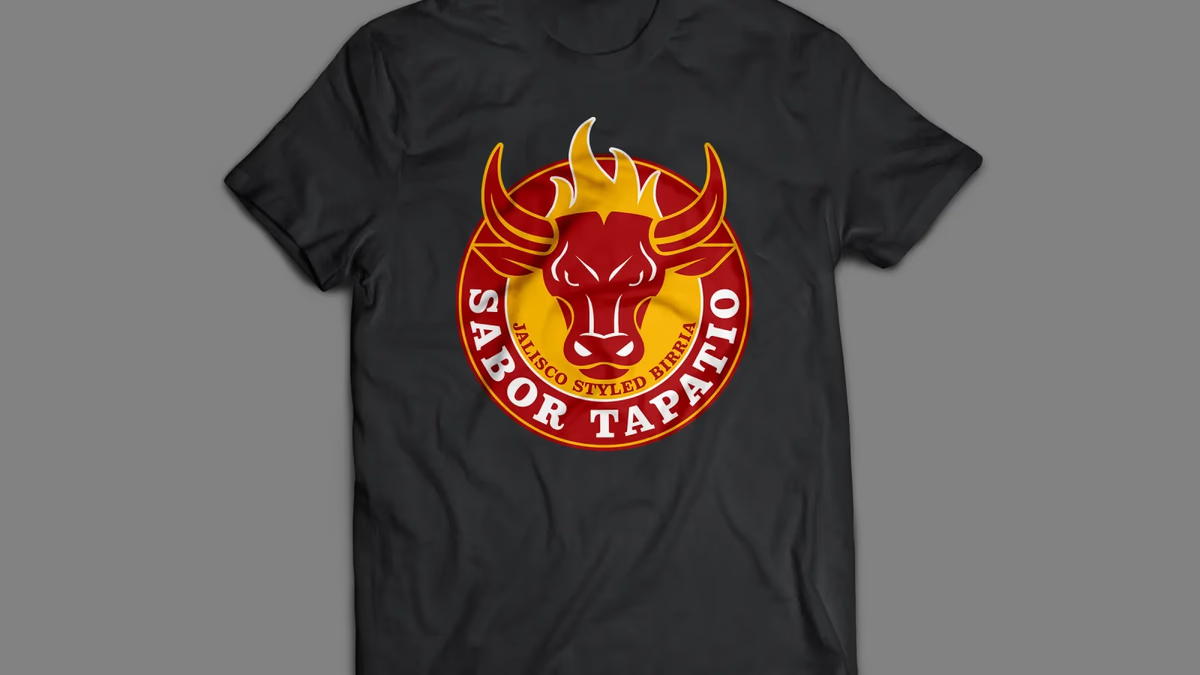
Table of Contents
Overview
Sabor Tapatio is a food truck concept specializing in traditional birria tacos inspired by the cooking traditions of Jalisco, Mexico. The business needed a visual identity strong enough to stand out in crowded street food environments, translate onto a moving vehicle, and carry across menus, merchandise, and digital platforms.
The project expanded well beyond a logo engagement into a full branding ecosystem: identity design, concept exploration, menu systems, merchandise applications, food truck wrap design, and a mobile-first website. Desque led the full scope from initial concepts through final delivery.
Challenges
The food truck market is saturated with visually repetitive branding. Many competing taco concepts lean on the same generic Mexican restaurant tropes, which made differentiation both a creative and a strategic challenge.
The identity also needed to satisfy competing demands simultaneously: recognizable from long distances, scalable to truck wrap graphics, simple enough for embroidery, readable on menus under poor lighting, and authentic to the Jalisco culinary tradition without feeling visually cliche.
An additional complication was scope growth. As the project evolved through concept exploration, the number of applications expanded significantly, requiring consistent design decisions across vehicle graphics, menus, merchandise, and digital touchpoints all at once.
Objectives
The primary goals were to create a highly recognizable food truck identity that differentiated the brand within a saturated market, to develop a cohesive visual system across physical and digital applications, and to design menus optimized for fast scanning in high-volume ordering environments.
The identity also needed to be merchandise-friendly, scalable for future expansion, and consistent enough to function as a unified brand system rather than isolated design pieces.
Solutions
The brand identity
The final identity system centered on a bold mascot-style bull integrated with flame-inspired iconography inside a circular badge structure. The bull reinforced strength, heat, and meat-focused cuisine, while the flame elements signaled open-fire cooking and the intense flavors central to the concept.
The circular badge became a foundational strategic decision. It translated naturally across truck graphics, apparel, stickers, social media, packaging, and menus. The direction prioritized recognition and visual confidence over minimalism, which is the correct call for a brand that operates as a moving advertisement on city streets.
Concept exploration
Multiple visual territories were explored before arriving at the final direction. Early concepts ranged from minimal horn-based symbols to vintage Texas-inspired badge systems, longhorn skull motifs, and distressed western aesthetics.
The exploration process was essential. It pressure-tested brand tone, audience perception, and scalability, and it revealed which directions created strategic positioning risks. Several early concepts leaned too heavily into western or ranch-style aesthetics, which risked confusing the brand with BBQ or Texas lifestyle categories rather than Mexican street food.
Menu design
The menu systems were designed as extensions of the brand rather than purely informational layouts. Large typography, high contrast, and integrated watermark graphics kept the visual energy consistent with the identity while ensuring fast category recognition in crowded, fast-paced ordering situations.
Merchandise applications
The identity was intentionally built to perform across merchandise. The simplified silhouette structure of the badge reproduced effectively through embroidery, screen printing, monochrome applications, and small-scale production. Merchandise itself became part of the promotional system.
Website design
The website was designed around mobile-first accessibility and operational simplicity. Rather than functioning as a corporate site, the platform served as a customer touchpoint for discovery, quick decision-making, and brand recognition. The visual language carried directly from the physical branding system, maintaining consistency across online and offline experiences.
Deliverables
- Logo design and brand identity system
- Concept exploration and direction refinement
- Food truck wrap design
- Menu design system (multiple layouts)
- Merchandise and apparel graphics
- Website design
- Social media assets
- Environmental branding assets
Results
The business gained a far more recognizable and cohesive visual identity capable of standing out in competitive food truck environments. The branding system established stronger visual recognition, more consistent presentation across touchpoints, better environmental visibility, and improved merchandise potential.
The menu systems improved readability and organization for fast-paced ordering environments. The website provided easier customer access to menu information, better mobile usability, and a more cohesive digital experience consistent with the physical brand. The food truck wrap transformed the vehicle itself into a large-scale marketing asset.
Assessment
This project is a strong example of how food truck branding demands a different strategic priority than restaurant branding. Physical immediacy and environmental readability matter more than subtlety, and the identity needs to hold together across a wider range of production methods and surfaces than most brand systems face.
The exploration process made the final outcome stronger. Testing multiple visual territories before committing revealed which directions created positioning risk and which ones had genuine strategic fit. Arriving at the circular bull badge system through that process, rather than defaulting to it early, meant the final direction was validated rather than assumed.
We explore the thinking behind brand design for businesses competing in crowded markets in our piece on visual brand language, and the role clarity plays in designing for small business. For other food and beverage brand work, see our Arena Cafe and 2 Phat Bastard Pies case studies.
Related Projects
Sapa and Co Brand and Website Design
We took Sapa and Co from a restaurant condiment to a shelf-ready culinary brand, building a full identity system, bottle label suite, and a custom interactive website that positioned the Houston-based sweet soy sauce as a modern food product.
Uptown Bakes Brand and Website Design
We transformed Uptown Bakes from an apartment-based baking operation into a polished boutique bakery brand with a deep oxblood identity, a custom Shopify storefront, and a cohesive print and packaging system built for events, catering, and everyday presence.
Shawarma & Shrac Brand Design
We built a scalable badge-style identity for Shawarma & Shrac, a Jordanian shawarma concept, that sets the brand apart from the repetitive visual systems common across Mediterranean fast-casual.