Epic Modeling Agency Brand and Website Design
We built Epic Modeling Agency a complete visual identity and a website that positioned the entertainment and atmosphere modeling agency as a premium, credible talent provider across multiple cities.
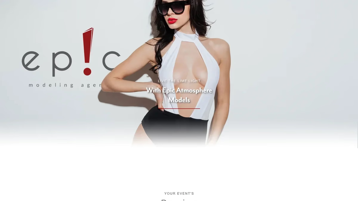
Table of Contents
Overview
Epic Modeling Agency is an entertainment and atmosphere modeling agency focused on upscale nightlife events, hospitality experiences, promotional campaigns, and private parties. The company positioned itself as a premium talent provider supplying models and promotional staff for brand activations, social events, and high-energy hospitality environments across multiple cities.
Because atmosphere modeling exists between nightlife, entertainment, hospitality, and experiential marketing, the agency required branding and digital infrastructure that could appeal to both event organizers and potential talent simultaneously. Presentation quality in this industry is not cosmetic. It directly influences booking opportunities and talent recruitment.
Challenges
The entertainment and nightlife industry is heavily saturated with visually noisy branding, overly flashy websites, and generic promotional aesthetics. The primary challenge was creating a brand that felt exciting and fashion-oriented without appearing cheap or overly trend-driven.
The agency also needed to serve two very different audience types at once: businesses and event organizers looking to hire promotional talent, and individuals interested in becoming atmosphere models. Without a cohesive identity system, the brand risked appearing fragmented or overly focused on only one side of the business. The digital experience also needed to present the agency as larger and more operationally established than a typical local nightlife brand.
Objectives
The engagement focused on building a visual identity system capable of scaling consistently across digital and physical environments while remaining distinctive enough to stand apart from generic nightlife competitors. The brand needed to communicate excitement, professionalism, exclusivity, and operational legitimacy at the same time.
A complete website was scoped to function as both a promotional platform for potential clients and a recruitment funnel for prospective models. Establishing a multi-city market presence and improving the agency’s overall perceived scale were both structural priorities from the start.
Solutions
We approached the identity around one central concept: attention. In an industry where everything competes for visibility, the brand itself needed to embody the quality it was selling. The core decision was to replace the “i” in “epic” with a custom exclamation mark icon, transforming the wordmark into a recognizable symbolic identity while reinforcing the emotional tone of the brand.
The typography system intentionally contrasted soft geometric letterforms with sharp angular iconography to balance elegance and energy. A restrained palette of deep crimson red, charcoal grey, and white maintained a premium and modern aesthetic without sacrificing visual impact. The resulting system was designed to hold up consistently across environmental graphics, digital platforms, apparel, print collateral, and promotional assets.
The brand identity
The exclamation mark became the structural foundation of the entire identity system, representing excitement, nightlife energy, presence, confidence, and performance. The icon works as a standalone mark independent of the full wordmark, giving the brand recognition that does not rely on typography alone.
The iconic mark was also delivered as a standalone graphic element for use as a seal, favicon, and secondary visual across all applications.
Social media
Social media assets were produced to support both sides of the business. The hiring post targeted event organizers and brands looking to book promotional staff, while the join post directed prospective talent toward the application process. Both assets carried the restrained premium tone of the brand rather than the visual noise typical of nightlife promotions.
Print design
The business card system was designed to support networking, event coordination, and client communication. The reverse side isolated the exclamation mark icon as a standalone graphic element, reinforcing memorability and strengthening symbolic recognition without additional copy. The restraint in the layout positioned the agency closer to luxury hospitality and fashion branding than to traditional nightlife promotions.
The website
The website was designed and developed to function as both a promotional platform for potential clients and a recruitment funnel for prospective models. Large photography, editorial-inspired layouts, restrained typography, and generous whitespace created a more premium and fashion-oriented user experience than is typical in nightlife and entertainment. This kind of web design approach, where atmosphere and presentation take priority over information density, is strategically appropriate for industries built around perception.
The website also implemented a multi-city section featuring Las Vegas, Houston, Austin, Dallas, and Miami to elevate the perception of operational scale and market reach. Within nightlife and entertainment, credibility and perceived presence significantly influence trust and booking confidence.
Deliverables
- Custom logo design with exclamation mark iconic mark and full lockup system
- Primary, red, and reverse lockup variations
- Standalone icon system in red and white
- Brand identity system with color palette and typography structure
- Brand guidelines covering logo hierarchy, icon usage, color systems, and visual direction
- Business card design, front and reverse
- Social media asset templates for client acquisition and talent recruitment
- Apparel concepts and marketing mockup applications
- Full website design and custom development
- Talent showcase layouts with editorial asymmetrical positioning
- Recruitment funnel design and dual-audience content structure
- Service positioning structure and multi-city market presence section
Results
The agency launched with a significantly stronger and more recognizable visual identity capable of scaling consistently across both digital and physical environments. The exclamation mark icon created immediate visual memorability while helping the brand stand apart from more generic nightlife and modeling competitors. The restrained visual system positioned the agency as more premium and professional without losing the excitement associated with entertainment branding.
The website provided a cohesive and visually aspirational experience that aligned with the emotional expectations of both clients and talent. The dual-audience structure, combining client acquisition pathways and recruitment funnels in a single platform, allowed the business to grow its roster and its client base from the same digital presence without fragmenting the experience.
Assessment
This project demonstrates strong early systems thinking applied to a perception-driven industry where the brand itself had to communicate operational legitimacy before any conversation about services could happen. The strongest aspect of the engagement was not the complexity of individual visual decisions but the consistency of the entire ecosystem. The exclamation mark concept carried weight throughout the project precisely because it was not decoration. It was structurally integrated into the identity and performed symbolic work at every application level, from business cards to environmental graphics to the website.
From a web design and brand design perspective, the project succeeded because it focused on building a recognizable brand system rather than producing isolated assets. The website avoided excessive trend-chasing and visual overcomplication, which helped it age more gracefully than entertainment sites from the same period that leaned into dark nightclub clichés and luxury tropes. For a broader look at why that kind of presentation discipline builds client confidence, see our post on building trust through web design. For other projects where brand credibility and visual identity came together, see the Antonio Bernal Photography and Crystal Lallego Art case studies.
Related Projects
Heatwave Houston Brand and Website Design
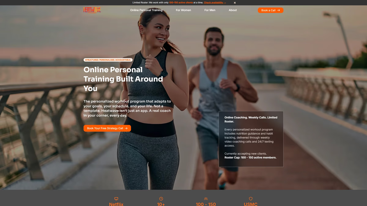
We rebuilt Heatwave Houston from a low-resolution logo file into a production-ready brand system and a full website designed to convert Instagram traffic into real client relationships.
Aros Gaming Brand Identity and Sponsorship System
We built Aros Gaming a scalable esports identity that grew from a single DOTA 2 pubstomp operation into a multi-city, multi-game community network with the visual credibility to attract real sponsors.
Veronica Mendoza Realty Brand and Website Design
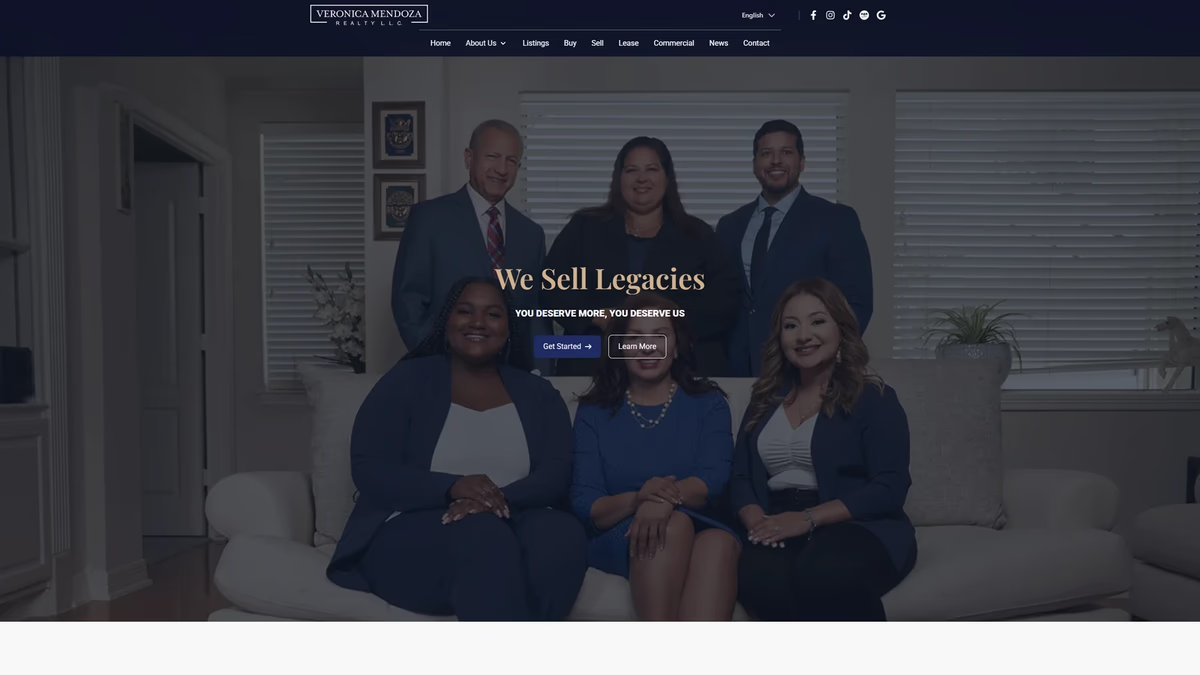
We rebuilt Veronica Mendoza Realty from a low-resolution logo and a generic brokerage template into a custom digital platform that reflects the professionalism and community trust the business had already earned.