Aros Gaming Brand Identity and Sponsorship System
We built Aros Gaming a scalable esports identity that grew from a single DOTA 2 pubstomp operation into a multi-city, multi-game community network with the visual credibility to attract real sponsors.
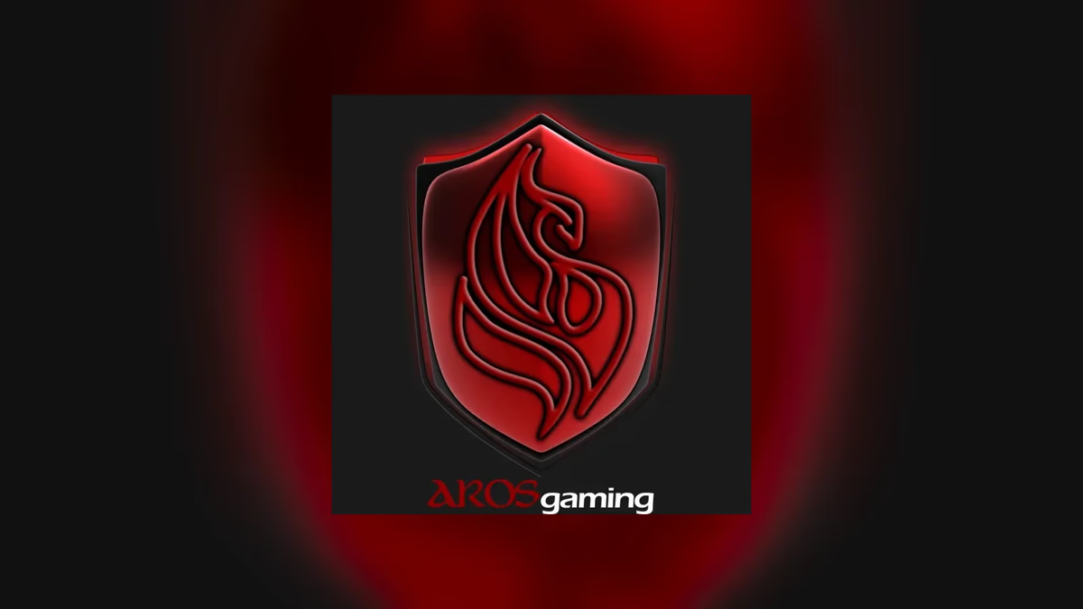
Table of Contents
Overview
Aros Gaming was a grassroots esports community organization built around DOTA 2 during the early rise of competitive gaming culture in Texas. What started as a small enthusiast-driven operation running local pubstomps quickly became a multi-city network hosting watch parties, LAN tournaments, and branded community gatherings across Houston, Austin, and Dallas.
At a time when most esports participation happened through online matchmaking and Twitch streams, Aros Gaming bet on physical community building. They hosted DOTA 2 pubstomps at bars, lounges, and LAN centers where attendees could watch major tournaments like The International alongside other players, compete in community raffles, and engage with a local scene that had real energy behind it. As the organization grew into Counter-Strike and League of Legends events and began pursuing sponsorship, they needed a visual identity that could scale with them and stand up to outside scrutiny.
Challenges
The central problem was legitimacy. Esports had not reached mainstream acceptance in 2017, which meant every outreach to a potential venue or sponsor required Aros Gaming to explain the concept before they could pitch the opportunity. The branding had to do that educational work before any conversation could move forward.
Several constraints shaped the scope.
- The organization needed a primary identity strong enough to anchor an expanding ecosystem of game-specific and city-specific sub-brands without fracturing into visual inconsistency.
- Sponsors unfamiliar with esports culture were skeptical. Without a professional sponsorship deck, those conversations stalled before they started.
- Merchandise and apparel needed to resonate with competitive gaming communities rather than read as generic promotional products.
Objectives
The goal was to give Aros Gaming a visual foundation that matched the ambition of the community they were building. That meant a primary brand identity with room to grow, a sub-brand system that could adapt to different games and cities while staying cohesive, and sponsorship materials that could put an unfamiliar concept in front of a business audience and land.
We also needed to make the brand feel culturally credible to the players themselves. Esports audiences are fluent in visual language. A brand that felt corporate or generic would have undermined the community trust Aros Gaming had worked to build.
Solutions
At Desque, we approached this as an identity system rather than a logo project. The primary phoenix crest established the visual foundation while the framework was designed from the start to support game-specific and city-specific sub-brands. That meant consistent structural logic, consistent typographic treatment, and a dark, high-contrast palette that read as authentic to gaming culture rather than as a brand pretending to understand it.
The brand design work covered everything from the primary mark through the sub-brand system, the sponsorship deck, and the merchandise graphics. Each deliverable reinforced the same identity logic so the organization looked consistent whether someone encountered Aros Gaming on a lanyard, a t-shirt, a flyer, or a slide deck in front of a potential sponsor. Color, visual brand language, and the psychology of color all played a deliberate role in grounding the brand in competitive gaming aesthetics without making it feel costume-like.
Brand identity
The primary mark is a phoenix crest built to read at event signage scale and hold its detail at smaller print sizes. The aggressive typography and dark palette were chosen deliberately to align with the visual language of competitive esports, not to follow trends, but because authenticity to the community was non-negotiable for an organization that needed players to feel represented by the brand.
The sub-brand system
The sub-brand framework was designed so any new game or city combination could be added without breaking the visual coherence of the overall organization. DOTA Houston, DOTA Austin, DOTA Dallas, CS Houston, and LoL Houston all drew from the same structural and typographic logic, which meant players could identify an Aros Gaming event regardless of which game or city they were in.
Event promotion
A large share of the work focused on the recurring event materials that kept the community engaged between major tournaments. Pubstomp events at local bars and LAN centers needed promotional assets that could draw walk-in attention as well as targeted online promotion. The events themselves were designed as community experiences, not just watch parties, with themed drink specials, raffles, giveaways, and competitive brackets woven in.
Sponsorship deck
Approaching sponsors required translating esports culture into a format business decision-makers could evaluate. The sponsorship deck was built to educate before it pitched, explaining the community model, the audience, and the growth trajectory in terms that made sense to someone with no prior context. It established Aros Gaming as a structured organization rather than a casual gaming group.
Merchandise and apparel
The merchandise was designed to function as community signaling. A player wearing an Aros Gaming shirt was communicating something about their scene affiliation, not just wearing promotional material. The apparel leaned into DOTA culture, competitive language, and the visual humor specific to the community, which made it something people actually wanted to wear rather than something they received in a goodie bag.
Deliverables
- Primary logo design and full brand identity system
- Sub-brand framework for game-specific and city-specific divisions (DOTA Houston, DOTA Austin, DOTA Dallas, CS Houston, LoL Houston)
- Sponsorship deck design and layout
- Event promotion assets for recurring pubstomps and LAN tournaments
- Merchandise and apparel graphics
- Social media asset system
Assessment
This project is a good example of what brand design has to accomplish when the audience is both the end community and the business sponsor. The identity had to feel credible to competitive gamers and professional enough to survive in a meeting with a potential venue partner, and those two requirements pull in different directions. Getting both right required understanding the culture before designing for it.
For more on how brand design works as a system rather than a single logo, see our piece on visual brand language and how color choices communicate credibility in our post on the psychology of color in web design. For other entertainment and talent-focused branding projects, see our work with Anthony Mata.
Related Projects
Deadlocked On Esports Media Brand Identity
We built Deadlocked On a faction-inspired brand identity designed to feel native to the Deadlock game universe, scaling from streaming overlays and social platforms to apparel and environmental installations.
Anthony Mata Brand Design
We built a minimal, monogram-based brand identity for Houston music producer Anthony Mata, creating a flexible personal mark with a hidden narrative that travels from social profile to live event.
Epic Modeling Agency Brand and Website Design
We built Epic Modeling Agency a complete visual identity and a website that positioned the entertainment and atmosphere modeling agency as a premium, credible talent provider across multiple cities.