Fast Hammers Remodeling Brand Design
We stabilized and professionalized the visual identity for Fast Hammers Remodeling, turning low-quality raster files into a scalable brand system built for consistent use across print and digital applications.
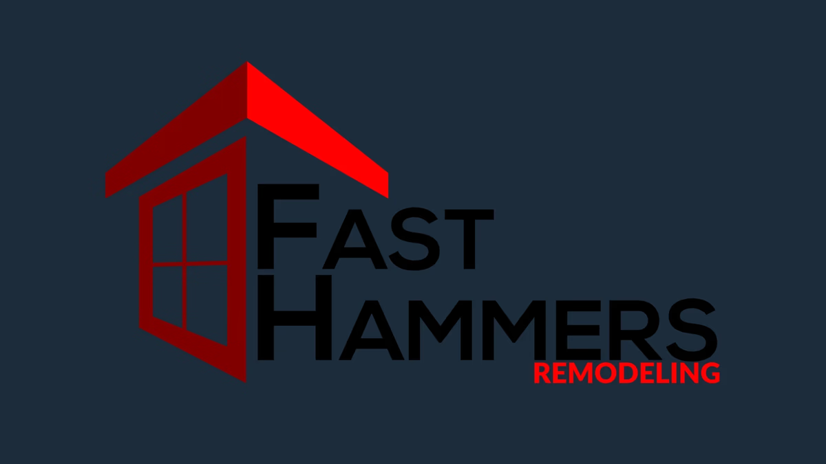
Table of Contents
Overview
Fast Hammers Remodeling is a residential remodeling company helping homeowners improve the functionality and appearance of their living spaces through renovation and improvement work. The engagement was focused on refining and professionalizing the company’s existing visual identity, not rebuilding it from scratch.
The goal was to create a more cohesive and production-ready brand presence that could be used consistently across print and digital applications. For a service-based contractor, that kind of visual reliability matters at every client touchpoint.
Challenges
The client originally sourced their logo externally, which produced low-quality raster assets that lacked scalability and consistency. Reproducing those files across signage, print materials, and digital platforms created real limitations over time.
Beyond the technical file quality, the business had no defined visual system. Typography standards, supporting colors, and logo usage guidelines had never been formally established, causing the brand to appear fragmented and less professional across applications.
The project also carried a constraint that shaped the entire approach: the client needed the identity to remain familiar. That meant working within a tight scope rather than pursuing a full redesign.
Objectives
- Improve logo scalability and production readiness
- Create a cleaner and more professional visual presentation
- Establish foundational brand consistency
- Improve usability across print and digital applications
- Preserve familiarity with the client’s existing identity
- Create supporting visual standards for future marketing materials
Solutions
Rather than rebuilding the identity from scratch, the project focused on stabilizing and elevating the existing concept into a more functional and cohesive brand system. The original logo was reconstructed as a clean vector asset to ensure scalability across both print and digital mediums.
Minor refinements were made to improve alignment, balance, and line consistency while preserving the recognizable structure the client was already attached to. A supporting visual system was then established, covering primary and secondary color usage, typography selection, scalable logo variations, and foundational brand consistency guidelines.
The visual direction leaned into bold contrast, geometric structure, and construction-inspired forms. The roofline silhouette and window framing elements helped reinforce themes associated with residential construction and renovation, giving the identity stronger contextual relevance despite the intentionally limited project scope.
At Desque, we approach identity refinement engagements with the same discipline as full brand design projects. A constrained scope does not mean a loosened standard.
The brand identity
The refined identity system centers on a clean, scalable logo mark that reads clearly at any size, from vehicle signage to a mobile browser tab.
Deliverables
- Logo vectorization and reconstruction
- Logo refinement
- Typography system
- Color palette
- Scalable logo variations
- Foundational brand guidelines
Results
Fast Hammers Remodeling gained a cleaner and more production-ready visual identity that could be used consistently across both print and digital applications. By transforming an inconsistent low-resolution logo into scalable vector assets supported by a basic visual system, the company established a stronger foundation for future marketing materials and business presentation.
The refined identity improved overall professionalism while reducing the limitations commonly associated with low-quality raster artwork in commercial use.
Assessment
This project is a useful reminder that not every brand engagement starts with a blank canvas. Many small service-based businesses in the construction industry operate with fragmented or low-quality visual assets that create unnecessary limitations as the business grows. The most practical solution is often a disciplined refinement, not a full rebrand.
Preserving familiarity while improving scalability and consistency produced a more realistic and cost-effective outcome for where the client was in their business lifecycle. Establishing usable assets, typography standards, and visual consistency can significantly improve professionalism and long-term flexibility without requiring a complete redesign.
For more on how we think about this kind of work, read our guide to defining your brand identity or explore what foundational brand design looks like in practice. See how we applied similar thinking to Costa Custom Pools and Champion House Buyers.
Related Projects
Renovating Resources Brand Design
We built a complete brand identity for Renovating Resources LLC, a Houston residential renovation company, giving them a cohesive visual system built for practical field use across signage, print, and digital applications.
Global Air Service Brand and Web Design
We built Global Air Service a modern visual identity and a multi-phase website that positioned the Texas-based HVAC company as a credible, professionally managed service provider in a heavily saturated local market.
Texas Hardwood Flooring Pros Brand Design
We built a practical, market-grounded brand identity for Texas Hardwood Flooring Pros, giving a local flooring contractor a recognizable visual system that communicates credibility and regional positioning across print and business applications.