Accubod Brand Identity Design
We built Accubod a brand identity that sits between aggressive fitness aesthetics and clinical rehabilitation, credible, athletic, and precise without defaulting to either extreme.
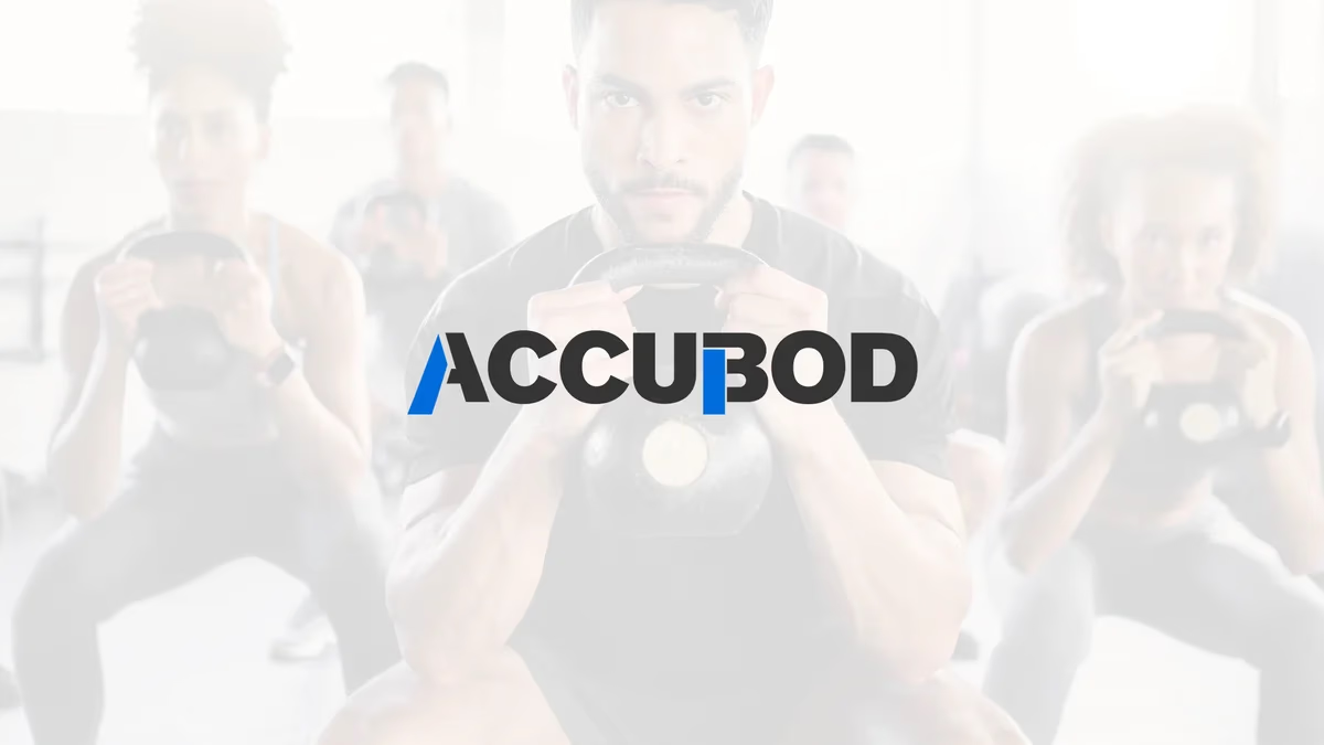
Table of Contents
Overview
Accubod is a fitness and performance concept built around intentional physical training rather than conventional gym culture. The company helps clients improve movement quality, reduce pain, strengthen weak areas, and align physical performance with real-world lifestyle demands.
Rather than leading with aesthetics, Accubod approaches fitness through a functional lens that blends corrective exercise, mobility training, rehabilitation principles, and strength development. Their clients range from people recovering from physical limitations to those simply looking to move and perform better in daily life.
That positioning required a brand capable of communicating performance credibility and professional trust at the same time.
Challenges
The primary challenge was creating a brand identity capable of sitting between two adjacent but visually disconnected industries. Traditional fitness brands rely heavily on aggressive aesthetics, hyper-masculine visuals, and physique-driven messaging. Rehabilitation and wellness brands tend to lean clinical, soft, or medically sterile.
Accubod required a middle ground that could communicate professionalism, physical performance, and trust all at once. Because the concept was more specialized than standard personal training, the identity also needed to help clarify the company’s positioning as targeted and purposeful, not generalized gym coaching.
The visual system also needed enough versatility to function across athletic and professional contexts without appearing too niche in either direction.
Objectives
- Develop a brand identity that occupies the space between performance fitness and corrective rehabilitation
- Communicate professionalism and athletic credibility without relying on aggressive fitness tropes
- Create a visual system versatile enough for apparel, digital platforms, and print collateral
- Differentiate Accubod from commodity gym and personal training brands in the market
- Establish a scalable foundation capable of supporting future business expansion
Solutions
At Desque, we built the identity around themes of precision, structure, movement, and controlled performance. The logo uses bold geometric typography combined with angular cuts and directional shaping to create a sense of momentum and physical progression without defaulting to the visual aggression common in the fitness space.
The color palette centers on a strong blue accent paired with dark neutral tones. Blue was selected to reinforce trust, professionalism, technical expertise, and rehabilitation-oriented credibility, while the darker tones ground the identity with the strength and stability associated with athletic branding.
Typography choices focused on clarity and confidence, deliberately avoiding the exaggerated styling common in performance and supplement industries. This gave the brand a more mature and specialized appearance that aligned with where Accubod positioned itself.
The brand identity
The final identity holds up across apparel, digital, and print because it was built on a structured visual system rather than a single stylistic moment. The mark reads cleanly across apparel, digital, and print.
Brand applications
We extended the identity into a full brand presentation system that showed how the mark functions across real-world contexts. A strong brand design system does not stop at the logo file. It demonstrates how the identity holds up in the environments where it will actually live.
Deliverables
- Custom logo design with angular geometric mark and full wordmark lockup
- Brand identity system with blue accent color palette and dark neutral tones
- Typography selection calibrated for clarity and mature performance positioning
- Logo variations for multi-environment use across apparel, digital, and print
- Brand presentation mockups demonstrating real-world application
- Visual identity guidelines for consistent future use
Results
Accubod established a visual identity that better reflected its more intentional and specialized approach to fitness and performance training. The branding positioned the company outside of traditional gym culture while maintaining the athletic credibility the concept required.
The final system created a cleaner and more professional presentation that aligned naturally with corrective training, mobility improvement, and functional performance services. The identity also provided a strong foundational framework capable of extending across future digital marketing, apparel, environmental branding, and business collateral without requiring major redesign work.
Assessment
This project succeeded because of restraint rather than despite it. Many fitness brands from that period leaned into visual aggression, excessive effects, or bodybuilding-centric aesthetics. Accubod benefited from a more controlled and structured approach that aligned with the company’s actual positioning around functional movement and individualized performance improvement.
The strongest design decision was balancing professionalism with athletic energy without letting either side overpower the other. The angular visual language introduced enough movement and performance association while the typography and color system kept trust and clarity intact. For the thinking behind that kind of positioning work, our piece on visual brand language covers how color and type choices shape brand perception, and our post on the psychology of color in web design explores why Accubod’s blue palette carries the weight it does.
For other fitness brand projects where identity clarity drove the outcome, see our AMH Training case study.
Related Projects
AMH Training Brand Identity Design
We built AMH Training a complete brand identity system rooted in transformation and athletic discipline, anchored by a geometric phoenix mark that speaks to the brand before a word is read.

Sweat Social Brand Design
We built the complete brand identity for Sweat Social from the ground up: naming strategy, logo system, color palette, merchandise, and event marketing, positioning a Houston Pilates pop-up as a lifestyle-first wellness community.
Nuletica Fitness Brand Design
We built a scalable visual identity for Nuletica Fitness, a personal training and nutrition brand targeting adults entering or returning to their fitness journey.