AMH Training Brand Identity Design
We built AMH Training a complete brand identity system rooted in transformation and athletic discipline, anchored by a geometric phoenix mark that speaks to the brand before a word is read.
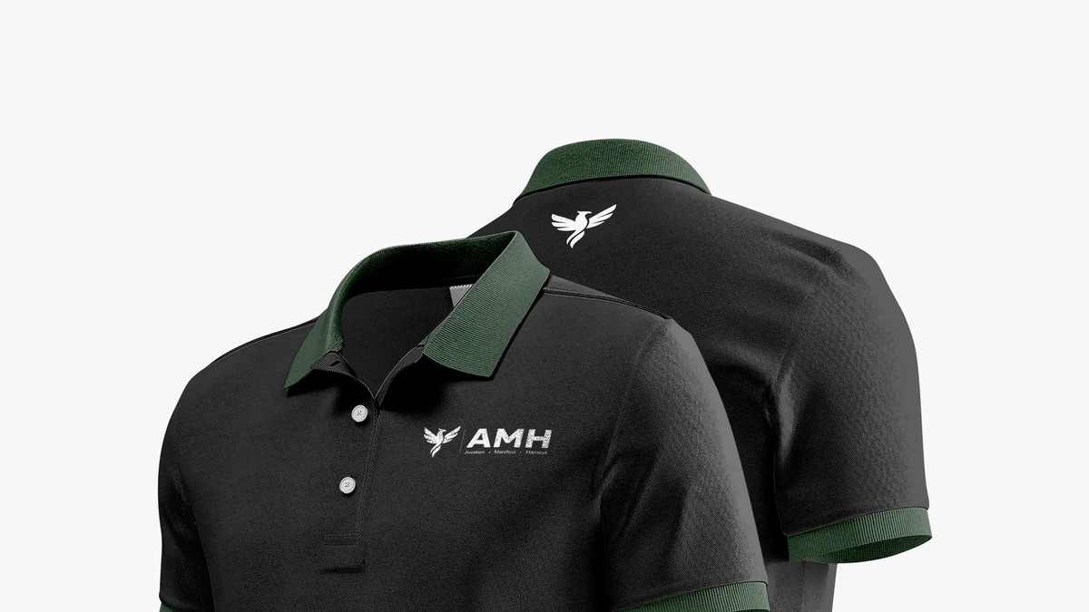
Table of Contents
Overview
AMH Training is a Houston-based fitness brand built around the philosophy that physical transformation requires an equal shift in mindset. The initials AMH stand for Ahmad Mahmood Hassiba, the founder and trainer behind the brand, and his supporting phrase, “Awaken. Manifest. Harness,” makes that philosophy literal. Every word in the tagline is an instruction, not a feeling.
The brand needed an identity that could carry that weight. A personal training operation launching in a crowded fitness market cannot afford a generic dumbbell-and-sweat visual language. The founder had a specific idea of what the brand should feel like and a clear philosophy to build from. Our job was to turn that into a system that could live on apparel, digital, and print without losing any of its edge.
Challenges
Fitness branding is one of the most saturated visual categories in design. The defaults are predictable: bold sans-serifs, aggressive gradients, silhouetted athletes in motion. None of that was wrong for the category, but all of it would have made AMH invisible inside it.
A few specific tensions shaped the scope of this project.
- The brand needed to feel premium and disciplined without reading as cold or inaccessible. The target audience is people in the middle of a transformation, not people who have already arrived.
- The phoenix symbolism the founder had in mind is powerful but overused. Executing it as a geometric mark rather than a literal illustration was essential to keeping it from feeling generic.
- The color story required careful calibration. A black-and-white foundation with muted green accents sounds simple on paper, but it demands precise application to hold together across light and dark backgrounds, fabric, and screen.
Objectives
The goal was to deliver a brand identity that could anchor a growing fitness business without needing to be rebuilt as that business scales. That meant creating a mark flexible enough to live on a polo chest and a phone screen with equal confidence.
Specifically, we set out to develop a geometric phoenix mark that communicated rebirth and resilience without relying on familiar fire and feather cliches, a color system anchored in contrast and restraint, and a full logo suite with primary, alternate, stacked, and reverse lockups ready for every real-world application. Apparel mockups across polos, t-shirts, shorts, and drinkware were included to show the system performing in the contexts the brand would actually occupy.
Solutions
At Desque we approached the mark development by treating the phoenix as architecture rather than illustration. The final icon is a geometric silhouette, built from clean angular forms that read as a rising bird without committing to a single literal interpretation. That ambiguity is intentional. The shape can be a flame, a shield, or a figure depending on the viewer, which gives the brand a durability that more literal marks rarely have.
The color system kept black as the primary surface, white as the primary contrast, and a muted green as the accent that signals energy without shouting it. That restraint is what allows the system to hold together across athletic shorts, premium polos, and social graphics without feeling like three different brands.
The “Awaken. Manifest. Harness.” tagline was integrated into the primary horizontal lockup, giving the brand an explanation built into its first impression.
Logo exploration
Before arriving at the final mark, we explored several directions for the horizontal lockup and the relationship between the phoenix icon, the AMH wordmark, and the supporting tagline. Each concept tested a different weight, spacing, and compositional hierarchy.
The brand identity
The final system delivers the phoenix mark in every configuration the brand needs. The primary lockup carries the full identity, the isolated marks work at icon scale, and the stacked and reverse variants cover the contexts where horizontal space is limited or the surface is dark.
Primary horizontal lockup with full tagline.
Brand applications
The identity was extended into the apparel and product categories the business operates in from day one. Each application demonstrates the system holding up under real production conditions, from screen-printed t-shirts to embroidered polos to drinkware.
Deliverables
- Geometric phoenix brand mark with full vector source files
- Primary, alternate horizontal, stacked, and reverse logo lockups
- Color phoenix icon, single-color black icon, and white reverse icon
- Black-and-white color system with muted green accent palette
- Typography system for digital and print use
- Logo application suite across polo, t-shirt, athletic shorts, and drinkware
- Social and digital format brand applications
- Brand guidelines covering color, typography, and logo usage
Results
AMH Training launched with a brand system that can hold its own in a category defined by visual noise. The geometric phoenix mark reads with clarity at icon scale and anchors the full horizontal lockup with equal confidence. The restrained black-and-white palette with green accents avoids every cliche the fitness category defaults to while still reading immediately as athletic.
The apparel suite demonstrated from day one that the system performs in the physical contexts the business actually operates in. A logo that looks strong on screen but falls apart under embroidery is not a complete identity. This one holds together across fabric, drinkware, and digital with no special-case adaptation required.
A mark built around transformation needs to look like it already arrived.
Assessment
AMH Training is an example of a project where the founder’s clarity of philosophy made the design process stronger rather than more constrained. The “Awaken. Manifest. Harness.” framework gave the identity a backbone that visual decisions could test against. The phoenix mark works because it was designed to carry a specific meaning, not simply to fill a space.
The brand design work on this project follows the same thinking we outline in our pieces on defining your brand identity and visual brand language, where the mark and the message are developed together rather than one following the other. For a fitness-adjacent identity where brand clarity drove every application decision, see our Accubod case study.
Related Projects

Sweat Social Brand Design
We built the complete brand identity for Sweat Social from the ground up: naming strategy, logo system, color palette, merchandise, and event marketing, positioning a Houston Pilates pop-up as a lifestyle-first wellness community.
Accubod Brand Identity Design
We built Accubod a brand identity that sits between aggressive fitness aesthetics and clinical rehabilitation, credible, athletic, and precise without defaulting to either extreme.
Twin Dragon Taekwondo Brand Identity Design
We built Twin Dragon Taekwondo a disciplined martial arts identity engineered for real-world production, from embroidered doboks and headgear to large-scale wall signage, anchored by a twin-dragon crest that carries authority and tradition at every scale.