Karbon Kingdom Brand Design
We built Karbon Kingdom a complete automotive brand identity, from a bold KK monogram and decal system to business cards that match the carbon fiber culture the company lives in.
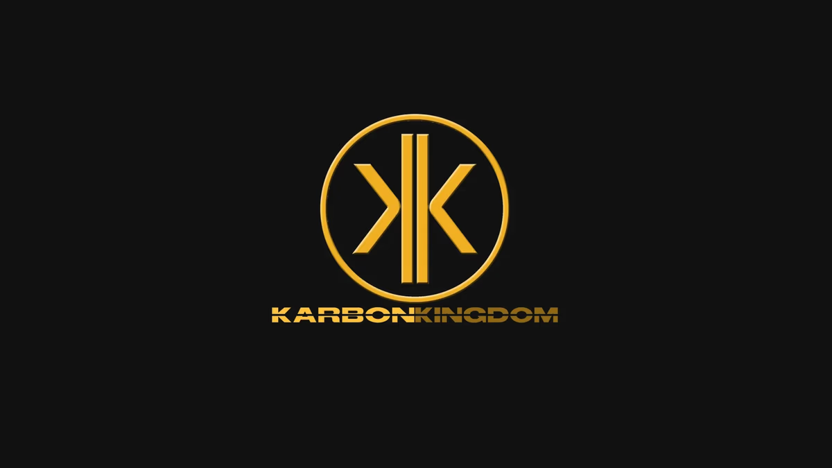
Table of Contents
Overview
Karbon Kingdom was an automotive customization and fabrication company serving car enthusiasts across American muscle, JDM, and European vehicle communities. Their services covered carbon fiber skinning, custom parts and molds, fiberglass fabrication, suspension modifications, paint and body work, and full interior and exterior vehicle customization.
Operating within a heavily visual and enthusiast-driven industry, the company needed a brand identity capable of resonating with performance-focused automotive culture while remaining versatile across decals, business cards, promotional graphics, and real-world vehicle placements.
Challenges
The automotive modification space is saturated with visually aggressive branding, making differentiation difficult without falling into generic or overly chaotic visual trends. Karbon Kingdom needed an identity system that balanced two contrasting directions: a clean and recognizable core logo with a gritty, textured, performance-oriented visual language aligned with enthusiast culture.
Because much of the company’s visibility would come through decals, event exposure, and physical vehicle applications, the branding also needed to maintain strong readability across varying surfaces, lighting conditions, and scales. Another challenge was ensuring the brand felt authentic across multiple enthusiast communities rather than appearing tied exclusively to a single automotive niche.
Objectives
- Create a recognizable identity system tailored to automotive enthusiast culture
- Develop a scalable logo suitable for decals, print, and digital use
- Establish a visual language balancing minimal structure with aggressive styling
- Improve overall presentation and professionalism within a competitive customization market
- Create branding flexible enough to support future promotional and merchandise applications
Solutions
We developed a custom “KK” monogram as the foundation of the visual identity system. The mirrored structure created a strong sense of symmetry while reinforcing the “Kingdom” aspect of the brand through an emblematic, badge-like appearance. The circular enclosure surrounding the monogram helped the mark translate naturally into automotive applications such as decals, badges, and promotional graphics common within enthusiast culture.
A bold geometric wordmark accompanied the iconography to create a more industrial and performance-inspired visual language. The typography emphasized width, weight, and stance, helping the identity feel grounded within tuner and aftermarket automotive aesthetics. The gold and bronze color palette was intentionally selected to contrast heavily against dark surfaces, carbon fiber textures, tinted glass, and painted body panels.
While the core logo remained clean and minimalist, the supporting visual language leaned into grunge-inspired textures, smoke overlays, and layered compositions. This contrast created flexibility: the logo stayed scalable and recognizable while supporting materials could feel raw, energetic, and culturally authentic to automotive enthusiasts.
The logo system
Real-world application
The identity was designed specifically with physical implementation in mind. Custom decal systems were created for vehicle placement, ensuring the typography and logo maintained legibility across curved glass surfaces, tinted windows, and varying environmental conditions. The stacked decal arrangement expanded the visual identity beyond a traditional single-line logo lockup while maintaining brand recognition.
Business cards
The business card system embodied the brand’s balance directly by pairing structured typography and organized layouts with textured carbon fiber backgrounds and atmospheric visual treatments. Personalized business cards were produced for the Karbon Kingdom team, each carrying the primary logo and individual contact information.
Deliverables
- Logo design (KK monogram badge and wordmark)
- Brand identity system
- Typography system
- Color palette
- Business card design (two personalized versions)
- Automotive decal design
- Promotional graphics
Results
Karbon Kingdom established a recognizable visual identity aligned closely with automotive customization culture while maintaining enough structure and scalability for long-term brand usage. The combination of clean logo construction and aggressive supporting visuals allowed the brand to feel both professional and enthusiast-driven without leaning too heavily into either direction.
The branding translated effectively into physical automotive applications, particularly through vehicle decals and promotional materials used within local enthusiast communities. The identity system maintained strong readability and visual presence across dark surfaces, carbon fiber textures, and real-world vehicle environments.
Assessment
This project worked because it understood the difference between a logo system and a visual culture system. We kept the core identity intentionally minimal and structured, allowing it to scale effectively across decals, print, and digital use. Rather than forcing excessive detail into the logo itself, the more aggressive styling was pushed into supporting materials through textures, overlays, and promotional graphics, preserving long-term usability while still feeling authentic to the enthusiast audience.
The gold and bronze palette choice was a strategic decision that extended beyond aesthetics. By designing against dark backgrounds from the outset, the palette ensured reliable visual contrast across the surfaces Karbon Kingdom’s branding would most often encounter: tinted glass, carbon fiber, and painted body panels. This grounded the color system in the physical reality of where the brand would actually live.
For more on the approach behind this kind of work, see our brand design service page and our piece on visual brand language. For related automotive branding, see our case studies for Chasing Bimmer and First Class Collision Repair.
Related Projects
First Class Collision Repair Brand Design
We gave First Class Collision Repair a clean, industrial identity that cut through a crowded market of generic body shop branding and positioned the business as the most credible option on the block.
Pristine Street Culture Brand Design
Desque created a bold street automotive identity for Pristine Street Culture, a car enthusiast community that needed a logo system built to live on decals, apparel, and vehicle merchandise without losing its edge at any scale.
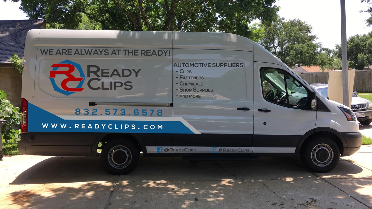
Ready Clips Brand Design
We built Ready Clips a complete commercial identity system designed for field visibility, fleet branding, and trust-building in the Houston automotive supply market.