First Class Collision Repair Brand Design
We gave First Class Collision Repair a clean, industrial identity that cut through a crowded market of generic body shop branding and positioned the business as the most credible option on the block.
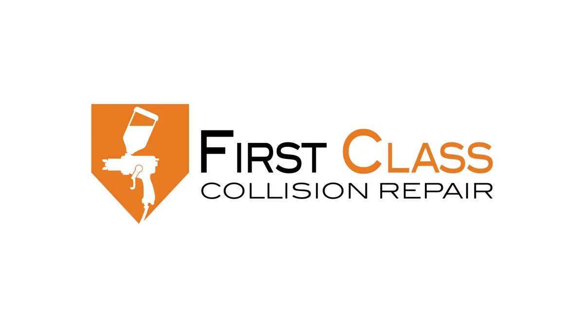
Table of Contents
Overview
First Class Collision Repair is an automotive collision and refinishing company specializing in body repair, paint restoration, and vehicle refinishing services. The company operates in a local market where trust and visual credibility drive customer decisions, and where most competitors rely on the same tired visual shortcuts: flames, racing fonts, shield clip art, and overly aggressive graphics.
The goal was to build something better. We developed a complete brand identity that positioned First Class Collision Repair as a more established and professional operation, one that could hold its own on a storefront, on a uniform, and on a business card.
Challenges
The collision repair category is one of the hardest to differentiate visually. Most businesses in the space look interchangeable at a glance, especially at roadside signage distances where split-second recognition matters.
The dual challenge was avoiding both extremes. A design too minimal would lose its automotive connection entirely. A design too on-the-nose would read as dated and low-budget alongside competitors relying on the same clichés. The identity also needed to work practically across embroidery, vinyl decals, uniforms, large-format signage, and digital assets without any loss in readability or impact.
Objectives
- Create a recognizable and professional automotive brand identity
- Differentiate the business from generic collision repair competitors
- Build a scalable logo system that works across physical and digital applications
- Improve perceived professionalism and trustworthiness
- Maintain clear automotive industry relevance without visual clutter
- Design for long-term durability, not trend-driven aesthetics
Solutions
The solution centered on a shield icon with a spray gun silhouette integrated directly into the negative space. The shield communicates protection, reliability, and structural integrity, all qualities central to what a collision repair shop delivers. The spray gun reference is immediate without being literal, keeping the mark from feeling like a generic automotive clip art badge.
The wordmark paired with the icon used a clean geometric sans-serif, chosen specifically because it reads clearly at distance and reproduces well across embroidery and vinyl. Stylized racing fonts were ruled out early because they age poorly and erode the professional positioning the business needed.
The color palette landed on orange and black. Orange brings energy, motion, and industrial familiarity. Black grounds the system and adds authority. The high-contrast pairing ensures visibility in every practical environment, from shop fascia to safety vests to printed collateral.
The brand identity
The system ships as three coordinated assets: the full horizontal lockup, the reversed white variant for dark environments, and the standalone icon for tight spaces. Each serves a distinct production context without requiring any visual rework.
Deliverables
- Logo design
- Brand identity system
- Primary logo lockup
- Icon design
- Typography system
- Color palette
- Scalable vector assets
- Print-ready logo files
- Digital brand assets
Results
The completed identity gave First Class Collision Repair a significantly more professional and recognizable presence compared to most competitors in the local collision repair market. The branding established a cleaner, more modern presentation while remaining clearly connected to the automotive refinishing industry.
The scalable system allowed the business to maintain consistency across signage, uniforms, print materials, decals, and digital applications. Simplified structure also improved production usability across embroidery, vinyl, and large-format printing, all without requiring redesign adjustments later.
The final identity helped position the company as more trustworthy and established by avoiding the visual clutter and dated aesthetics that make most automotive repair businesses look interchangeable.
Assessment
This project is a good example of how restraint becomes a competitive advantage in a cluttered category. The collision repair market is full of aggressive, noisy branding, so a clean, confident identity does not just look better. It communicates a different kind of business, one that takes its craft seriously. That is the positioning First Class Collision Repair needed, and the identity system we built delivers it at every touchpoint.
For more on the thinking behind this kind of brand design work, see our piece on visual brand language and our post on designing for small business. For related automotive work, see our case studies for Chasing Bimmer and Detail Exchange.
Related Projects
Karbon Kingdom Brand Design
We built Karbon Kingdom a complete automotive brand identity, from a bold KK monogram and decal system to business cards that match the carbon fiber culture the company lives in.
Pristine Street Culture Brand Design
Desque created a bold street automotive identity for Pristine Street Culture, a car enthusiast community that needed a logo system built to live on decals, apparel, and vehicle merchandise without losing its edge at any scale.
Ready Clips Brand Design
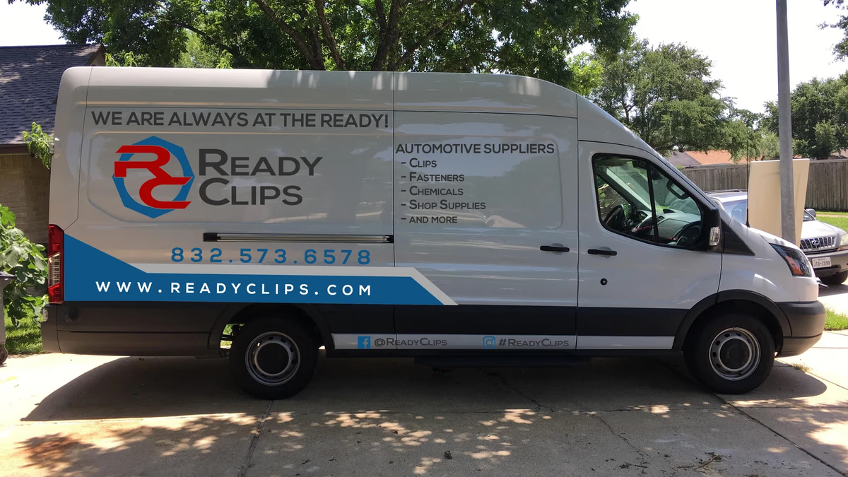
We built Ready Clips a complete commercial identity system designed for field visibility, fleet branding, and trust-building in the Houston automotive supply market.