The Network Realty Brand Design
We built a complete brand identity system for The Network Realty, a Houston real estate brand that needed a distinctive, modern presence to stand out in a relationship-driven and highly competitive market.
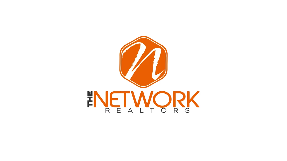
Table of Contents
Overview
The Network Realty was a Houston-based real estate brand focused on building visibility through relationships, referrals, and personal reputation. In a market where trust and recognition drive business, the brand needed an identity that felt approachable and modern while projecting the professionalism expected of a credible real estate presence.
The project centered on creating a visual identity that could stand independently and establish stronger recognition across both digital and print marketing materials.
Challenges
The brand had no established visual identity to support client acquisition, referral networking, or market positioning. Houston’s real estate market is competitive and heavily relationship-driven, which means first impressions carry real weight.
The challenge was to move beyond the generic visual tropes common in real estate branding and create something that felt both warm and professional. The identity needed to work across a wide range of applications, from yard signage and business cards to social media and digital advertising.
Objectives
- Create a timeless, recognizable brand identity for a Houston real estate professional
- Avoid overused real estate visual clichés (rooftops, keys, house silhouettes)
- Develop a flexible logo system that scaled across digital and print environments
- Build a color palette that communicated approachability, energy, and professionalism
- Establish a typography system with strong visual hierarchy and readability
Solutions
Brand identity
We built the identity around a custom hand-drawn “N” monogram housed within a geometric hexagonal badge. Rather than relying on literal real estate imagery, the concept emphasized abstraction and memorability to create a more distinctive presence.
The expressive, hand-crafted quality of the “N” gave the brand personality and approachability, positioning the brand as relationship-driven rather than transactional. The surrounding geometric badge structure balanced the organic mark with a structured, professional frame.
Color and typography
Orange was chosen as the primary brand color, selected for its higher visibility, warmth, and energy compared to the blue and green tones common throughout the real estate industry. Dark neutral tones were paired with the orange to maintain readability and visual balance across all applications.
The typography system used a clean geometric sans-serif typeface to reinforce professionalism and improve readability. Heavier emphasis on “NETWORK” created strong visual hierarchy, while the spaced letterspacing in “REALTY” delivered a cleaner and more refined presentation. The contrast between the expressive monogram and the structured wordmark produced a balanced system that felt contemporary without becoming dated.
The brand identity
Deliverables
- Logo Design
- Brand Identity System
- Primary Logo Variations
- Color Palette
- Typography Direction
Results
The final identity gave The Network Realty a recognizable and modern visual presence that differentiated the brand from more traditional real estate competitors. The system was designed to scale effectively across business cards, yard signage, social media graphics, print collateral, digital advertising, and website applications.
The identity balanced professionalism with personality, helping the brand build a stronger and more approachable presence within Houston’s competitive real estate market.
Assessment
This project is a clear example of how strategic brand design can lift a real estate professional above the visual noise of a crowded market. The combination of an expressive hand-drawn monogram within a structured geometric badge gave The Network Realty an identity that is both memorable and scalable, qualities that matter in a business built entirely on visibility and trust.
We approach real estate branding the same way we approach every identity project: by building something that is grounded in the client’s market context and designed to last. For more on how we approach brand identity work, explore our brand design services or read our series on defining your brand identity. To see how we have applied similar thinking to other real estate clients, take a look at JR Investments and Champion House Buyers.
Related Projects
Urban Residence Realty Brand Design
We built a compact but distinctive brand identity for Urban Residence Realty, an independently operated real estate agent who needed a recognizable personal brand to stand out in a market full of templated, interchangeable visuals.
JR Investments Brand Design
We designed a complete brand identity system for JR Investments, an urban real estate investment firm specializing in residential redevelopment, balancing residential warmth with investment-grade credibility.
Champion House Buyers Brand Design
We built a foundational brand identity and print collateral system for Champion House Buyers, a Houston wholesale real estate company competing in a market where visual credibility separates legitimate buyers from the noise.