JR Investments Brand Design
We designed a complete brand identity system for JR Investments, an urban real estate investment firm specializing in residential redevelopment, balancing residential warmth with investment-grade credibility.
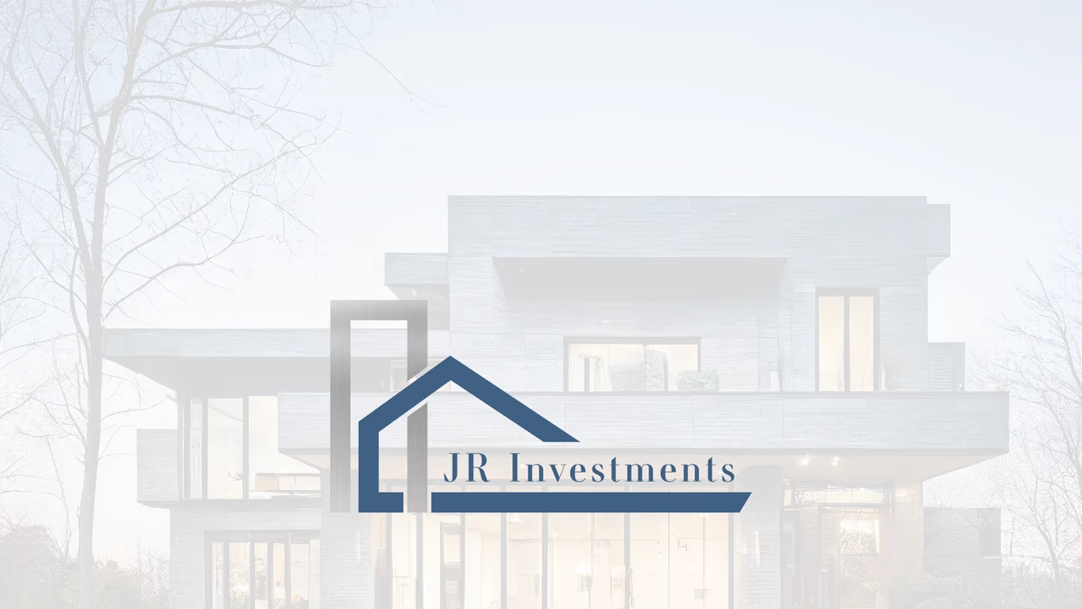
Table of Contents
Overview
JR Investments was a real estate investment and development firm focused on acquiring older or underutilized inner-city properties and transforming them into modern residential housing. Their portfolio ranged from single-family homes to duplexes and small-scale townhouse developments, targeting areas with strong long-term growth potential.
The company operated in a competitive market where credibility, professionalism, and trust directly influence the ability to secure partnerships and acquisition opportunities. At the time of engagement, they had no established visual identity to support any of those outcomes.
Challenges
The core challenge was creating an identity that worked across two distinct audiences: residential sellers and investment partners. The brand had to feel grounded in the residential market while projecting the financial confidence expected of a development firm.
Generic real estate branding in this segment tends to rely on literal house iconography, oversaturated blue palettes, or construction-style typography that lacks differentiation. JR Investments needed something more refined without sacrificing immediate market recognition. The identity also had to scale across a wide range of formats, from large property signage and construction fencing down to business cards and presentation decks.
Objectives
- Create a professional brand identity that bridges residential and investment positioning
- Build a scalable logo system functional at both large-format and single-color scale
- Differentiate the brand from generic real estate and construction aesthetics
- Establish visual credibility appropriate for investor presentations and property marketing
- Develop a flexible color system suitable for print, digital, and signage
Solutions
We developed a custom logo system built around a simplified geometric mark combining architectural structure with residential symbolism. The vertical framing element creates a strong foundational form, while the angled roofline anchors the brand clearly within the residential real estate space.
Rather than using a literal house illustration, the mark was reduced to a modern geometric system conveying stability, structural integrity, and long-term investment. A refined serif typeface positioned the brand closer to established investment firms than to trend-driven real estate startups, providing an elevated tone that offset the minimal iconography.
The muted blue palette reinforced trust and reliability without the aggressive saturation common to competitors in the segment. Monochrome and reverse colorway variations were developed to ensure flexibility across signage, embroidery, print production, and digital applications.
Logo exploration
The logo system was designed to maintain visual integrity across multiple reproduction environments. Three primary colorways were developed to cover the full range of expected applications.
Deliverables
- Primary logo design
- Brand identity system
- Blue, black, and white logo colorways
- Horizontal wordmark lockup
- Typography system (serif primary, geometric mark pairing)
- Muted blue color palette
- Vector logo exports
- Print-ready brand assets for signage, presentations, and collateral
Results
The finalized identity gave JR Investments a professional visual foundation aligned with the scale of their redevelopment work. The brand positioned the company closer to established investment firms while maintaining clear residential market relevance.
The simplified geometric mark reproduced cleanly across every expected format, from property signage and construction fencing to presentation decks and digital platforms. The serif typography and restrained palette helped the brand stand apart from the category default without requiring ongoing adaptation.
Assessment
This project is a clear example of why restraint produces stronger results in investment and real estate branding. The temptation in this category is to reach for generic housing imagery or aggressive color choices that signal energy but undermine credibility. Reducing the concept to a geometric architectural mark, pairing it with a refined serif typeface, and anchoring it in a muted palette produced something more durable and more differentiated.
The logo system we delivered works across every scale and surface the client needed, from construction signage to business cards, without losing clarity or recognition. That kind of range comes from building the system on a simplified geometric base rather than illustrative complexity.
If you are building a brand for a real estate or investment firm, our brand design services page outlines how we approach identity work. For the strategic thinking behind systems like this, the Defining Your Brand Identity and Visual Brand Language posts cover the relevant principles. You can also see how we applied similar brand-first thinking for Champion House Buyers and FM Tax.
Related Projects
The Network Realty Brand Design
We built a complete brand identity system for The Network Realty, a Houston real estate brand that needed a distinctive, modern presence to stand out in a relationship-driven and highly competitive market.
Urban Residence Realty Brand Design
We built a compact but distinctive brand identity for Urban Residence Realty, an independently operated real estate agent who needed a recognizable personal brand to stand out in a market full of templated, interchangeable visuals.
Champion House Buyers Brand Design
We built a foundational brand identity and print collateral system for Champion House Buyers, a Houston wholesale real estate company competing in a market where visual credibility separates legitimate buyers from the noise.