Urban Residence Realty Brand Design
We built a compact but distinctive brand identity for Urban Residence Realty, an independently operated real estate agent who needed a recognizable personal brand to stand out in a market full of templated, interchangeable visuals.
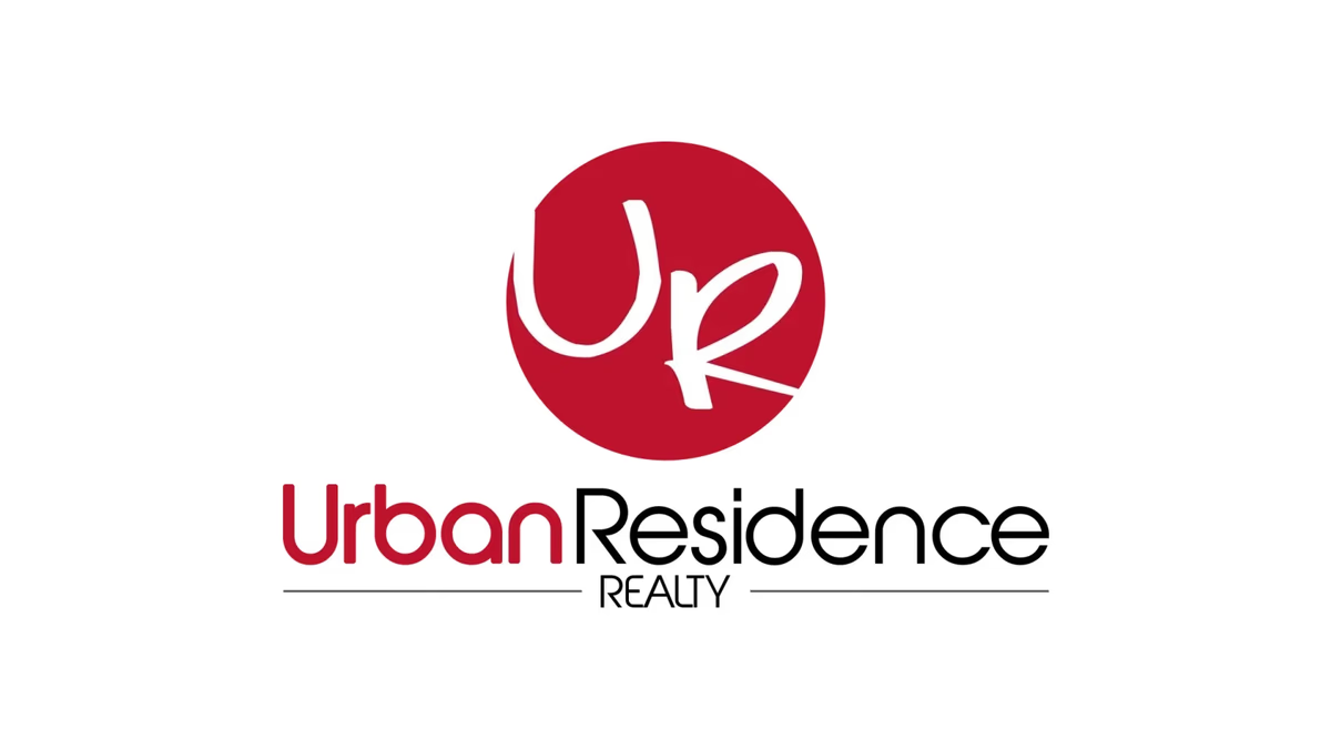
Table of Contents
Overview
Urban Residence Realty is an independently branded real estate business operating under a freelance-style brokerage structure, where agents manage their own marketing and visual identity while the brokerage handles legal and compliance requirements. For an agent working this way, the brand does most of the relationship-building work before a client ever picks up the phone.
The project called for a visual identity that could hold up across the full range of real estate touchpoints: yard signage, business cards, listing graphics, social profiles, and digital platforms. With no brokerage recognition to rely on, everything came down to the agent’s own mark.
Challenges
The real estate market is one of the most visually crowded industries we work in. Most independent agents either inherit generic brokerage templates, buy off-the-shelf logo packs, or land on the same navy-and-gold corporate styling everyone else uses. The result is a sea of brands that look interchangeable at the moment they matter most.
Urban Residence Realty needed to cut through that without overcomplicating the system. The identity had to stay lightweight and adaptable, since a solo agent manages every application without a dedicated marketing team. It also needed to feel personal and approachable rather than corporate, while still being professional enough for a trust-dependent business.
Objectives
- Create a recognizable identity that reads as personal rather than templated
- Differentiate visually from the navy, black, and gold palettes common throughout the market
- Build a flexible system that works at small scale, particularly for profile images and signage
- Keep the design minimal enough for the agent to manage independently across multiple touchpoints
- Develop a monogram-based mark that could function as a standalone icon when needed
Solutions
The identity system centers on a custom “UR” monogram placed inside a circular badge structure. The initials are drawn with a handwritten quality that introduces personality and warmth, making the brand feel human rather than institutional. The circular container formalizes those expressive initials and creates the professional structure the business needs.
The badge format was a deliberate choice for flexibility. The icon reads clearly at small sizes, works as a standalone element for profile images and social platforms, and scales up cleanly for signage without losing legibility or presence.
Color strategy was equally intentional. While competitors defaulted to navy, black, and gold, we used a bold red palette that gives the brand stronger visibility and memorability. The contrast between the white monogram and the deep red circle also helps the mark hold up in environments where it competes with a lot of visual noise.
A rounded sans-serif typeface for the “Urban” wordmark complements the softer handwritten curves of the monogram, keeping the full lockup balanced between personality and clarity. The system is intentionally kept minimal so the agent can adapt it independently across business cards, listings, and digital platforms without requiring brand management infrastructure.
Deliverables
- Logo design
- Brand identity system
- Primary logo lockup
- Monogram icon (standalone use)
- Typography system
- Color palette
Results
The final identity gave Urban Residence Realty a cleaner, more recognizable market presence compared to the templated real estate brands common in the same brokerage environment. The handwritten monogram introduced personality without sacrificing the professional credibility the business needs in client-facing situations.
The simplified system proved immediately practical. The standalone icon performs well in small-format applications like profile images and listing thumbnails, where full wordmarks lose legibility. The color differentiation from the standard real estate palette means the brand stands out when it appears alongside competitor listings and signage.
Assessment
This project is a good reminder that brand work does not need to be complex to be effective. For an independently operated real estate agent managing their own marketing across a wide range of touchpoints, the right answer was a tight, flexible system that earns recognition without demanding brand management expertise to maintain.
The handwritten monogram was the decision that made the identity work. Without it, the circular badge would have read as another generic real estate emblem. The contrast between the expressive initials and the structured container, paired with the red color strategy, gave the brand enough personality to stand apart in a market where visual sameness is the default.
We approach this kind of project the same way we approach any brand identity: start with the operational reality of how the brand will actually be used, then build a system that holds up under those conditions without overreaching. If you are working through a similar challenge as an independent agent or small real estate business, our brand design services cover this process end to end. For more on how visual identity decisions shape recognition and trust, see our series on visual brand language and our piece on designing for small business. For a related real estate identity project where we took a similar approach to personal differentiation, see our work for Naran Group.
Related Projects
The Network Realty Brand Design
We built a complete brand identity system for The Network Realty, a Houston real estate brand that needed a distinctive, modern presence to stand out in a relationship-driven and highly competitive market.
JR Investments Brand Design
We designed a complete brand identity system for JR Investments, an urban real estate investment firm specializing in residential redevelopment, balancing residential warmth with investment-grade credibility.
Champion House Buyers Brand Design
We built a foundational brand identity and print collateral system for Champion House Buyers, a Houston wholesale real estate company competing in a market where visual credibility separates legitimate buyers from the noise.