Naran Group Brand and Website Design
We built a complete brand identity and website for Naran Group, a Houston-area luxury real estate team, grounding the identity in personal symbolism and positioning the business as a refined, relationship-driven alternative to generic realtor branding.
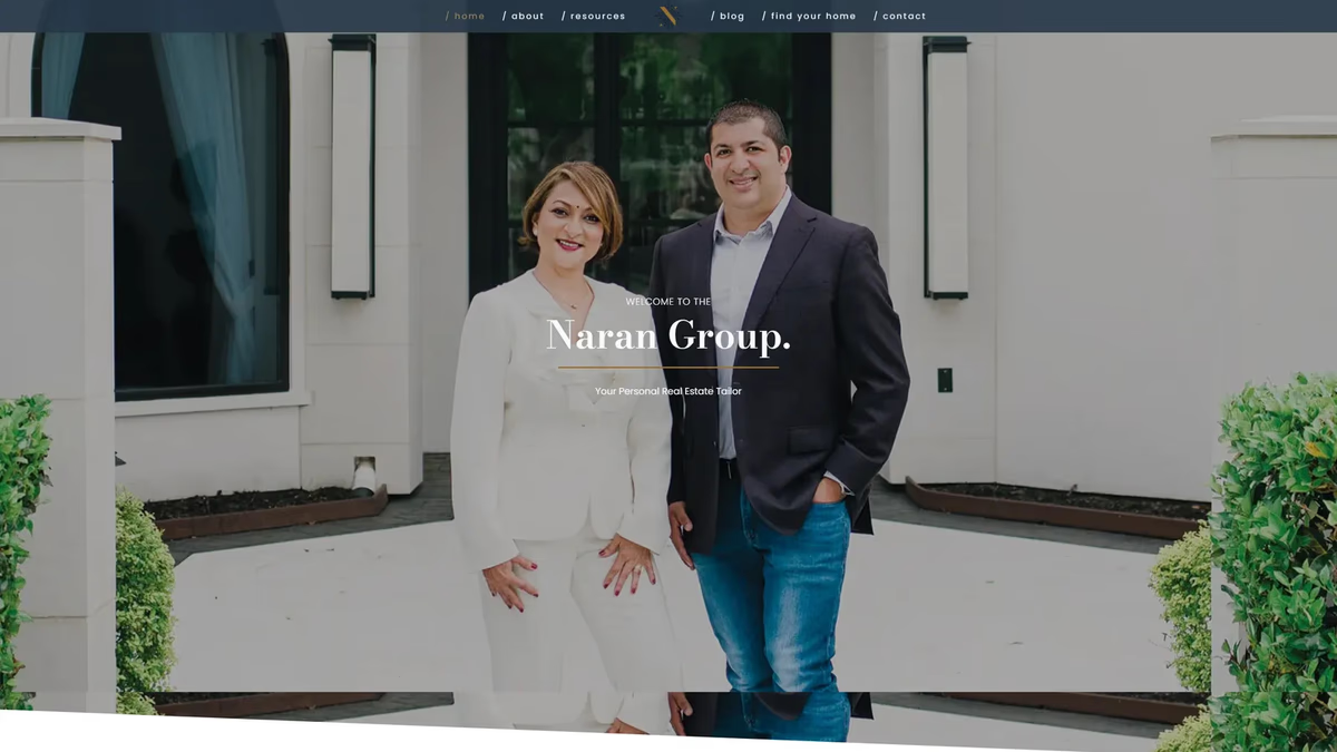
Table of Contents
Overview
Naran Group is a Houston-area real estate team specializing in high-end residential properties throughout Sugar Land, Richmond, and the surrounding suburban luxury markets. Operated by a mother-and-son duo, the business placed a heavy emphasis on personalized service, deep local knowledge, and relationship-driven transactions rather than high-volume sales.
Their clientele ranged from first-time buyers to investors, with a primary focus on luxury homes in the seven-figure range. Because so much of the business relied on trust, referrals, and long-term relationships, the quality of every client touchpoint carried real weight. Naran Group needed a brand and a website capable of meeting that standard.
Challenges
Prior to engagement, Naran Group lacked any cohesive premium identity to support the level of clientele they were pursuing. Real estate branding is notoriously saturated with generic visual language: rooftop icons, skyline silhouettes, gold-on-black luxury cliches, and templated marketing systems that look identical across thousands of agents.
The team also wanted the identity to carry personal meaning. During discovery, the client introduced a symbolic ornamental motif from Rishi Naran’s wedding emblem and expressed interest in incorporating it into the final system. This meant balancing cultural and personal symbolism with the scalability and restraint a professional luxury brand requires.
The website presented its own challenge. Most realtor sites at the time prioritized MLS listings over credibility and relationship-building. Naran Group needed a site that felt consultative, educated buyers and sellers, and positioned the team as trusted advisors rather than just agents.
Objectives
- Develop a distinctive brand identity rooted in personal symbolism while meeting luxury market standards
- Avoid generic realtor visual cliches in every design direction
- Build a website that supports trust, storytelling, and long-term client relationships
- Deliver a consistent system across digital and physical touchpoints: signage, cards, and marketing collateral
Logo exploration
Before landing on the final direction, Desque explored a range of mark styles for the “N” icon and wordmark, testing different weights, compositions, and typographic approaches. The goal was to find a lockup that felt elevated without leaning into cliched luxury tropes.
The brand identity
The final system centers on a custom “N” icon derived from the ornamental motif Rishi Naran brought to discovery. The shape was isolated, mirrored, and arranged into a four-point compass structure surrounding the diagonal “N” form. The result reads as both a navigational symbol and a refined emblem with genuine personal meaning.
Typography pairs Ratio Modern, an editorial serif chosen for sophistication and luxury positioning, with Montserrat and Proxima Nova for readability across digital and print. The color palette of muted gold, deep navy, white, and charcoal was deliberately restrained to avoid the aggressive luxury aesthetic common in the category.
Brand applications
The identity was extended across stationery, marketing materials, and a full suite of yard signs. We delivered all four sign variants with both agent contact configurations, covering every transaction scenario the team encounters in the field.
Stationery suite mockup in teal and terracotta, showing folder and card system.
The website
The website was built to feel consultative rather than transactional. Rather than centering the experience around a listings feed, we structured the site around the team’s story, their market expertise, and the resources they offer buyers and sellers throughout the Sugar Land area.
Website
About
Solutions
The brand identity was built around the personal motif Rishi Naran contributed from his wedding emblem. Rather than reproducing the ornamental shape literally, we isolated the core form and restructured it into a four-point compass arrangement surrounding a strong diagonal “N.” The result carries genuine personal meaning while reading as a professional, scalable mark at any size.
The website departed from the standard realtor template approach by leading with narrative and expertise. The resources section educated visitors rather than pushing listings, and the about page used real team photography to make the relationship-driven nature of the business tangible before a visitor ever made contact.
Deliverables
- Logo design and complete identity system
- Brand guidelines (color, typography, usage rules)
- Horizontal and vertical lockup variations, light and dark colorways
- Business cards (two agent configurations, front and back)
- Yard signs (four transaction types, both agent configurations)
- Stationery suite
- Multi-page website design and development
Results
Naran Group gained a significantly more refined and differentiated brand presence within a highly saturated real estate market. The identity system positioned the business as experienced, upscale, and trustworthy without leaning into the overused visual cliches that define most competitor branding in the category.
The website gave the team a platform that supported trust-building and long-term relationship development, providing a more consultative client experience than the MLS-driven templates that dominated the market at the time.
Assessment
This project is a clear example of how personal meaning and professional rigor can coexist in a brand system. The ornamental motif from Rishi Naran’s wedding emblem gave the identity a foundation most real estate brands simply cannot replicate, and the restraint applied throughout the color and typography system ensured the result felt elevated rather than ornate. We delivered a full end-to-end system, from iconmark to yard signs, that holds together across every surface the business uses daily.
For more on how we approach brand and web work in the real estate and professional services space, visit our web design and brand design service pages. We’ve explored the trust mechanics behind this type of work in Building Trust Through Web Design and in our Houston Market Analysis. See also our work for JR Investments and Champion House Buyers, two other real estate clients in the Houston market.
Related Projects
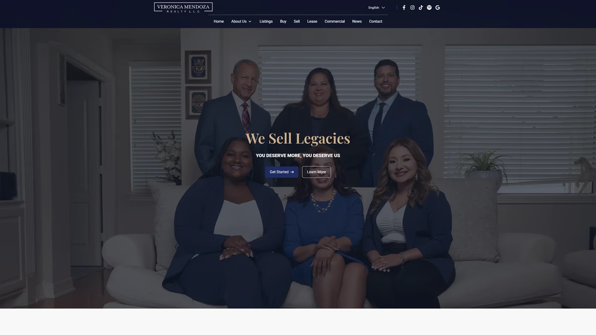
Veronica Mendoza Realty Brand and Website Design
We rebuilt Veronica Mendoza Realty from a low-resolution logo and a generic brokerage template into a custom digital platform that reflects the professionalism and community trust the business had already earned.
JR Investments Brand Design
We designed a complete brand identity system for JR Investments, an urban real estate investment firm specializing in residential redevelopment, balancing residential warmth with investment-grade credibility.
The Network Realty Brand Design
We built a complete brand identity system for The Network Realty, a Houston real estate brand that needed a distinctive, modern presence to stand out in a relationship-driven and highly competitive market.