Crystal Lallego Art Brand Design
We built Crystal Lallego Art a signature-based identity system that frames the artist without competing with the work, anchored by a bold orange palette that travels from canvas to print to digital.
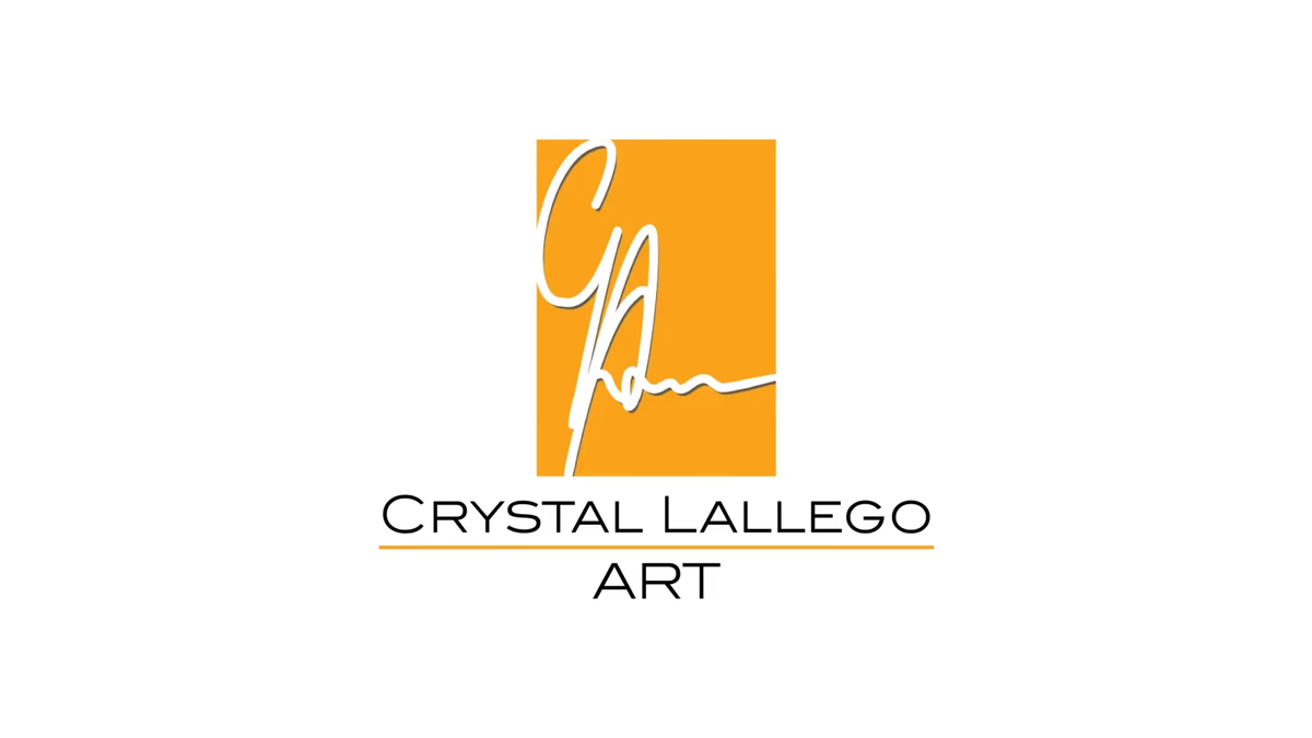
Table of Contents
Overview
Crystal Lallego Art is an independent artist brand built around abstract artwork, custom canvas pieces, and mural projects. The work is expressive, fluid, and emotionally driven, which created a specific design problem from the start: the identity had to be recognizable and professional without overwhelming the art it was meant to support.
As a personal artist brand, the visual system was also tied directly to Crystal’s personality and signature style. That meant the solution could not be generic. It needed to feel handcrafted and specific to one person while still holding up across canvas signatures, print applications, social media, and portfolio presentations.
Challenges
The central challenge was authenticity without cliche. Many artist brands reach for paint textures, decorative flourishes, or overly stylized typography systems that signal creativity but reduce clarity and long-term usability. The identity needed to feel genuinely personal without borrowing from those familiar visual shortcuts.
A few specific tensions shaped the scope.
- Because the artwork itself is abstract and highly expressive, the brand system had to function as a frame rather than a focal point. Anything visually heavy or complex would have competed with the art rather than contextualizing it.
- The identity needed to scale from small digital profile usage to large mural and print applications without losing legibility or coherence.
- The personal connection to Crystal as an individual creator had to come through clearly. A corporate or templated look would have undermined the brand’s core premise.
Objectives
The goal was to build an artist identity system that felt specific, flexible, and professionally restrained. That meant creating a mark rooted in Crystal’s actual signature, establishing a color palette strong enough to carry the brand across neutral and abstract contexts, and delivering a typography hierarchy that stayed out of the way of the artwork.
More specifically, the system needed to support canvas work, murals, social media assets, portfolio presentations, and print applications from a single coherent visual foundation.
Solutions
At Desque we built the identity around Crystal’s personal signature, transforming it into a piece of iconography rather than treating it as decorative text. The signature was extracted and composed within a square frame, creating contrast between the expressive hand-drawn movement of the mark and the structured geometry of its container. That tension, between fluidity and organization, became the defining visual logic of the system.
The iconography retained the natural imperfections and movement of the original signature deliberately. Smoothing them out would have removed the authenticity the brand depended on. The extended line flowing from the signature into the typographic elements introduced a sense of continuity and motion that echoed the abstract qualities of the artwork itself.
The typography hierarchy was kept intentionally minimal. The signature icon anchors the system as the dominant element. A simplified name line and supporting designation follow it. That restraint kept the brand from becoming visually heavy and preserved flexibility across every application format.
The primary orange palette was chosen based on Crystal’s personal preference and became the identity’s defining characteristic. The vibrant orange against the black signature work created a bold, minimal system that remained highly scalable and immediately recognizable.
The brand identity
The final mark transforms Crystal’s personal signature into a structured icon, pairing expressive hand-drawn movement with a square frame that gives the system stability across every application.
Brand applications
The system was extended into the print touchpoints Crystal uses for client-facing presentation and networking. The business cards carry the orange palette and signature mark cleanly, keeping the identity consistent whether someone encounters the brand on a canvas or in hand.
Deliverables
- Signature-based logo design and brand iconography
- Primary, single-color, and scalable logo variations
- Color palette anchored in Crystal’s personal orange direction
- Minimal typography hierarchy for cross-application flexibility
- Social media branding assets
- Print-ready brand assets including business cards
- Full brand identity system documentation
Results
The final identity gave Crystal Lallego Art a cohesive visual foundation that preserved the authenticity and expressive nature of the work. The signature-based mark created immediate personal recognition, and the orange palette introduced the energy and visibility the brand needed to stand out against neutral or monochromatic artwork backgrounds.
The system translated effectively from small digital profile usage to print and mural-scale applications without losing visual coherence, which was the primary functional requirement from the start.
An artist brand has to support the work, not compete with it. Getting that restraint right is harder than it looks.
Assessment
This project worked because the approach avoided the most common failure mode in artist branding: overdesigning the identity to prove creativity. Complexity at the brand level creates direct conflict with complex artwork. The decision to use Crystal’s actual signature as the foundation of the iconography produced immediate authenticity without requiring visual noise to signal it.
The brand design thinking here applies broadly to any individual creative whose personal identity is the product. We explore that approach in depth in our piece on defining your brand identity. For other identity systems where simplicity was the strategic choice, see our case studies for Antonio Bernal and Anthony Mata.
Related Projects
Exotico Rentals Brand Design
We named and built the complete brand identity for Exotico Rentals, a luxury partnership-based rental company covering exotic vehicles, private aviation, and marine experiences across Miami and Houston.

Sweat Social Brand Design
We built the complete brand identity for Sweat Social from the ground up: naming strategy, logo system, color palette, merchandise, and event marketing, positioning a Houston Pilates pop-up as a lifestyle-first wellness community.
Karbon Kingdom Brand Design
We built Karbon Kingdom a complete automotive brand identity, from a bold KK monogram and decal system to business cards that match the carbon fiber culture the company lives in.