Antonio Bernal Photography Brand Design
We built a minimal, monogram-based brand identity for Antonio Bernal Photography, designing a custom abp mark and spaced wordmark system that positions the studio in an editorial market rather than the crowded freelance photography space.
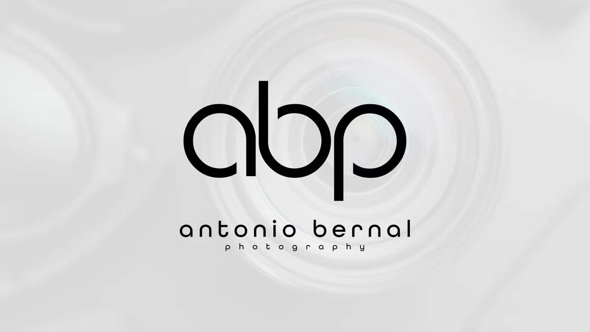
Table of Contents
Overview
Antonio Bernal Photography was conceived as a modern studio brand focused on clean visual storytelling, emotional composition, and premium presentation. The direction aimed to position the studio in a more refined and editorial market segment rather than the saturated space typically associated with generic photography branding.
The intended audience spanned portrait clients, lifestyle and editorial work, creative campaigns, and commercial visual content. The identity needed to feel equally appropriate across portfolio presentations, social media, watermarked imagery, print collateral, and client-facing materials.
Challenges
The photography industry presents a consistent branding problem: most visual identities in the space lean on script typography, literal camera symbolism, overly cinematic styling, or generic luxury aesthetics. That sameness makes it difficult for independent photographers to establish genuine premium positioning.
The challenge was to design an identity that felt modern without becoming trend-dependent, communicated professionalism without reading as corporate, and supported both artistic and commercial contexts. An equally important constraint was scalability. The mark needed to hold up at both large-format presentation size and as a subtle image watermark without losing clarity or recognition.
Objectives
- Build a timeless, recognizable photography brand identity
- Position the brand toward a premium editorial aesthetic
- Avoid the visual tropes that dominate photography branding
- Develop a flexible logo system for digital and print environments
- Create a minimalist visual language that complements photography rather than competing with it
- Ensure scalability across social, web, and watermark applications
Solutions
At Desque, we approached this project through reduction rather than addition. Instead of using literal photography iconography, the identity system was built around abstract visual balance and geometric cohesion.
The custom “abp” monogram was designed as a unified continuous mark rather than three disconnected characters. Rounded geometry and monoline construction created a balance between softness and technical precision. The mark emphasizes optical balance and memorability through silhouette, giving it recognition that works independently from the full wordmark.
The typography system reinforced that editorial tone. A clean sans-serif wordmark with deliberate letter spacing creates breathing room, sophistication, and a gallery-inspired presentation style. The spacing treatment slows visual pacing, producing a calmer and more intentional brand presence.
The surrounding visual language drew subtle references from lens optics, aperture movement, light diffusion, and focus rings. Soft gradients, radial distortions, and restrained monochromatic treatments reinforce the photography connection without becoming literal or distracting.
The brand identity
Deliverables
- Custom abp monogram design
- Logo design and full wordmark system
- Typography system with spaced tracking treatment
- Brand identity system and visual direction
- Brand presentation assets
- Digital branding assets for social media and watermark applications
Results
The identity successfully differentiated itself from conventional photography brands through minimalism, strong geometric structure, timeless presentation, and editorial-inspired restraint. The logo system maintained strong recognition while remaining flexible enough for both large-scale branding and subtle image watermark usage.
The restrained visual language allowed photography itself to remain the centerpiece of the brand experience rather than competing with excessive branding elements. Although the business ultimately never formally launched, the identity system was designed with long-term scalability in mind, capable of expanding into commercial photography, creative direction, production work, and fashion and editorial campaigns.
Assessment
This project is a clear demonstration of why restraint in branding is harder than abundance. When a system is reduced to its essentials, every proportion, curve, and spacing decision carries more weight. The abp monogram succeeded because its optical balance and monoline consistency gave it a silhouette strong enough to function independently at watermark scale.
Our brand identity design services regularly confront this challenge in creative fields where the work itself is the product and the identity must support rather than compete. For a deeper look at the principles behind that kind of visual thinking, our visual brand language guide covers how systematic restraint produces more durable identities, and defining your brand identity explains the strategic decisions that precede any mark. For another example of a personal brand identity built around a custom monogram in a creative field, see our Anthony Mata case study.
Related Projects
Standing Planted Publishing Brand Design
We built Standing Planted Publishing a heritage-rooted brand identity centered on a custom Victorian monogram, crown motif, and ornamental system that positioned the imprint as a premium literary presence rather than a generic modern publisher.
Anthony Mata Brand Design
We built a minimal, monogram-based brand identity for Houston music producer Anthony Mata, creating a flexible personal mark with a hidden narrative that travels from social profile to live event.
Nude Addiction Brand Identity
We built Nude Addiction a warm, minimalist fashion identity rooted in tonal restraint, developing a logo system and apparel application suite that positioned the boutique clothing brand around softness, femininity, and understated elegance.