Nude Addiction Brand Identity
We built Nude Addiction a warm, minimalist fashion identity rooted in tonal restraint, developing a logo system and apparel application suite that positioned the boutique clothing brand around softness, femininity, and understated elegance.
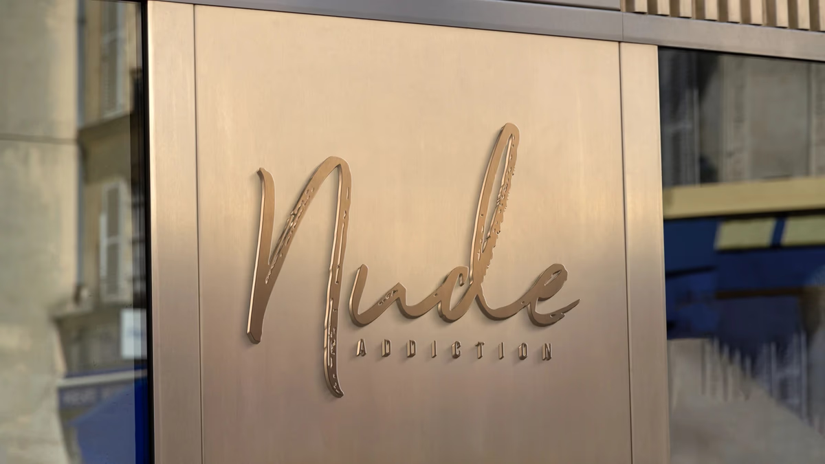
Table of Contents
Overview
Nude Addiction was a fashion-focused clothing brand built around warm neutral tones inspired by natural skin colors. The concept centered on a monochromatic nude palette ranging from lighter creams to deeper earthy browns, positioning the line around subtlety, softness, and minimalism rather than loud graphics or trend-heavy aesthetics.
The project started in February 2021 during early-stage brand development, before the product line had reached commercial launch. We developed the full identity system, apparel application suite, and creative direction for the brand’s photoshoot presentation.
Challenges
The central challenge was creating a visually compelling fashion identity while operating within an intentionally restrained color spectrum. With nude and neutral tones as the only palette, there was a real risk of the identity becoming forgettable or lacking enough contrast to hold its own.
The branding needed to communicate warmth, femininity, and sophistication without becoming visually repetitive or sterile. It also had to translate naturally across physical apparel applications, including clothing tags, garment labels, business cards, and signage, while avoiding a feel that was either overly corporate or luxury-exclusive.
Objectives
- Create a cohesive fashion identity centered around nude and neutral tones
- Establish a soft and premium visual atmosphere without relying on excessive complexity
- Develop a logo system capable of scaling across apparel and physical brand applications
- Build a flexible identity system adaptable to multiple tonal color variations
- Support the brand’s boutique fashion positioning through minimal, restrained presentation
Solutions
The brand design system was built on restraint, typography, and tonal cohesion rather than decorative graphics. The primary logo combined an expressive handwritten script with a structured condensed sans serif submark, creating balance between femininity and stability while keeping the brand from feeling either too delicate or too corporate.
Color strategy relied on subtle tonal variation across a nude spectrum rather than bold accent colors or high-contrast systems. Material interaction became the primary vehicle for depth and sophistication, with embossing, texture, and spacing carrying the visual weight across physical applications.
The brand identity
Brand applications
The strongest applications came through material interaction. Embossing on fabric tags, tonal contrast on business card stock, and warm-lit product photography all reinforced the brand’s core aesthetic without requiring additional graphic elements. The apparel mockups demonstrated how the identity scaled from small-format tags to larger print and signage contexts.
Deliverables
- Logo design (primary nude-tone, black, and white reverse lockups)
- Brand identity system
- Typography direction
- Color palette development
- Apparel label concepts
- Business card design
- Signage mockups
- Brand presentation assets
- Photoshoot creative direction
- Social media visual direction
Results
The completed identity established a strong boutique fashion aesthetic built around warmth, minimalism, and tonal consistency. The system translated cohesively across clothing applications, print collateral, signage, and brand presentation materials.
Although Nude Addiction did not reach full commercial launch, the aesthetic direction anticipated fashion trends that later became more mainstream. Neutral monochromatic branding and nude-toned apparel collections became significantly more common across lifestyle and apparel brands in subsequent years, affirming the relevance of the original direction.
Assessment
This project is a strong example of how restraint itself becomes a design decision. The identity worked because every element, from the script wordmark to the embossed signage, reinforced the same tonal and atmospheric idea rather than competing for attention. The handwritten script introduced personality and softness; the surrounding system of spacing, texture, and material application gave it credibility.
We cover the thinking behind this kind of atmosphere-first brand design in our series on visual brand language and brand voice and messaging. For other fashion and lifestyle brand projects where tonal identity was central to the work, see our Bleu Vibes and Kreature Look case studies.
Related Projects
Tailored Attire Brand Identity
We built Tailored Attire a modular, production-ready menswear identity system designed to function across every apparel touchpoint, from embroidered patches to digital channels, without losing cohesion or visual strength.
Kreature Look Brand Identity
We built Kreature Look a bold, CMYK-driven brand identity that embedded the company core value proposition directly into its visual structure, separating a print-on-demand apparel startup from generic print shop aesthetics.
Bleu Vibes Brand Identity
We built Bleu Vibes a refined coastal brand identity designed to position a beachwear concept closer to lifestyle fashion than to mass-market swimwear.