Kreature Look Brand Identity
We built Kreature Look a bold, CMYK-driven brand identity that embedded the company core value proposition directly into its visual structure, separating a print-on-demand apparel startup from generic print shop aesthetics.
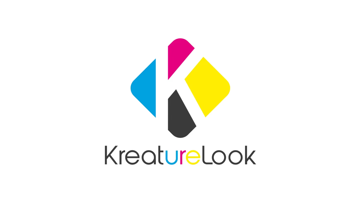
Table of Contents
Overview
Kreature Look was an online print-on-demand apparel company built around a straightforward idea: remove the minimum-quantity barriers that made custom apparel inaccessible for individuals, small creators, and event organizers. At a time when local print shops almost universally required bulk orders before production could begin, Kreature Look allowed customers to produce custom garments in extremely small runs, including single-item orders, with no inventory commitments required.
The business targeted individuals, independent creators, small brands, and event organizers who needed flexible, low-barrier apparel production. Branding the company meant capturing that creative energy and accessibility without letting the identity drift toward the industrial, production-focused aesthetic that most print competitors relied on.
Challenges
The print-on-demand market in 2018 was significantly less developed than it is today. Most of the accessible infrastructure for low-quantity custom apparel production had not yet been built into mainstream platforms. Kreature Look was entering a space where the incumbent visual language, generic print shop aesthetics, heavy use of literal printing equipment iconography, and a generally transactional tone, actively worked against the kind of creative, approachable brand experience the company needed to build.
The identity also had to manage a specific tension between abstraction and clarity. The system was built around CMYK color theory and geometric forms, which can quickly become visually chaotic if the underlying logic is not tight. Every element had to feel intentional, remain scalable across apparel, digital, and packaging applications, and communicate individuality and creative freedom without losing coherence.
Objectives
The goal was to create a brand identity that felt genuinely creative and consumer-friendly rather than industrial or technical. Kreature Look needed to differentiate itself from traditional print vendors and position itself as a platform for self-expression, one that lowered the barrier to custom apparel for people who were not professional designers or bulk buyers.
We also set out to build a system with long-term flexibility, one that could grow beyond its original apparel scope into packaging, digital marketing, and social applications without requiring the identity to be rebuilt from the ground up.
Solutions
Naming and concept alignment
The project originally began under the name “Creature Look.” During development, the name evolved to “Kreature Look,” replacing the “C” with a “K” to align the typography with CMYK color blocking and create a more ownable brand structure.
That substitution introduced a secondary layer of meaning: within the name “KreatURE Look,” the letters “URE” can be read as “Create Your Look.” The brand system reinforced this hidden message by selectively highlighting those letters using CMYK accent colors, embedding the company’s core value proposition directly into the wordmark without relying on explicit messaging.
Logo system
The logo icon was built from four abstract geometric forms arranged around a negative-space “K.” Each form carried one of the CMYK colors, cyan, magenta, yellow, and black, connecting the mark visually to the print production process at the core of the business. The construction intentionally referenced CMYK color separation, modularity, and creative assembly without using literal printing equipment or apparel imagery.
The negative-space “K” rewards closer engagement with the mark rather than explaining itself immediately, which gave the identity a more refined and memorable quality over time.
Color system
The entire palette was built around CMYK theory: cyan, magenta, yellow, and black. This decision grounded the brand in print culture while maintaining a visually energetic and youthful character. The colors served both a conceptual and a functional role, reinforcing the company’s printing foundation, increasing visual memorability across digital touchpoints, and enabling the selective typographic color treatments that carried the hidden brand message.
Typography
A rounded geometric sans-serif was selected to counter the visual weight of the icon system and keep the identity approachable and modern. The typeface avoided corporate or luxury associations, which mattered because Kreature Look was not positioning itself as a high-end apparel house but as an accessible, creator-friendly production platform.
Deliverables
- Primary logo mark with CMYK geometric construction and negative-space K
- Full wordmark lockup with selective CMYK color highlights on “ure”
- Brand identity system with CMYK-driven color palette
- Typography system with rounded geometric sans-serif
- Icon system with scalability guidelines for apparel, digital, and packaging
- Brand presentation assets
- Digital branding assets
Results
Kreature Look established a distinct visual identity that set the company apart from both generic print shops and the broader commodity apparel market. The CMYK-driven visual language created immediate and memorable association with print culture while the rounded typography and abstract icon system kept the brand from feeling industrial or technical.
The hidden “Create Your Look” concept embedded within the wordmark gave the identity conceptual depth that could carry brand storytelling across marketing, packaging, and digital applications without requiring additional explanation.
Assessment
Kreature Look is a project where the strongest design decisions were also the most strategic. Renaming from “Creature Look” to “Kreature Look” was not a cosmetic choice but a structural one, it unlocked CMYK color segmentation in the typography, introduced an ownable brand asset, and embedded the company’s core promise directly into the name. At Desque, we treat that kind of alignment between naming, visual system, and business model as a standard for brand design work rather than a bonus outcome.
The project also represents a genuine artifact of the print-on-demand industry at an early stage of its development. Building a brand that felt modern, accessible, and creator-oriented in 2018, before platforms like Printful normalized low-quantity fulfillment, required the identity to carry a positioning argument that the product infrastructure alone could not yet make.
The principles behind this kind of concept-first brand design work are covered in depth in our posts on visual brand language and the psychology of color in web design. For other Desque brand identity projects in the fashion and lifestyle space, see Bronze Bar and Bleu Vibes.
Related Projects
Tailored Attire Brand Identity
We built Tailored Attire a modular, production-ready menswear identity system designed to function across every apparel touchpoint, from embroidered patches to digital channels, without losing cohesion or visual strength.
Nude Addiction Brand Identity
We built Nude Addiction a warm, minimalist fashion identity rooted in tonal restraint, developing a logo system and apparel application suite that positioned the boutique clothing brand around softness, femininity, and understated elegance.
Bleu Vibes Brand Identity
We built Bleu Vibes a refined coastal brand identity designed to position a beachwear concept closer to lifestyle fashion than to mass-market swimwear.