Tailored Attire Brand Identity
We built Tailored Attire a modular, production-ready menswear identity system designed to function across every apparel touchpoint, from embroidered patches to digital channels, without losing cohesion or visual strength.
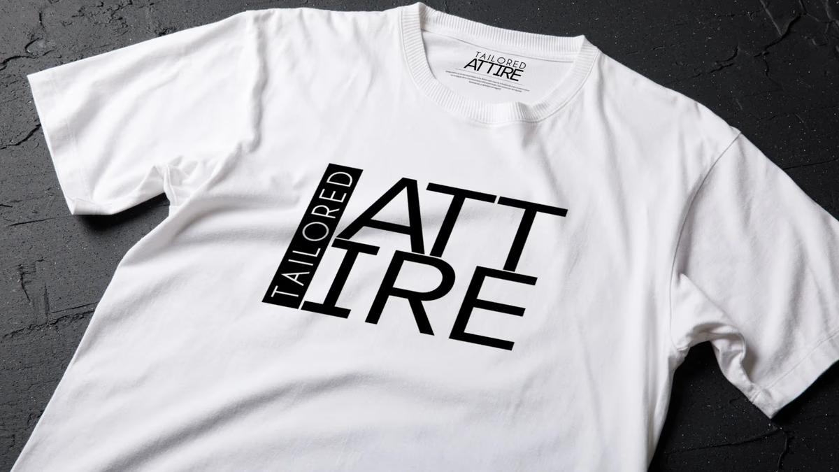
Table of Contents
Overview
Tailored Attire was a menswear concept built around curated everyday apparel for men between 25 and 35. The brand positioned itself around simplifying wardrobe decisions while maintaining a polished, modern appearance across casual, athletic, and more formal settings. A subscription model would deliver hand-picked outfit selections matched to each customer’s lifestyle and preferences.
Because the brand would operate across both digital channels and physical apparel applications, the identity needed to go well beyond a single logo mark. Our challenge was to design a scalable system that felt premium and recognizable whether it appeared on a garment tag, an embroidered patch, or a mobile screen.
Challenges
The modern minimalist menswear space is saturated with generic luxury-inspired typography that struggles to create real distinction. Many apparel identities look compelling in a brand deck but begin to fall apart the moment they move into production environments such as embroidery, woven labels, or stitched patches.
Tailored Attire needed a visual identity that balanced sophistication, modernity, and simplicity while remaining production-usable across a wide range of materials and formats. The system had to hold together whether displayed at large scale on a shirt graphic or reduced to a small woven label inside a collar. Restraint was essential: over-designing would have weakened its adaptability and shortened its shelf life within the fashion market.
Objectives
- Develop a complete modular identity system for an apparel startup
- Ensure production usability across embroidery, woven labels, fabric tags, and patches
- Create a scalable logo architecture that works across square, vertical, and horizontal formats
- Establish a monochromatic visual language to support premium minimal presentation
- Build a system capable of evolving alongside future product and apparel expansion
Solutions
We approached the project as an identity architecture problem rather than a purely aesthetic exercise. The result was a complete modular system that included full lockups, wordmarks, iconic marks, and inverse variations. Each component was designed to function independently or together depending on the application.
The primary logo lockup used a vertically aligned “TAILORED” structure paired against the larger “ATTIRE” typography to create a stronger rectangular composition. This decision served multiple purposes: it improved readability at small scales, produced a stronger silhouette for recognition, and naturally translated into the square and vertical formats common across apparel production. The structure performed cleanly across embroidery, woven labels, patches, and fabric applications without requiring redesign adjustments for each context.
Typography drove the visual language throughout. A modern geometric sans-serif with structured spacing and controlled hierarchy created a refined presentation without relying on decoration. The monochromatic palette, pure black and white, was a deliberate operational choice, improving contrast across fabrics, simplifying embroidery execution, and supporting premium minimal presentation while staying adaptable across future apparel variations.
The brand identity
The complete logo system gives the brand everything it needs to operate across a wide range of production and digital environments. Each lockup and mark was designed as part of a unified architecture, not as isolated assets.
Full lockup, black: primary application.
Brand guideline
The brand guideline document established the visual rules governing how each component of the system should be used, including color values, spacing requirements, and approved logo configurations for both digital and production contexts.
Brand applications
The identity was pressure-tested across the apparel touchpoints where most branding systems start to break down. We produced mockups across garments, hang tags, clothing labels, and accessories to confirm the system held up in production-realistic environments. Each application demonstrated that the monochromatic architecture and modular structure translated cleanly without additional adaptation.
Deliverables
- Logo Design
- Full Logo Lockups (black and white)
- Wordmark Variations
- Iconic Mark System
- Inverse Logo Variations
- Brand Guidelines
- Typography System
- Apparel Mockups
- Clothing Tag Design
- Embroidery Mockups
- Patch Mockups
- Garment Branding Applications
Results
Tailored Attire received a cohesive, production-ready identity system that functions across both digital and physical apparel environments without requiring case-by-case redesign. The modular logo architecture reduced friction when adapting the brand to different garment and print environments because production constraints were built into the system from the start rather than addressed after the fact.
The identity translated effectively across embroidery, woven labels, hang tags, and fabric applications. The completed system positioned the brand with a stronger foundation for future product expansion, social media consistency, apparel manufacturing, and broader deployment as the subscription model scaled.
Assessment
This project’s most effective quality was not the logo itself but the structural thinking behind the identity system. Rather than treating it as a purely aesthetic fashion branding exercise, we focused from the beginning on operational usability and real-world deployment. The identity had to survive the specific production environments where many branding systems fail: stitching limitations, material interference, and multi-format scaling requirements.
The vertically structured composition became one of the strongest decisions in the project. It created a silhouette with immediate recognition while naturally adapting to the square and vertical formats common throughout the apparel industry. The monochromatic palette reinforced that thinking at every level: high contrast across fabrics, clean embroidery execution, and the kind of restrained presentation that holds up across trend cycles rather than dating within a few seasons.
For brands entering the fashion space, the investment in a brand identity system that accounts for production from the start is what separates a mark that works on screen from one that works on a garment. Our work on Tailored Attire is an example of that discipline in practice. For related work in the fashion and apparel space, see our projects for Kreature Look, Nude Addiction, and Bleu Vibes. For more on how we approach fashion brand identity, read our guide to visual brand language.
Building a scalable fashion brand identity requires prioritizing production logic alongside visual refinement. We bring both disciplines to each engagement, which is why the systems we design at Desque perform beyond the brand deck.
Related Projects
Nude Addiction Brand Identity
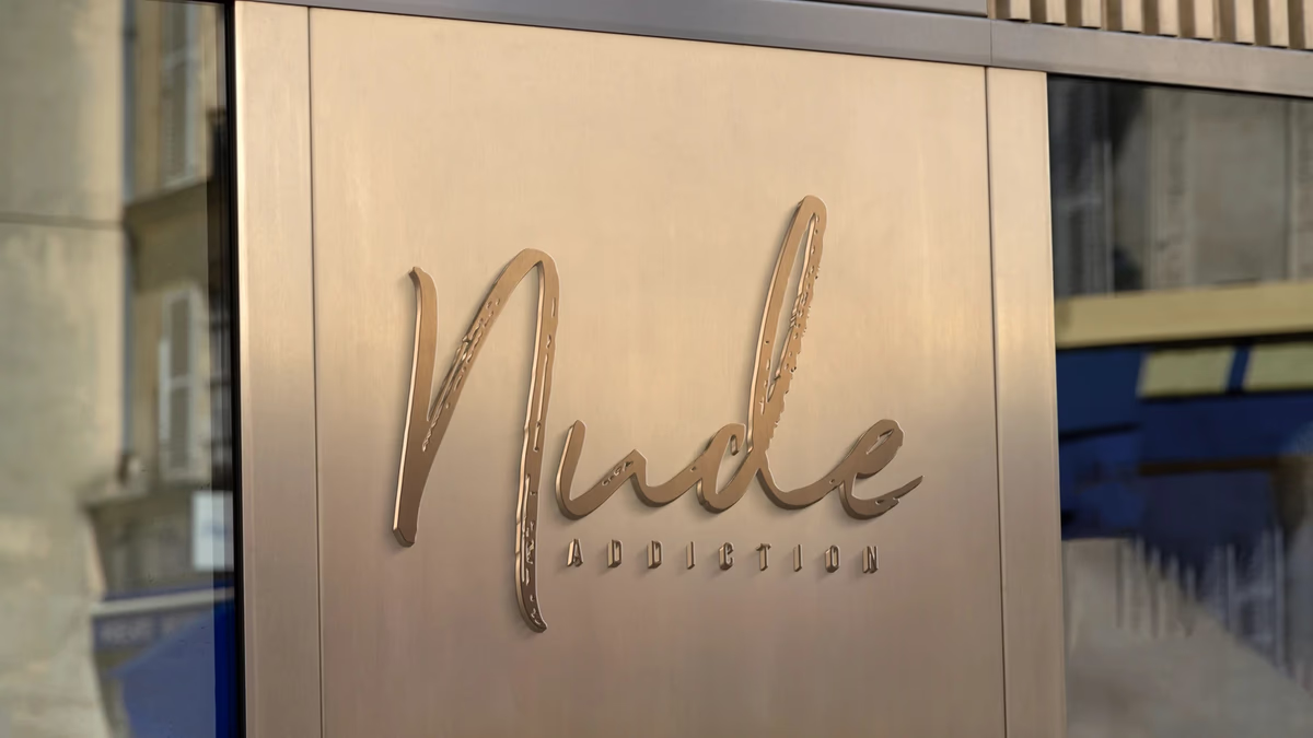
We built Nude Addiction a warm, minimalist fashion identity rooted in tonal restraint, developing a logo system and apparel application suite that positioned the boutique clothing brand around softness, femininity, and understated elegance.
Kreature Look Brand Identity
We built Kreature Look a bold, CMYK-driven brand identity that embedded the company core value proposition directly into its visual structure, separating a print-on-demand apparel startup from generic print shop aesthetics.
Bleu Vibes Brand Identity
We built Bleu Vibes a refined coastal brand identity designed to position a beachwear concept closer to lifestyle fashion than to mass-market swimwear.