Nuletica Fitness Brand Design
We built a scalable visual identity for Nuletica Fitness, a personal training and nutrition brand targeting adults entering or returning to their fitness journey.
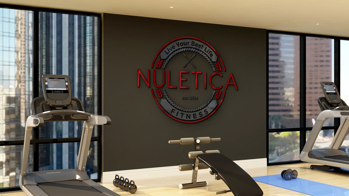
Table of Contents
Overview
Nuletica Fitness is a personal training and nutrition-focused lifestyle brand built around helping adults between the ages of 22 and 35 build sustainable fitness habits. Rather than positioning itself alongside hardcore athletic or bodybuilding brands, Nuletica wanted to bridge modern wellness culture with traditional fitness structure, offering personal training, nutritional support, and long-term lifestyle development.
From the start, the brand was designed with future scale in mind. The identity needed to work across supplements, apparel, a mobile application, and digital coaching platforms, requiring a visual system cohesive enough to carry the brand through multiple product verticals.
Challenges
The fitness industry is saturated with aggressive, formulaic branding built around extremes. For a brand aimed at approachable, sustainable fitness, that visual language would have been a mismatch. Nuletica needed an identity that felt credible and structured without alienating newer fitness audiences who are not yet drawn to hardcore gym aesthetics.
The secondary challenge was future-proofing. A logo system that reads well on a gym wall had to scale down to a mobile app icon, print cleanly on a supplement label, and reproduce on apparel, all without losing its meaning or coherence.
Objectives
The goal was to develop a complete visual identity system that positioned Nuletica as a modern fitness and lifestyle brand, distinct from traditional commercial gym branding. The identity had to carry authority and discipline while staying approachable, and it needed to function across physical and digital touchpoints from day one.
Equally important was establishing a typography system that elevated the brand beyond the condensed athletic lettering common in the category, giving Nuletica a more premium, contemporary feel.
Solutions
We developed a circular badge logo combining rope detailing, wheat and laurel elements, crossed fitness bars, and minimal geometric typography. The circular framing provided structure and consistency across formats. The fitness-inspired iconography reinforced the core brand values of strength, endurance, and discipline, while the tagline “Live Your Best Life” anchored the approachable positioning.
To prevent the identity from reading as dated or overly aggressive, the wordmark used thin, contemporary letterforms in deliberate contrast to the more traditional emblem structure. This tension between classic badge construction and modern type created a balance between traditional fitness symbolism and lifestyle brand appeal.
A structured brand design system was built around three colors, a deep red (#910000), a dark charcoal (#454545), and white, with a three-font typography hierarchy using Ratio Modern, Montserrat, and Proxima Nova. This combination gave the brand both warmth and restraint.
Deliverables
- Full logo system with primary, alternate, and reversed color treatments
- Brand color palette (primary red, charcoal, white)
- Typography hierarchy (Ratio Modern, Montserrat, Proxima Nova)
- Logo presentation across gym signage, apparel, supplement packaging, and mobile app
- Brand guidelines document
Results
The identity established a cohesive, recognizable visual system that extended cleanly across every planned touchpoint. Shown across a gym environment mockup, apparel, supplement packaging, and a digital fitness app, the badge held its integrity at every scale.
The brand’s positioning shifted Nuletica away from traditional commercial gym aesthetics and toward a modern lifestyle fitness category, broadening appeal among adults who want structure without intimidation.
Assessment
This project is a strong example of how brand scalability has to be designed in from the start, not retrofitted. Nuletica’s brief explicitly called for a system that would grow across supplements, apparel, digital platforms, and physical spaces, and that requirement shaped every decision we made around construction, contrast, and type. The circular badge format gave the system the structural repeatability it needed, while the deliberate contrast between traditional iconography and thin contemporary typography kept it from reading as generic gym branding.
To explore the thinking behind this kind of brand design work, see our posts on defining your brand identity and visual brand language. For other fitness and sports identity projects, see our work for Instinct Athletics and Accubod.
Related Projects
Sweat Social Brand Design
We built the complete brand identity for Sweat Social from the ground up: naming strategy, logo system, color palette, merchandise, and event marketing, positioning a Houston Pilates pop-up as a lifestyle-first wellness community.
AMH Training Brand Identity Design
We built AMH Training a complete brand identity system rooted in transformation and athletic discipline, anchored by a geometric phoenix mark that speaks to the brand before a word is read.
Accubod Brand Identity Design
We built Accubod a brand identity that sits between aggressive fitness aesthetics and clinical rehabilitation, credible, athletic, and precise without defaulting to either extreme.