Instinct Athletics Brand Identity Design
We built Instinct Athletics a modern brand identity system grounded in geometric symbolism, athletic discipline, and long-term scalability across apparel, signage, and print.
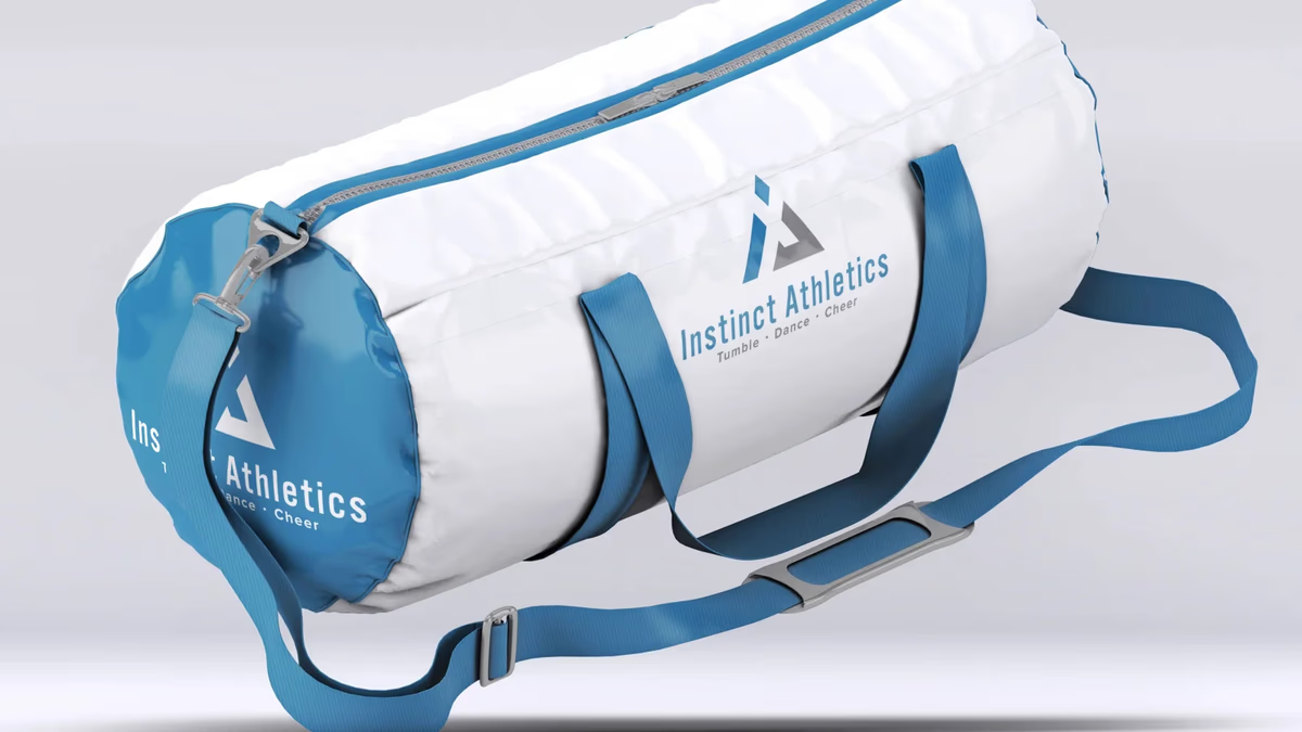
Table of Contents
Overview
Instinct Athletics is a youth athletic training facility specializing in tumbling, dance, cheer, and developmental athletic instruction. The company positioned itself as a structured training environment focused not only on athletic performance, but also on confidence building, progression, and individual growth.
Operating within a highly competitive youth athletics industry, the business needed a visual identity capable of balancing professionalism with accessibility. The brand had to resonate with younger athletes while simultaneously building trust with parents evaluating training facilities for long-term development.
Unlike many competitors that relied heavily on overly aggressive sports branding or highly decorative cheer aesthetics, Instinct Athletics aimed to establish a cleaner and more modern identity system, one that reflected structure, discipline, movement, and progression.
Challenges
The youth athletics and cheer industry is saturated with branding that often lacks consistency, scalability, or long-term positioning. Many competing facilities leaned on mascot-driven identities, overly decorative typography, generic sports iconography, and trend-based aesthetics. This created an environment where brands visually blended together and struggled to establish a more professional or trustworthy presence.
Instinct Athletics needed a cohesive identity system that could feel athletic without becoming overly aggressive, appeal to both younger athletes and parents, support multiple athletic disciplines, and scale across signage, apparel, and merchandise. The brand also needed to avoid visually boxing itself into a single category such as cheerleading alone, since the business offered broader developmental athletic services.
Objectives
- Create a modern and scalable athletic identity system
- Establish a stronger sense of professionalism and structure
- Differentiate the brand from common industry aesthetics
- Develop a versatile logo capable of supporting future growth
- Create a recognizable identity across apparel and environmental applications
- Build a visual system that balanced athletic energy with approachability
- Improve long-term brand consistency across all touchpoints
Solutions
We developed a complete identity system built around an abstract geometric monogram combining the initials “I” and “A” into a unified athletic symbol. The logo was intentionally designed with layered meaning: at first glance, the icon reads as a strong triangular geometric structure; on closer inspection, the negative space reveals an abstract athlete figure with raised arms and an asymmetrical stance, representing movement, athleticism, achievement, and progression.
The triangular construction was highly intentional. The triangle communicates strength, stability, foundation, and directional progression, all qualities central to athletic development. The separated upper diamond element functions simultaneously as the apex of the triangular form, the implied head of the athlete figure, and a symbolic representation of elevation and achievement.
For typography, a condensed sans-serif system was selected to support readability from distance, apparel applications, and environmental signage, while remaining restrained enough to let the iconography stay the focal point. The color palette centered around cool athletic blues paired with neutral gray tones, introducing energy and confidence while maintaining the professionalism the facility needed.
Logo exploration
Before finalizing the system, we developed and evaluated multiple directions, testing different balances of geometric form, abstract symbolism, and overall athletic presence.
The brand identity
The final system delivers a geometric “IA” monogram that functions simultaneously as a structural mark and an abstract athlete in motion. Three colorways ensure the identity performs across every surface.
Primary full lockup, blue and gray on light ground.
Brand applications
We extended the identity across the physical and environmental touchpoints the facility uses every day, from business stationery to signage and facility graphics. Particular attention was placed on ensuring the icon remained highly functional across embroidery, vinyl production, screen printing, and large-format signage.
Deliverables
- Logo design
- Brand identity system
- Brand guidelines
- Primary logo variations
- Iconic logo variations
- Typography system
- Color system
- Merchandise mockups
- Environmental signage mockups
- Window graphic mockups
- Business stationery
Results
Instinct Athletics gained a significantly more cohesive and professional visual identity that differentiated the company from many competitors within the youth athletics industry. The final branding balanced athletic energy with professionalism, helping the business appeal to both athletes and parents without relying on exaggerated sports aesthetics.
The geometric simplicity and structural consistency of the logo system allowed the identity to scale effectively across apparel, merchandise, facility signage, print applications, and digital media. The brand system remained flexible enough to support future business growth and expanded athletic offerings without requiring a visual overhaul.
One of the strongest indicators of success was the longevity of the identity itself. The visual system avoided trend-heavy design decisions, allowing the branding to remain relevant and believable years after implementation. The abstract nature of the identity also prevented the company from being visually restricted to a single athletic category, supporting broader service expansion over time.
Assessment
This project succeeded because of restraint. Many brands within the youth athletics industry rely on excessive visual energy to communicate athleticism: mascots, swooshes, exaggerated motion effects. Instead of following that direction, the identity focused on geometry, symbolism, structure, and scalability. The strongest aspect is the icon itself: a mark that functions simultaneously as an “IA” monogram, a triangular structural form, and an abstract athlete figure in motion. That conceptual layering gives the brand significantly more depth than a standard geometric sports logo.
The hidden athlete silhouette was particularly important because it introduced humanity and movement into what otherwise could have become an overly rigid geometric mark. The raised-arm posture subconsciously reinforces themes of confidence, achievement, and progression, qualities that are central to the youth development environment Instinct Athletics operates in.
For work in brand design for athletic and performance-focused clients, also see Accubod and AMH Training, two fitness brand identity systems we built with similar priorities around structure, discipline, and long-term scalability. Our series on visual brand language explores the principles behind identity systems built for physical environments and multi-surface applications.
Related Projects
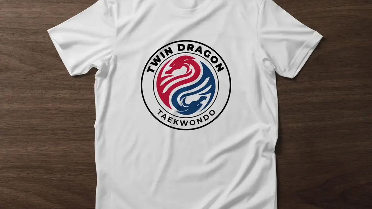
Twin Dragon Taekwondo Brand Identity Design
We built Twin Dragon Taekwondo a disciplined martial arts identity engineered for real-world production, from embroidered doboks and headgear to large-scale wall signage, anchored by a twin-dragon crest that carries authority and tradition at every scale.
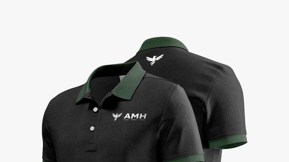
AMH Training Brand Identity Design
We built AMH Training a complete brand identity system rooted in transformation and athletic discipline, anchored by a geometric phoenix mark that speaks to the brand before a word is read.

Accubod Brand Identity Design
We built Accubod a brand identity that sits between aggressive fitness aesthetics and clinical rehabilitation, credible, athletic, and precise without defaulting to either extreme.