Twin Dragon Taekwondo Brand Identity Design
We built Twin Dragon Taekwondo a disciplined martial arts identity engineered for real-world production, from embroidered doboks and headgear to large-scale wall signage, anchored by a twin-dragon crest that carries authority and tradition at every scale.
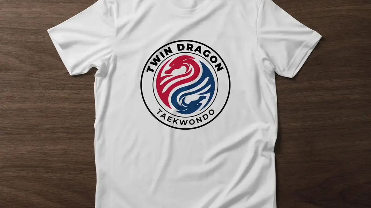
Table of Contents
Overview
Twin Dragon Taekwondo is a martial arts academy focused on traditional taekwondo training, competitive development, and the disciplined culture that comes with it. Like most martial arts schools, the business lived primarily through physical brand visibility: uniforms, training equipment, signage, merchandise, and tournament presentation rather than digital-first touchpoints.
The academy needed a recognizable identity that felt authoritative within the martial arts community and resonant with the expectations of students and parents. Visual consistency and perceived legitimacy were not secondary considerations here. For a school competing on local reputation and trust, they were the project.
Challenges
Martial arts branding occupies one of the most visually saturated niches in sports design. Schools tend to fall into two traps: overly aggressive and cluttered visuals on one end, or generic clipart-style marks that signal zero investment on the other. Neither builds the institutional credibility that parents look for when choosing where to enroll their children.
The client came to us with a clear creative direction: dragons, traditional crest structures, familiar taekwondo color language, legible academy typography. That meant the challenge was never conceptual. It was execution quality and production reliability. The identity would spend most of its life stitched into fabric, pressed onto vinyl, stamped onto protective equipment, and mounted on physical signage. Every form decision carried a production consequence, and that shaped everything.
Objectives
- Create a recognizable and disciplined martial arts identity
- Establish visual legitimacy and professionalism for the academy
- Develop a logo system optimized for embroidery and print production
- Ensure scalability across uniforms, signage, merchandise, and equipment
- Build a durable identity system for long-term operational use
Solutions
Brand identity
The final mark centers on two mirrored dragons intertwined into a circular crest system. The composition references balance and duality, discipline and harmony, motion and flow, without any of it feeling invented. Circular crest structures carry a specific authority within martial arts culture; they read as emblems, not startup logos, and that distinction matters when you are building institutional trust.
The red and blue palette draws directly from traditional Korean taekwondo color language. Beyond cultural resonance, the split palette creates immediate visual separation between the two dragon forms without introducing complexity. Typography was held intentionally legible, functional enough to survive embroidery, heat transfers, vinyl, and every other physical reproduction method the academy would encounter.
Production optimization
Because the identity would primarily exist on physical materials, production reliability became one of the most important strategic considerations. We constructed the logo using simplified forms, controlled line weights, strong silhouette recognition, and balanced negative space. That structure allowed the mark to hold readability across embroidery stitching, screen printing, vinyl applications, small-scale patches, and large environmental signage.
The system also translated cleanly into single-color applications, which matters for manufacturing flexibility and cost-controlled merchandise runs. The brief explains our full thinking around visual systems built for production durability in our visual brand language piece.
Uniform and equipment applications
Once applied to doboks, sleeve patches, gloves, wrist wraps, and headgear, the branding immediately felt established and authentic to the martial arts environment. The crest structure adapted particularly well to chest patches, circular equipment stamps, and stitched applications because the form was engineered for exactly that context from the start.
Apparel and merchandise
Academy merchandise extended the identity system to member-facing apparel. The t-shirt mockup below reflects a typical merchandise application: structured, on-brand, and straightforward to produce across different garment suppliers and print methods.
Environmental branding
Large-scale wall signage demonstrated how the identity extended beyond apparel to function as a recognizable academy centerpiece within a physical training space. Environmental branding carries particular weight for martial arts schools, where parents and students associate visual professionalism with training quality and organizational credibility.
Deliverables
- Logo Design
- Brand Identity System
- Primary Logo Variations
- Monochrome Logo Variations
- Uniform Branding Applications
- Equipment Branding Applications
- Apparel Mockups
- Environmental Signage Mockups
- Production-Ready Brand Assets
- Print-Ready Export Files
Results
Twin Dragon Taekwondo gained a cohesive and professional visual identity system that aligned closely with traditional martial arts culture while maintaining modern production reliability. The identity felt recognizable and believable within the industry immediately, reinforcing trust, discipline, and professionalism across every academy touchpoint.
The simplified dragon forms and crest structure translated successfully across embroidered uniforms, protective equipment, merchandise, staff apparel, and environmental signage. The logo held strong legibility across both full-color and single-color applications, allowing the academy to scale branding consistently across different production methods and materials.
The project established a unified visual system the academy can continue expanding into tournaments, promotional materials, interiors, and future marketing initiatives. Rather than disconnected visual assets, the school now has a durable identity foundation capable of supporting long-term operational growth.
Assessment
This project succeeded because we respected the realities of the industry rather than trying to impose creative experimentation onto it. The direction was intentionally conservative and literal, and that was the right call. Martial arts schools are not typically searching for abstract brand systems. They are looking for familiarity, authority, trust, and tradition. Execution discipline mattered far more than originality here.
The strongest aspect of this work was engineering the identity to survive real-world usage across embroidery, equipment printing, apparel production, and environmental applications without losing clarity or consistency. That production-focused thinking is the same discipline we bring to every brand design project, regardless of industry. For more on the visual fundamentals behind durable identity systems, see our piece on defining your brand identity. For another Desque brand project in the sports and fitness space, see our AMH Training and Instinct Athletics case studies.
Related Projects

Instinct Athletics Brand Identity Design
We built Instinct Athletics a modern brand identity system grounded in geometric symbolism, athletic discipline, and long-term scalability across apparel, signage, and print.
AMH Training Brand Identity Design
We built AMH Training a complete brand identity system rooted in transformation and athletic discipline, anchored by a geometric phoenix mark that speaks to the brand before a word is read.
Black Rose Solace Brand Identity
We built Black Rose Solace a complete brand identity designed to carry a Houston barbershop from storefront signage to branded merchandise with a bold, luxurious presence.