Black Rose Solace Brand Identity
We built Black Rose Solace a complete brand identity designed to carry a Houston barbershop from storefront signage to branded merchandise with a bold, luxurious presence.
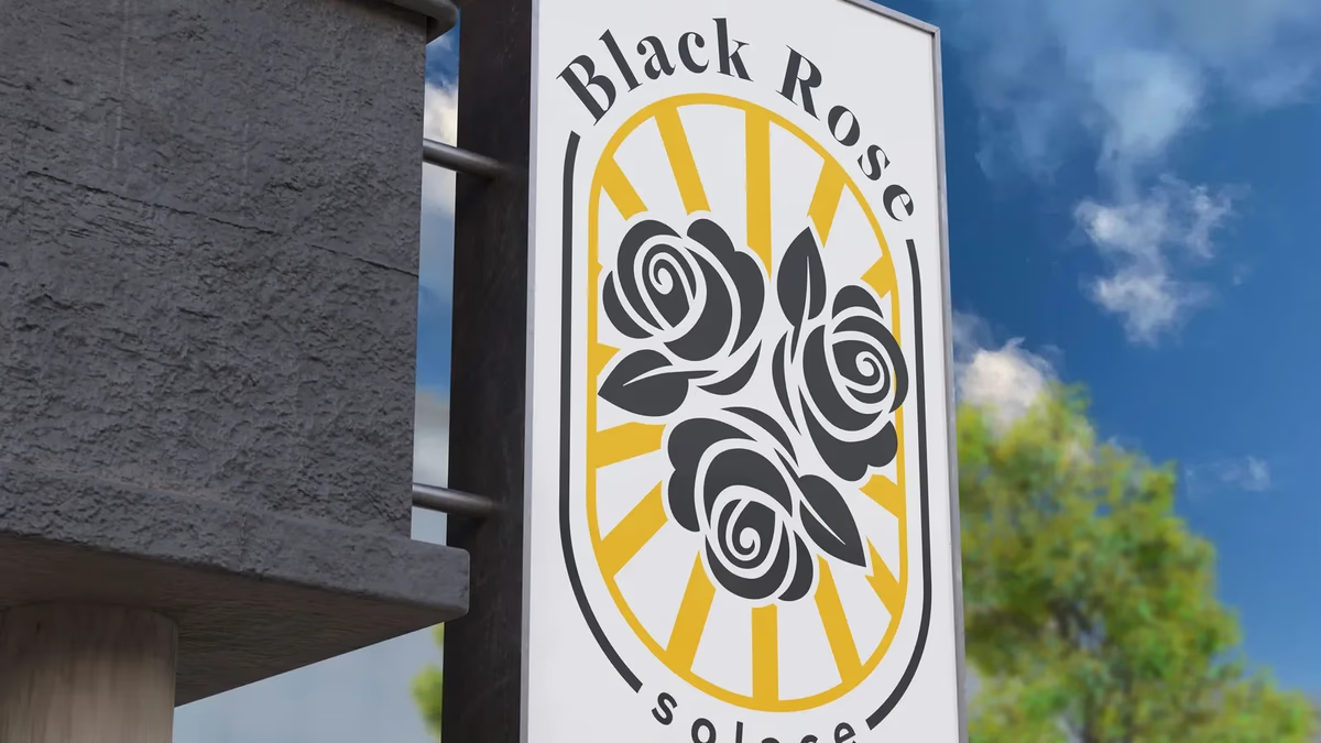
Table of Contents
Overview
Black Rose Solace is a Houston barbershop built around the idea that a haircut should feel like an occasion. The name carries a specific atmosphere: dark, refined, and intentional. The owners came to Desque with a clear sense of who their client is and what the space should feel like, but no visual language to match it. The gap between a concept this specific and a brand that could actually hold up on a storefront, a staff apron, and a product bottle was what the project needed to close.
The challenge was not building a barbershop brand. It was building one that operated at the luxury end of the grooming market without borrowing the cliches that make luxury feel generic.
Challenges
The beauty and personal care space in Houston is competitive at every price point. Black Rose Solace was positioning toward a client who expects the experience to feel curated, not just clean. Getting that right in a brand identity means avoiding the safe directions: the chrome and marble aesthetic common to high-end grooming, the vintage barber pole nostalgia that signals “craft” without saying much else, and the minimalism that reads as premium but often reads as empty.
A few specific constraints shaped the scope.
- The brand needed to work at building scale. Exterior signage is the first impression for every walk-in client, and the identity had to hold up at that size without losing detail or legibility.
- The name itself carries symbolic weight. A rose, particularly a black rose, has a specific cultural meaning in tattoo art, gothic aesthetics, and masculine refinement. The design needed to honor that without tipping into parody.
- Staff-facing applications like aprons and merchandise had to carry the identity in environments where the logo competes with physical texture and movement.
Objectives
The goal was to give Black Rose Solace an identity strong enough to signal premium positioning on sight. That meant a mark that reads at signage scale, a full logo system with the flexibility to appear across apparel, print, packaging, and environmental design, and a color and typography foundation that communicated luxury without borrowing from the categories they were deliberately not.
We also scoped a brand color and typography system so the identity could extend into any future touchpoint without requiring a designer to guess at what the brand should look like.
Solutions
At Desque we built the identity around the rose as a primary symbol, treating it as a mark rather than an illustration. The result is a contained emblem that holds authority at small sizes, stays legible at large format signage, and carries the brand’s specific tonal register without relying on literal references to barbershop heritage.
The color foundation pairs deep black with a warm gold. Both are deliberately uncommon in Houston’s grooming market, where cool grays and bright whites dominate. The combination signals premium without referencing competitors, and gives every application a material quality that reads differently in different environments.
Typography was chosen to complement the emblem rather than compete with it. The pairing creates contrast between the visual weight of the mark and the refinement of the letterforms.
Logo system
The identity delivers a complete logo system with primary, single-color, and reverse lockups, plus a gold variant and secondary mark. Each was designed to maintain brand clarity regardless of the surface it appears on.
Brand foundations
The color and typography systems give every future application a clear reference point. The palette keeps the brand visually distinct in a category that defaults toward either clinical white or aggressive black-and-red schemes.
Brand applications
The identity extends across the touchpoints that define the client experience. Apparel, lifestyle staging, business collateral, embossed materials, and product packaging each carry the mark into a different physical context.
Deliverables
- Custom logo design and complete brand identity system
- Primary, single-color, reverse, gold, and secondary logo lockups
- Brand color palette and typography system
- Logo application suite across apparel, collateral, packaging, and signage
- Environmental signage design for exterior building facade
- Style guide for consistent brand application across all touchpoints
Results
Black Rose Solace launched with a visual identity that operates with the same confidence as the shop itself. The exterior signage reads clearly at distance, the staff aprons and product bottles reinforce the premium positioning at every point of contact, and the five-variant logo system gives the brand flexibility to show up correctly on any material or surface.
The identity holds its character without requiring a designer to interpret it every time a new application comes up.
A brand built for a space this specific has to earn its authority on the first impression, before the client ever sits in the chair.
Assessment
This project is a strong example of what brand design does for a business that operates primarily in physical space. The investment in a full logo system with five variants paid returns immediately in the quality of the exterior signage, which became the shop’s most effective acquisition channel. A single-lockup identity would have forced compromises at every application. The system approach prevented that.
For the thinking behind building a brand identity with this level of specificity, our post on defining your brand identity walks through the decisions that determine whether a mark holds up at scale. Our piece on visual brand language covers how color and typography choices do the positioning work that copy alone cannot. For a project in a similar creative services context where brand identity had to carry the full weight of first impressions, see the Bleu Vibes case study.
Related Projects
Luxy Lashes Brand Design
We refined the Luxy Lashes identity from a low-quality raster file into a production-ready visual system, giving this beauty brand a scalable logo, defined color palette, and consistent typography.
AMH Training Brand Identity Design
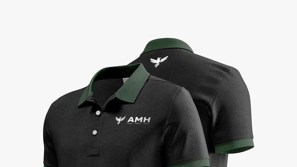
We built AMH Training a complete brand identity system rooted in transformation and athletic discipline, anchored by a geometric phoenix mark that speaks to the brand before a word is read.
Twin Dragon Taekwondo Brand Identity Design
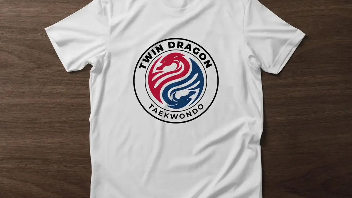
We built Twin Dragon Taekwondo a disciplined martial arts identity engineered for real-world production, from embroidered doboks and headgear to large-scale wall signage, anchored by a twin-dragon crest that carries authority and tradition at every scale.