Luxy Lashes Brand Design
We refined the Luxy Lashes identity from a low-quality raster file into a production-ready visual system, giving this beauty brand a scalable logo, defined color palette, and consistent typography.
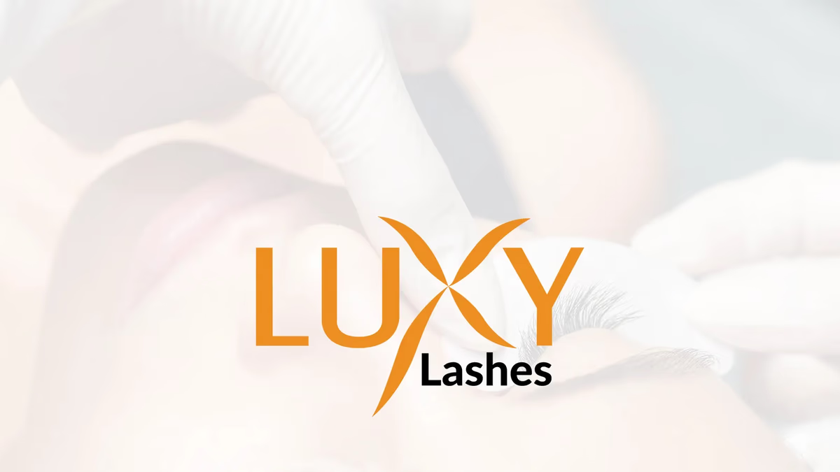
Table of Contents
Overview
Luxy Lashes is a beauty brand built around eyelash extension services and cosmetic enhancement. When the brand came to Desque, it had a clear visual direction it wanted to preserve, but the assets holding that direction together were not doing it any favors. The logo existed only as a compressed JPEG sourced from a low-cost freelance marketplace, which meant every application, from Instagram posts to printed materials, started from a broken foundation.
The goal was not to reinvent the brand but to rebuild it correctly.
Challenges
The original artwork had no viable path forward in its existing form. A compressed raster file cannot scale to signage, cannot be placed on a dark background without artifacts, and cannot be reliably reproduced across different print vendors. The identity also lacked any defined standards beyond the mark itself.
Specific gaps the project needed to close:
- No vector construction meant the logo blurred or degraded at any size beyond its original dimensions
- No defined brand colors left social media and collateral visually inconsistent
- No typography system meant every piece of marketing copy defaulted to inconsistent font choices
- The stylized “X” element at the center of the mark was the strongest visual asset but had never been properly refined
Objectives
- Reconstruct the existing logo as a clean, production-ready vector asset
- Preserve the recognizable structure and spirit of the original mark
- Establish a defined brand color palette anchored in the warm orange the business had already been using
- Build a lightweight typography system to guide future marketing materials
- Deliver logo variations suitable for both digital and print contexts
Solutions
Logo reconstruction
Rather than starting from scratch, we reconstructed the mark from the ground up using the original concept as a reference. Curves, spacing, proportions, and alignment were rebuilt with precision, producing a mark that held its integrity at any scale. The stylized “X” received particular attention, with the intersecting curves refined to feel softer and more intentional while still anchoring the overall composition.
The result was a set of production-ready vector files that could be placed on a business card, a storefront sign, or a social media profile without any loss of quality.
Color and typography
The warm orange that had already become associated with the brand was retained and formalized into a defined palette. This kept the visual familiarity the business had built with its existing audience while giving the color system real structure. The palette also created useful separation from the oversaturated black-and-pink aesthetic common throughout the beauty industry.
Typography selections balanced elegance with practicality, supporting the brand’s feminine positioning without making everyday marketing materials difficult to produce.
Deliverables
- Vector logo reconstruction (primary, reversed, and monochrome variations)
- Brand color palette with defined values
- Typography system
- Production-ready logo files for digital and print
Results
The refined identity gave Luxy Lashes a visual foundation it could actually build on. Before the project, every new marketing touchpoint required working around the limitations of a degraded source file. After, the brand had consistent, reliable assets ready for any application.
The update improved brand consistency across social media, strengthened professional presentation in client-facing materials, and made future collateral production significantly more straightforward.
Assessment
This project is a good example of a scenario where poor execution quality, rather than poor creative direction, was the core issue. The original identity had a clear concept. The stylized “X” mark was distinctive and genuinely suited to the brand. What it lacked was the production care that makes a concept durable.
Refinement, in cases like this, tends to produce better outcomes than replacement. Preserving the elements a business and its customers already recognize while improving the technical quality underneath creates a brand that feels more evolved rather than unfamiliar. That distinction matters for a service business with an existing client base.
For a smaller beauty brand, these kinds of foundational improvements often deliver gains in perceived professionalism and trust that are disproportionate to the actual scope of the work. We approach brand design for independent businesses this way, whether a project calls for a full identity from scratch or a targeted refinement of what already exists.
Considering a brand refresh or starting a new identity? Learn about our brand design services. For a deeper look at what makes an identity system work over time, see our posts on defining your brand identity and visual brand language. For more examples of our identity work, see Bronze Bar and Bleu Vibes.
Related Projects
Black Rose Solace Brand Identity
We built Black Rose Solace a complete brand identity designed to carry a Houston barbershop from storefront signage to branded merchandise with a bold, luxurious presence.
Bronze Bar Airbrush Tanning Brand Design
We rebuilt a pixelated raster logo into a scalable, production-ready vector identity system for Bronze Bar Airbrush Tanning, delivering dark, light, and print-safe variations without disrupting the brand recognition the business had already established.
Nuletica Fitness Brand Design
We built a scalable visual identity for Nuletica Fitness, a personal training and nutrition brand targeting adults entering or returning to their fitness journey.