Sweat Social Brand Design
We built the complete brand identity for Sweat Social from the ground up: naming strategy, logo system, color palette, merchandise, and event marketing, positioning a Houston Pilates pop-up as a lifestyle-first wellness community.
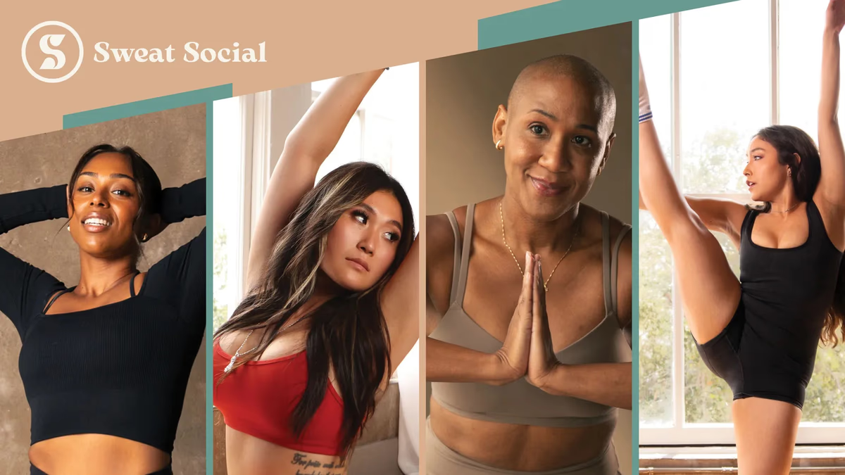
Table of Contents
Overview
Sweat Social is a Pilates and wellness social club built around movement, community, and human connection. Unlike traditional fitness studios focused solely on workouts, the company was designed as an experience-driven brand combining Pilates sessions with social gatherings and lifestyle-oriented events hosted at curated venues.
The business model centered on pop-up activations at lounges, bars, and event spaces, followed by a social hour for networking, accountability, and community engagement. That positioning created a hybrid between a boutique wellness studio, a lifestyle brand, and a social club. From day one, the brand needed to feel approachable, elevated, and modern without falling into the visual cliches commonly associated with fitness companies.
We partnered with Sweat Social during the foundational stages of the business, helping shape the visual identity, naming strategy, and key aspects of the company’s digital positioning.
Challenges
The wellness and Pilates space is saturated with brands that either lean into aggressive fitness aesthetics or overuse minimal luxury trends. Sweat Social faced a more nuanced problem: the business was not simply selling Pilates classes. It was attempting to create social accountability, recurring community engagement, and a lifestyle experience built around movement.
That required a brand identity capable of balancing multiple emotional tones at once. The brand needed to feel premium without feeling exclusive, feminine without appearing fragile, and social without appearing chaotic. Beyond the visual challenge, foundational business decisions around naming, social handle consistency, and domain strategy all needed to be resolved strategically before visual execution could begin.
Objectives
- Create a modern wellness identity centered around movement and community
- Develop a memorable, scalable brand name that avoided fitness cliches
- Build a flexible logo system that performs across social media, merchandise, signage, and apparel
- Establish cohesive marketing assets for event promotion and social engagement
- Position Sweat Social as a lifestyle-focused wellness experience rather than a traditional studio
Solutions
We started at the naming stage, working with the founders to explore business names, positioning direction, social media handle strategy, and domain considerations. The final name, Sweat Social, communicated two core concepts simultaneously: movement and physical wellness, and human interaction and community. That duality became central to everything that followed.
The identity system is built around a custom “S” icon enclosed in a circular frame. The symbol was designed with fluid curves, balanced negative space, and softened geometry that subtly references body movement, breath, and continuous flow. The circular structure reinforces inclusion and community. One of the most important decisions was avoiding literal fitness symbolism entirely: no dumbbells, no yoga poses, no heartbeat graphics. That restraint pushed the brand toward boutique wellness rather than athletic performance.
A muted, wellness-inspired palette of soft sage greens, warm sand neutrals, cream tones, and charcoal accents supports the emotional tone. The palette deliberately avoided high-energy fitness colors in favor of something calming and sophisticated. Serif typography complements the icon with softness, editorial presence, and premium perception.
The wordmark system delivers four color variants for consistent use across all brand touchpoints.
The full lockup system provides vertical and horizontal configurations in all four colorways, giving the brand flexibility across formats from social media profiles to signage.
Vertical lockup, primary colorway.
Deliverables
- Brand naming direction and social media handle strategy
- Domain naming assistance
- Logo design: custom “S” icon system in four colorways
- Full lockup system: vertical and horizontal configurations
- Typography system and color palette
- Brand identity presentation
- Motion logo reveal animation
- Social media graphics and event marketing assets
- QR code promotional materials
- Business card design
- Apparel mockups: activewear, tank tops, sweatshirts
- Water bottle and yoga mat mockups
- Environmental signage mockups
- Promotional banner and event tablecloth design
- Print design assets
Results
Sweat Social gained a cohesive wellness identity that successfully differentiated the company from traditional fitness studios and generic wellness brands. The branding established a stronger position as a lifestyle-focused wellness community rather than simply another exercise studio.
The identity system provided a strong foundation for pop-up activations, event marketing, social media promotion, and merchandise expansion. Visual consistency across digital and physical touchpoints improved the brand’s ability to build a recognizable community presence. The branding system was also designed with long-term scalability in mind, naturally supporting future expansion into apparel lines, recurring events, memberships, and branded experiences without requiring structural changes.
Brand applications
The identity was extended into the merchandise and physical touchpoints the business uses at every event. The icon’s simplicity and balance meant it integrated naturally into apparel and objects rather than overwhelming them, creating a believable lifestyle aesthetic.
Branded tank top mockup for activewear.
The print and event marketing system was designed to feel like boutique wellness campaign assets rather than traditional advertisements. The visual direction blended editorial composition, lifestyle photography, clean typography, and soft geometric framing.
Assessment
This project succeeded because the branding was built around emotional positioning rather than aesthetics alone. Many wellness brands focus entirely on visual minimalism or fitness motivation. Sweat Social instead focused on belonging, connection, movement, and community participation. That distinction gave the project significantly more depth. The cohesion between naming, emotional positioning, visual language, merchandise applications, and event branding consistently reinforced a single idea: movement creating connection.
The identity does not feel limited to a small local Pilates company. It feels capable of evolving into a broader lifestyle ecosystem supporting branded products, apparel lines, retreats, and ambassador programs. The strongest design decisions were the restrained color direction, the fluid icon geometry, and the editorial-inspired typography. The brand design work Desque does focuses on building identities that hold up across every surface the business touches, and Sweat Social is a strong example of that approach applied from the naming stage forward.
For a deeper look at how we think about building identity systems like this one, see our series on defining your brand identity and visual brand language. For related fitness brand work, see our case studies for Nuletica and Instinct Athletics.
Related Projects
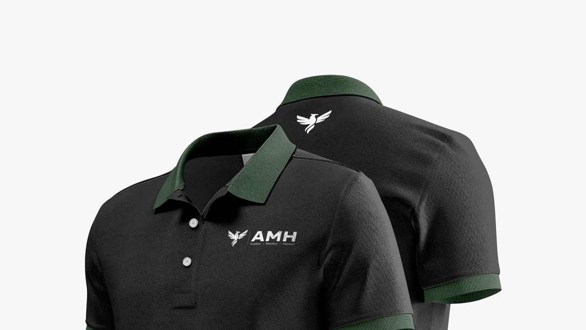
AMH Training Brand Identity Design
We built AMH Training a complete brand identity system rooted in transformation and athletic discipline, anchored by a geometric phoenix mark that speaks to the brand before a word is read.
Accubod Brand Identity Design
We built Accubod a brand identity that sits between aggressive fitness aesthetics and clinical rehabilitation, credible, athletic, and precise without defaulting to either extreme.
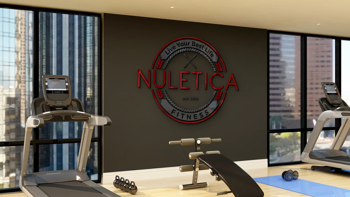
Nuletica Fitness Brand Design
We built a scalable visual identity for Nuletica Fitness, a personal training and nutrition brand targeting adults entering or returning to their fitness journey.