Ready Clips Brand Design
We built Ready Clips a complete commercial identity system designed for field visibility, fleet branding, and trust-building in the Houston automotive supply market.
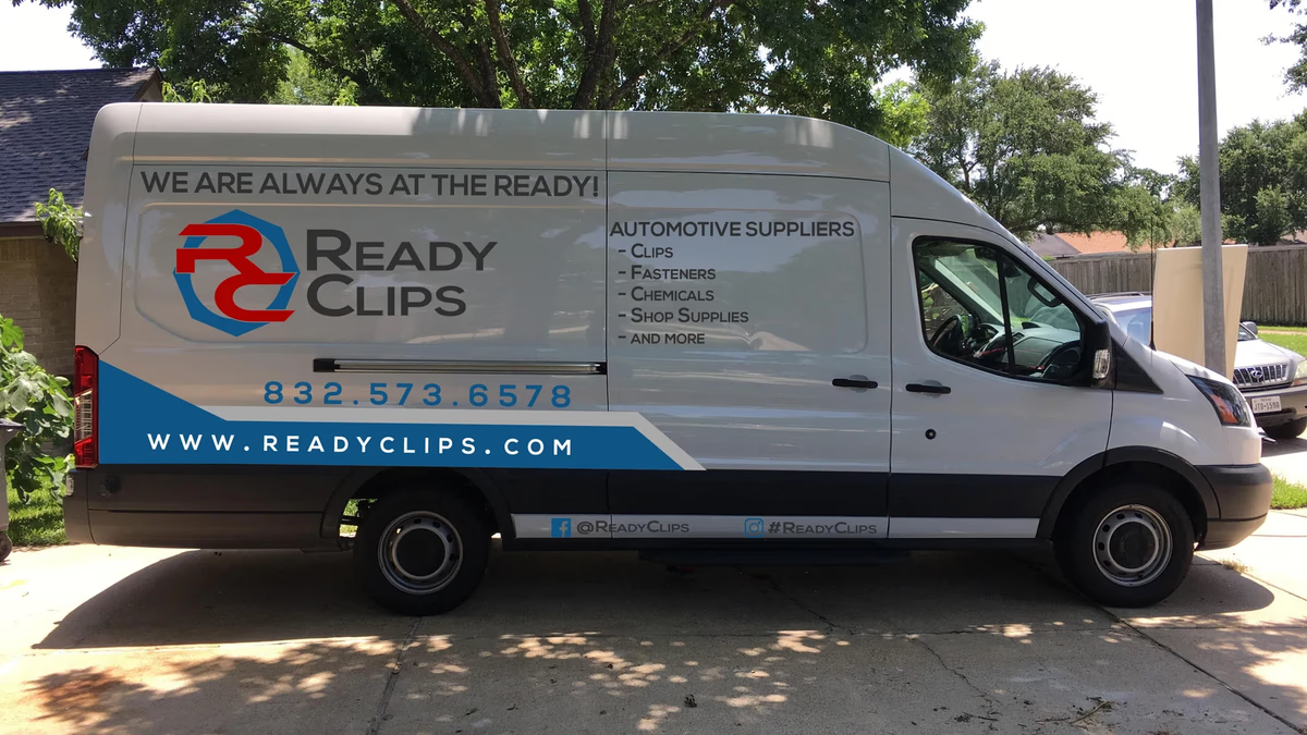
Table of Contents
Overview
Ready Clips was a Houston-based B2B automotive supply company serving body shops and collision repair facilities through a mobile delivery model. Rather than operating from a fixed storefront, the company delivered clips, fasteners, chemicals, abrasives, shop supplies, and other repair essentials directly to repair businesses, reducing procurement friction and keeping shops running without interruption.
Because the business ran entirely on field sales and direct relationships, brand visibility and operational credibility carried outsized weight. The company needed an identity that could hold its own in warehouse bays, roadside conditions, and in-person sales meetings.
Challenges
Without a physical storefront, Ready Clips had to establish credibility through every touchpoint it owned: vehicles, printed materials, apparel, and digital presence. Businesses without strong field branding risk appearing temporary or unreliable, which is a significant liability in an industry built on trust and consistency.
The identity system also needed to work at scale. Wrapping delivery vans, printing brochures, and outfitting sales staff with branded materials required a mark and color system that held up under real-world conditions: roadside visibility, large-format print, and low-resolution reproduction.
Objectives
- Establish a professional and trustworthy commercial identity
- Improve field visibility and roadside brand recognition for the company’s fleet
- Clearly communicate the mobile supply model to potential customers
- Create consistency across vehicles, print collateral, apparel, and digital platforms
- Support direct sales and relationship-driven business development in body shops and repair facilities
Solutions
Brand identity
We developed a complete visual identity system built around the company’s focus on speed, accessibility, and reliability. The final logo centered on a custom RC monogram integrated within a geometric hexagonal form, drawing from industrial hardware and automotive components. The mark used aggressive angular construction and directional shaping to convey movement and responsiveness while maintaining strong legibility.
The red and blue color palette reinforced urgency, reliability, and technical professionalism. Darker neutral tones grounded the system in an industrial commercial aesthetic appropriate for the automotive repair market.
Vehicle wrap system
The fleet vehicle system became the most visible output of the project. Company vans operated as storefronts, mobile advertisements, and trust signals simultaneously, so the wrap design had to communicate the company’s services and value proposition at highway speeds and at close range.
Messaging integrated directly into the wraps, including “We Bring The Warehouse To You,” “No More Freight, No More Wait,” and “We Are Always At The Ready,” reinforced the convenience-focused service model and addressed the operational frustrations common in collision repair workflows. Angular panel systems and directional graphics created a sense of forward movement while preserving legibility across large-format surfaces.
Print and sales collateral
A complete set of customer-facing materials supported the field sales operation. The brochure system focused on operational clarity, helping explain available product categories, supply capabilities, and delivery advantages in a format designed for in-shop conversations rather than passive marketing reads.
Deliverables
- Logo design and brand identity system
- Vehicle wrap design for fleet branding
- Business card design
- Brochure design and print collateral
- Promotional assets and embroidered apparel graphics
- Website design and product catalog design
- Marketing messaging and fleet branding system
Results
The unified identity system gave Ready Clips a significantly more professional and cohesive market presence across both physical and digital environments. The fleet branding system transformed company vehicles into highly visible mobile marketing assets capable of communicating services, positioning, and contact information in real-world operating environments.
Consistent branding across vehicles, printed collateral, apparel, brochures, and digital platforms created a stronger overall customer experience and improved presentation quality during sales interactions with body shops and repair facilities.
Assessment
Ready Clips is a strong example of practical commercial branding for a blue-collar B2B business where clarity, trust, and operational communication matter far more than trend-driven aesthetics. We approached the project with that priority in mind: every design decision prioritized readability, utility, and field performance over visual complexity. The vehicle wrap system stands out as the project’s most impactful deliverable, turning the company’s delivery fleet into functional marketing infrastructure that worked continuously across Houston’s automotive repair network.
The project also demonstrates how environmental constraints shape good brand design. Working within the demands of roadside readability, large-format print, and rapid information scanning produces tighter, more disciplined design decisions than unconstrained creative work. For more on building identity systems for field-facing businesses, see our brand design services and our series on brand voice and messaging.
For more automotive brand work, explore the Chasing Bimmer and First Class Collision Repair case studies.
Related Projects
First Class Collision Repair Brand Design
We gave First Class Collision Repair a clean, industrial identity that cut through a crowded market of generic body shop branding and positioned the business as the most credible option on the block.
Karbon Kingdom Brand Design
We built Karbon Kingdom a complete automotive brand identity, from a bold KK monogram and decal system to business cards that match the carbon fiber culture the company lives in.
Pristine Street Culture Brand Design
Desque created a bold street automotive identity for Pristine Street Culture, a car enthusiast community that needed a logo system built to live on decals, apparel, and vehicle merchandise without losing its edge at any scale.