Pristine Street Culture Brand Design
Desque created a bold street automotive identity for Pristine Street Culture, a car enthusiast community that needed a logo system built to live on decals, apparel, and vehicle merchandise without losing its edge at any scale.
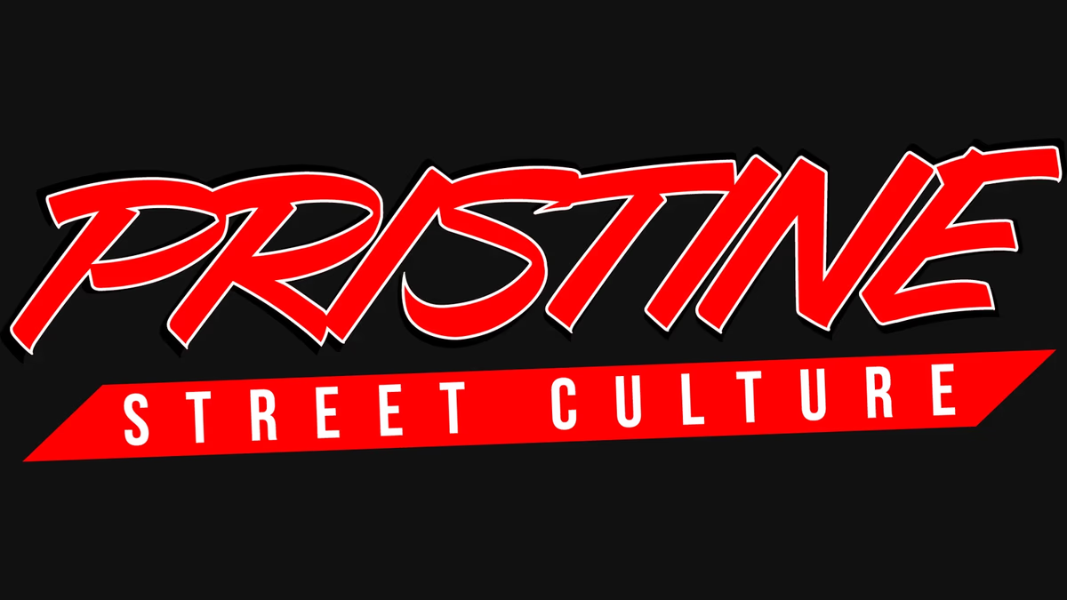
Table of Contents
Overview
Pristine Street Culture is a street car enthusiast group built around automotive culture, modified vehicles, community presence, and lifestyle branding. The group operates primarily within enthusiast spaces where visual identity plays a central role in recognition, affiliation, and credibility among peers.
Unlike a traditional business with a website at its core, Pristine Street Culture lives in physical environments: car meets, apparel, windshield banners, stickers, and social media. The brand needed to feel fully at home in those spaces, which shaped every decision Desque made from the first concept.
Challenges
Street culture branding carries a high authenticity bar. The audience is visual, experienced, and immediately recognizes when a design feels forced, overly polished, or culturally disconnected from the scene. Creating something that reads as genuine rather than corporate was the primary challenge.
The identity also had to perform across a wide range of physical production formats: stickers, windshield banners, t-shirts, hats, vinyl decals, and social graphics. Each format brings its own readability requirements, particularly around silhouette strength, contrast, and scalability. A highly detailed mark that looks great on screen often falls apart in embroidery or die-cut vinyl.
Because the brand’s primary touchpoints were merchandise and community visibility rather than a digital platform, the logo itself needed to carry the full weight of the brand presence without any supporting system to lean on.
Objectives
- Create a recognizable identity rooted in street automotive culture
- Develop a logo optimized for merchandise and decal applications
- Ensure strong readability across physical and digital formats
- Establish a visual style aligned with tuner and enthusiast aesthetics
- Build a flexible lockup system usable across apparel and promotional materials
Solutions
The visual direction leaned into classic tuner culture, motorsport typography, and aggressive street racing aesthetics. Rather than pursuing minimalism or modern corporate branding trends, the identity intentionally embraced boldness, movement, and visual aggression.
The custom wordmark uses exaggerated forward slants and sharp angular cuts to create a sense of motion and speed. Every letterform pushes forward visually, reinforcing the energetic character of automotive enthusiast culture. The typography itself became the primary brand asset, designed with enough personality and visual weight to stand alone without supporting elements.
A high-contrast red, white, and black palette was selected for maximum visibility across vinyl applications, embroidery, screen printing, and vehicle decals. A thick black outer stroke increased readability across every production format. The secondary “Street Culture” lockup grounds the identity and clarifies positioning without competing with the primary wordmark.
The simplified color structure and bold outlines allowed the branding to adapt cleanly into single-color prints, multi-color apparel, embroidered hats, die-cut stickers, and large windshield banners, maintaining visual consistency while avoiding the production limitations that often weaken highly detailed logos during manufacturing.
The brand identity
Deliverables
- Logo design
- Primary wordmark
- Secondary lockup
- Merchandise branding
- Sticker graphics
- Apparel graphics
- Brand asset exports
- Print-ready files
- Social media branding assets
Results
The identity provided Pristine Street Culture with a recognizable mark that aligned naturally with automotive enthusiast culture and community-driven branding. The bold structure and high readability maintained consistency across stickers, apparel, hats, vinyl decals, and social graphics regardless of scale or material.
The final identity felt authentic to the environment it was designed for rather than appearing overly commercial or disconnected from enthusiast culture. For a community where authenticity directly influences adoption and peer perception, that was the result that mattered.
Assessment
This project is a good example of understanding cultural context over pursuing unnecessary complexity. Street automotive culture has well-established visual language around aggression, motion, and boldness, and the correct design solution was to work within that language rather than impose unrelated trends. The identity succeeded because it respected the medium and the community it was entering.
Production practicality was just as important as visual direction. Automotive community brands live far more in physical applications than digital environments, which shifts design priorities significantly toward silhouette strength, print adaptability, and durability across merchandise formats. Our brand design process accounts for that production reality from the start, and it shows in the consistency of the final system across every format.
For more on how visual systems carry a brand across physical and digital touchpoints, see our piece on visual brand language. For other community and enthusiast brand projects, see our Chasing Bimmer and Kreature Look case studies.
Related Projects
First Class Collision Repair Brand Design
We gave First Class Collision Repair a clean, industrial identity that cut through a crowded market of generic body shop branding and positioned the business as the most credible option on the block.

Karbon Kingdom Brand Design
We built Karbon Kingdom a complete automotive brand identity, from a bold KK monogram and decal system to business cards that match the carbon fiber culture the company lives in.
Chasing Bimmer Brand Design
We built Chasing Bimmer a full enthusiast identity system, from a custom badge-style emblem and modular lockup family to motion graphics and merchandise applications, giving a BMW media brand the visual credibility to stand alongside the culture it covers.