Sapa and Co Brand and Website Design
We took Sapa and Co from a restaurant condiment to a shelf-ready culinary brand, building a full identity system, bottle label suite, and a custom interactive website that positioned the Houston-based sweet soy sauce as a modern food product.
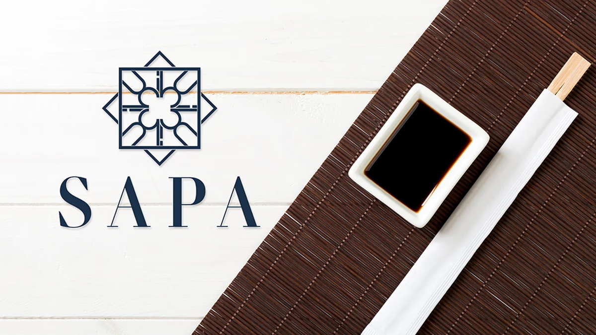
Table of Contents
Overview
Sapa and Co is a Houston-based sweet soy sauce brand that started as a house recipe served inside a restaurant. After customers began requesting bottles to take home, the company evolved into a packaged consumer product sold at food markets, Asian food festivals, anime conventions, and through direct-to-consumer channels.
The brand expanded its product line beyond the original recipe by introducing Garlic and Spicy Garlic variants, growing its presence through influencer content on TikTok, Instagram, and YouTube. As distribution widened, Sapa needed a visual identity that could carry the product into retail, events, and digital environments without blending into the soy sauce category.
Challenges
The soy sauce market is saturated with familiar visual conventions: red and black color palettes, brush script typography, traditional Asian motifs, and commodity-style packaging. Leaning into those conventions would have made Sapa invisible on a shelf.
At the same time, pushing the brand too far into luxury territory risked making it feel inaccessible or disconnected from everyday use. The brand also operated in live experiential environments including food festivals, anime conventions, and restaurant collaborations, which are visually chaotic and competitive for attention. The visual system needed to stop people in crowded spaces without relying on loud or gimmicky presentation tactics.
Operationally, the company was transitioning from restaurant usage to packaged retail and direct-to-consumer sales. The identity had to function cohesively across bottle labels, event booths, banners, bags, business cards, restaurant placements, and digital environments simultaneously.
Objectives
- Create a premium and modern culinary brand identity
- Differentiate Sapa from traditional soy sauce competitors
- Build a scalable visual system for future product expansion
- Improve event visibility and booth presentation
- Increase perceived product value across physical and digital touchpoints
- Develop packaging that felt elevated while remaining approachable
- Create a memorable website experience that reinforced the product identity
Solutions
Brand strategy
The core strategic direction centered on repositioning soy sauce from a commodity pantry product into a modern culinary experience. Rather than leaning into traditional category aesthetics, the identity was designed to feel refined, intentional, modern, hospitality-driven, and culturally aware without becoming performative.
The brand positioning centered around the phrase “Modern Flavor for the Modern Table.” This became the foundation for the visual and experiential system, framing the product in the same light as ingredients found in contemporary kitchens, high-end restaurants, and food photography.
Color palette and visual language
We built the identity around a navy and muted gold palette that intentionally avoided aggressive luxury black and gold combinations, bright commercial food colors, and the category-standard red and black palettes. Navy introduced sophistication, depth, and trust, while muted gold created warmth and premium contrast.
A repeating geometric pattern system was developed and applied across labels, business cards, booth assets, and print collateral. The pattern added texture and visual continuity while reinforcing the geometric structure established by the logo itself.
The brand identity
Primary gold lockup on navy.
Brand applications
The identity was designed to carry across print, packaging, and physical environments without losing its character. Mockups showing the brand applied to real products made the visual system tangible for restaurant partners, event organizers, and retail buyers.
Packaging design
The bottle label system covered three product variants: Original, Garlic, and Spicy Garlic. Each label maintained the navy and gold visual system while using subtle differentiation to communicate the variant clearly on shelf.
Print design
Business cards carried the navy and gold system with the geometric pattern applied as a texture on the reverse. The cards functioned as both a contact tool and a brand statement at events, restaurant meetings, and partnership conversations.
Product photography
The identity was validated in real product photography showing the bottles in lifestyle and display contexts. These images supported event presentations, influencer partnerships, and digital marketing across TikTok, Instagram, and YouTube.
Hero product shot.
Event and booth design
Because the company relied heavily on live events and public-facing activations, environmental branding became a major component of the project. We developed a cohesive event system that included booth design, tent graphics, table covers, backdrop design, and branded bags.
The goal was differentiation through restraint and elevated presentation rather than visual noise. In environments filled with bright signage, crowded vendor spaces, and aggressive marketing visuals, the Sapa brand stood apart by leaning into sophistication and contrast. According to the client, event attendees frequently stopped specifically because the branding visually stood out and felt distinct from surrounding vendors, creating natural curiosity before they even sampled the product.
The website
We designed and developed a landing page experience for Sapa that focused on first impressions, immersion, and branded storytelling. The Shopify storefront itself was handled separately; our scope covered the front-facing branded web experience.
One of the primary interactive features was a custom bottle-follow effect where the product bottle dynamically followed users throughout the browsing experience. This interaction reinforced the product visually, increased memorability, and created a more premium custom experience that differentiated the site from standard food brand templates. Rather than relying on excessive animation or trendy visual effects, the interaction remained product-centered and controlled, aligning with the broader identity system.
Deliverables
- Logo system (full lockups in gold, white, and black; horizontal wordmark; icon mark)
- Color palette and visual language guidelines
- Geometric pattern system
- Bottle label design (Original, Garlic, Spicy Garlic variants)
- Business card design (front and back)
- Event and booth design (booth, tent graphics, table covers, backdrop, branded bags)
- Brand collateral and print-ready assets
- Website landing page design and development (interactive bottle-follow experience)
- Digital brand assets for social media and influencer use
Results
The new identity system elevated the perceived value of the product and positioned Sapa beyond traditional soy sauce branding conventions. The brand gained stronger visual differentiation, improved premium positioning, stronger event presence, increased visual memorability, and cohesive multi-platform presentation.
The identity system also created enough flexibility to support future product expansion, including new flavor variants, without requiring major redesigns. At events, the brand consistently drew attention through visual restraint rather than visual noise, with attendees stopping to engage before even tasting the product.
Assessment
Sapa and Co shows what it looks like to take a product with genuine demand and give it an identity that meets the quality of what is inside the bottle. We approached this as a full commercial positioning project, not a packaging refresh. The result is a visual system that can carry the brand from farmers markets to retail shelves to restaurant menus without needing to reinvent itself at each stage.
The depth of work here, from logo system and bottle labels to event environments and a custom interactive website, reflects how we approach food and beverage clients: every touchpoint is an opportunity to either reinforce the brand promise or dilute it.
To explore what this kind of end-to-end brand thinking looks like for your business, visit our brand design services or our web design services. For more on building a visual system that travels, read Visual Brand Language. You can also see related work in food and beverage at Arena Cafe and Atlas Pub.
Related Projects
Sabor Tapatio Brand and Website Design
We built Sabor Tapatio a bold, merchandise-ready visual identity and mobile-first website for a Texas food truck specializing in traditional Jalisco-style birria tacos.
Arena Cafe Brand Design
We gave Arena Cafe a cohesive visual identity and print system that unified every customer touchpoint inside a Houston commercial office building, turning a fragmented cafeteria into a recognizable, welcoming workplace fixture.
Uptown Bakes Brand and Website Design
We transformed Uptown Bakes from an apartment-based baking operation into a polished boutique bakery brand with a deep oxblood identity, a custom Shopify storefront, and a cohesive print and packaging system built for events, catering, and everyday presence.