Atlas Pub Brand Design
We built Atlas Pub a mascot-driven brand identity that cut through Houston nightlife visual noise with a custom beer mug character, geometric linework, and a full logo system built to scale across signage, merchandise, and digital.
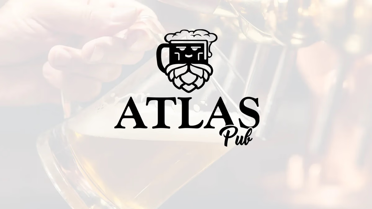
Table of Contents
Overview
Atlas Pub was a Houston-based sports pub in the Washington Avenue nightlife district, a stretch of the city known for high bar density and intense competition for repeat customers. The pub distinguished itself through a serious investment in craft beer culture: dedicated draft stations, curated selections, and operationally chilled mugs.
The business needed a visual identity that could hold its own inside a crowded nightlife corridor while communicating something genuine about the people behind it. Generic sports bar tropes — neon, bold sans-serifs, or predictable vintage beer motifs — would not create the kind of recognition that drives regulars.
Challenges
The hospitality and nightlife space is saturated with visual sameness. Sports bars tend to default to aggressive masculine aesthetics or nostalgic Americana that blur together over time.
Atlas Pub had a more layered audience to serve simultaneously: casual sports viewers, nightlife traffic, craft beer enthusiasts, and everyday dining customers. The brand had to communicate warmth and approachability without losing credibility with the more discerning craft beer crowd.
A mascot-driven direction introduced its own challenge. Mascot logos in hospitality frequently age poorly when the execution leans too far into novelty or cartoon exaggeration. The character had to feel restrained, legible, and conceptually grounded.
Objectives
- Create a memorable and approachable hospitality brand identity
- Visually reinforce the pub’s focus on craft beer culture
- Differentiate the business within Houston’s competitive nightlife market
- Develop a simplified icon system usable across signage, merchandise, and digital
- Balance playfulness with strong visual clarity and scalability
- Build emotional recognition through character-driven branding
Solutions
We built the identity around a custom illustrated mascot icon assembled from layered beer-related visual references. The primary mark combined a beer mug silhouette, overflowing foam, a stylized hop cone structure, and a subtle facial expression integrated directly into the mug form.
The lower portion of the mark used the shape language of an inverted hop cone, anchoring the logo in authentic brewery symbolism rather than generic beer imagery. The facial expression was intentionally restrained: simplified eyes and a relaxed smile gave the character personality without sliding into cartoon excess.
Line work stayed clean and geometric throughout to preserve readability at every scale. The typography system paired the structured icon with a script-based treatment for “Pub,” softening the identity and reinforcing the pub’s social atmosphere while keeping the overall system legible.
The brand identity
The final identity balanced geometric construction with character-driven memorability. We delivered a logo system with primary, single-color, and reverse lockups so the brand holds up across every application from exterior signage to coasters.
Deliverables
- Logo design with full mascot iconography system
- Primary brand identity
- Single-color and reverse lockups
- Typography selection and pairing system
- Brand asset variations
- Social media ready assets
Results
The final identity gave Atlas Pub a more memorable and personality-driven visual presence within the Washington Avenue nightlife corridor. The mascot approach created stronger visual recall than traditional sports bar branding while staying clean enough to avoid feeling gimmicky.
The simplified logo structure performed effectively across every hospitality touchpoint: digital applications, exterior signage, apparel, menus, and promotional materials. The icon’s silhouette clarity made it especially effective in low-light nightlife environments where branding competes in crowded visual fields.
The brand successfully positioned Atlas Pub as accessible to everyday pub-goers and credible to craft beer patrons simultaneously — a balance that generic sports bar aesthetics rarely achieve.
Assessment
This project was a strong example of using mascot-style branding in a restrained and strategically effective way. Mascot logos in hospitality often become visually noisy or over-reliant on novelty. This identity worked because the underlying construction stayed simple, geometric, and conceptually layered rather than illustratively heavy.
The strongest aspect of the mark was the integration of the hop cone into the lower beard-like structure of the character, creating a visual device that reads as both a face and a brew reference simultaneously. That kind of double-read is what makes a mark memorable at a glance.
If your business operates in a competitive local market where visual differentiation is the difference between a first visit and a regular, our brand design service builds identity systems that hold up under real-world conditions. For more on how we approach character-driven and hospitality branding, see Defining Your Brand Identity and Visual Brand Language. For another hospitality project in our portfolio, see Arena Cafe, and for a similarly mascot-adjacent food brand, see 2 Phat Bastard Pies.
Related Projects
Doc Holliday's Brand Design
We built a western-meets-nightlife identity for Doc Holliday's and a recurring event marketing system that kept the Rice Village venue visible across every themed night it ran.

Sweat Social Brand Design
We built the complete brand identity for Sweat Social from the ground up: naming strategy, logo system, color palette, merchandise, and event marketing, positioning a Houston Pilates pop-up as a lifestyle-first wellness community.
Karbon Kingdom Brand Design
We built Karbon Kingdom a complete automotive brand identity, from a bold KK monogram and decal system to business cards that match the carbon fiber culture the company lives in.