2 Phat Bastard Pies Brand and Website Design
We built 2 Phat Bastard Pies a bold brand identity and a Webflow website that introduced Houston to a one-of-a-kind savory pie concept rooted in Indo-African flavor.
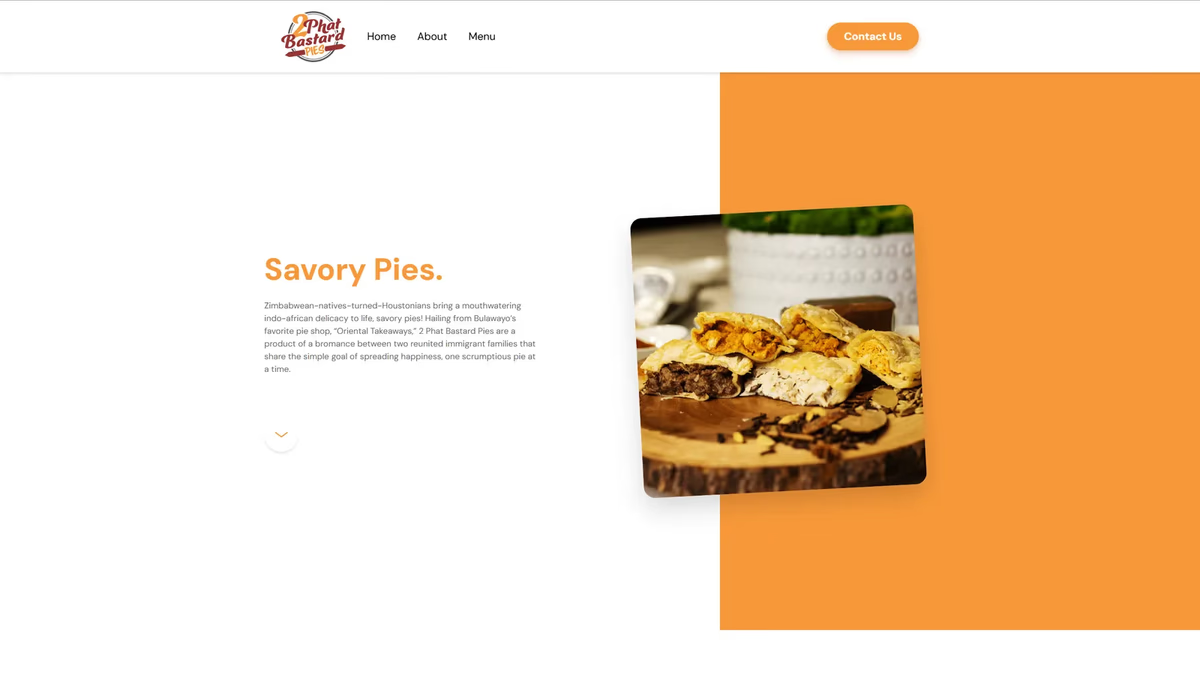
Table of Contents
Overview
2 Phat Bastard Pies is a Houston-based food concept built around savory meat pies with Indo-African flavor influences. Founded by two partners, the brand operates in a food hall environment and serves a market that had no prior reference point for what they were selling. The product is distinctive, bold, and deeply personal to the founders, which made the positioning both an opportunity and a challenge from the start.
The concept had real energy behind it. What it needed was a visual and digital presence that could translate an unfamiliar food format into something appetizing, memorable, and worth seeking out.
Challenges
When 2 Phat Bastard Pies came to us, the central problem was education. Savory meat pies with Indo-African flavor profiles are not a category most Houston diners walk in already knowing. The brand needed to do the work of introduction before it could do the work of persuasion.
A few specific obstacles defined the scope.
- The food concept was unfamiliar enough that generic or expected restaurant branding would have left it invisible. A gimmicky or novelty-driven look would have undercut the quality of the product.
- The original website had grown limited. It could not support the pathways the business needed, including catering and events, as the concept expanded.
- The visual identity needed to carry warmth and appetite appeal without leaning on cliches common to the food and beverage category.
Objectives
The goal was to give 2 Phat Bastard Pies the brand presence and digital foundation their concept deserved. That meant building something bold enough to stop a first-time visitor and clear enough to explain the product on sight.
More specifically, we set out to create a brand identity anchored in warmth and appetite-driven tones, a website that clarified the savory pie concept without overexplaining it, and a Webflow build that gave the founders direct editorial control over their content. Catering and events needed their own clear pathways. The result had to work as both a launch platform and a foundation the business could grow into.
Solutions
We started with the identity because the concept needed to speak before the website could sell. At Desque we built a brand system grounded in warm, appetite-forward tones that reflected the boldness of the product without tipping into the generic palette common to fast-casual brands. The “2” in the name became a meaningful design element, serving as a visual reference to the two founders and anchoring the brand mark with something personal and specific.
The typography and color system were designed to read confidently in a food hall environment, where the brand competes with physical signage and foot traffic as much as with digital discovery.
Logo exploration
Before landing on the final mark, we explored several directions for how the brand could look and feel, from a flame-led emblem to circular badge systems in different palettes. Each concept tested a different balance of boldness, warmth, and appetite appeal.
The brand identity
The final identity keeps the warmth of the concept while staying legible at signage scale. We delivered a full logo system with primary, single-color, and reverse lockups so the brand holds up across menus, packaging, storefront, and screen.
Brand applications
We extended the identity into the touchpoints the business uses every day, from food hall service to takeout. Each application was designed to keep the mark recognizable whether it sits on fabric, packaging, or a printed menu.
The website
For the website, we approached the build in two phases. The launch phase established the core digital presence: a Webflow site with clear product storytelling, a catering and events pathway, and a structure that let the founders update content themselves without developer dependency. The evolution phase was scoped from the start to give the site room to grow as the concept scaled. That kind of web design thinking, where the build anticipates future needs rather than just current ones, is a standard part of how we approach food and beverage clients.
Website
About
Deliverables
- Custom logo design, iconic brand mark, and full brand identity system
- Color palette and typography systems tuned for food hall and digital environments
- Logo application suite across apparel, packaging, and print
- Webflow website design and development, fully mobile responsive
- Product storytelling architecture and concept clarity framework
- Catering and events pathway design and content structure
- Client content management setup for independent editorial control
Results
2 Phat Bastard Pies launched with a brand and website that could stand alongside established Houston food concepts rather than looking like a startup finding its footing. The warm, appetite-driven identity gave the concept a distinct visual language that works across signage, digital, and social touchpoints. The Webflow build delivered the catering and events pathways the business needed, and put content control directly in the founders’ hands without ongoing developer overhead.
The two-phase website approach meant the launch was clean and purposeful rather than overbuilt, with a clear path to expand as the concept grows.
A brand that explains an unfamiliar concept while still making you hungry for it is the hardest kind to get right.
Assessment
This project is a good example of why brand and web design belong together when a concept is genuinely new to its market. The identity had to do educational work before the website could do commercial work, and both had to feel confident rather than apologetic about the product.
We cover the thinking behind that kind of brand design in more depth in our piece on defining your brand identity, and the trust signals that make a new food brand credible online in our post on building trust through web design. For other Houston food and beverage projects where brand and web came together, see our Arena Cafe and Atlas Pub case studies.
Related Projects
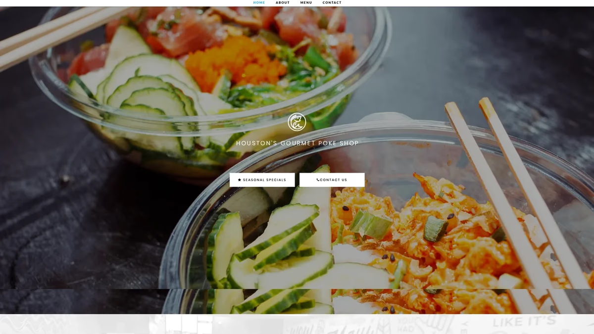
Pokeology Brand and Website Design
We built Pokeology a full brand identity, website, menu system, and marketing collateral that introduced Houston to a fresh poke concept and gave the restaurant a visual foundation strong enough to grow from a bar pop-up into a standalone dining destination.
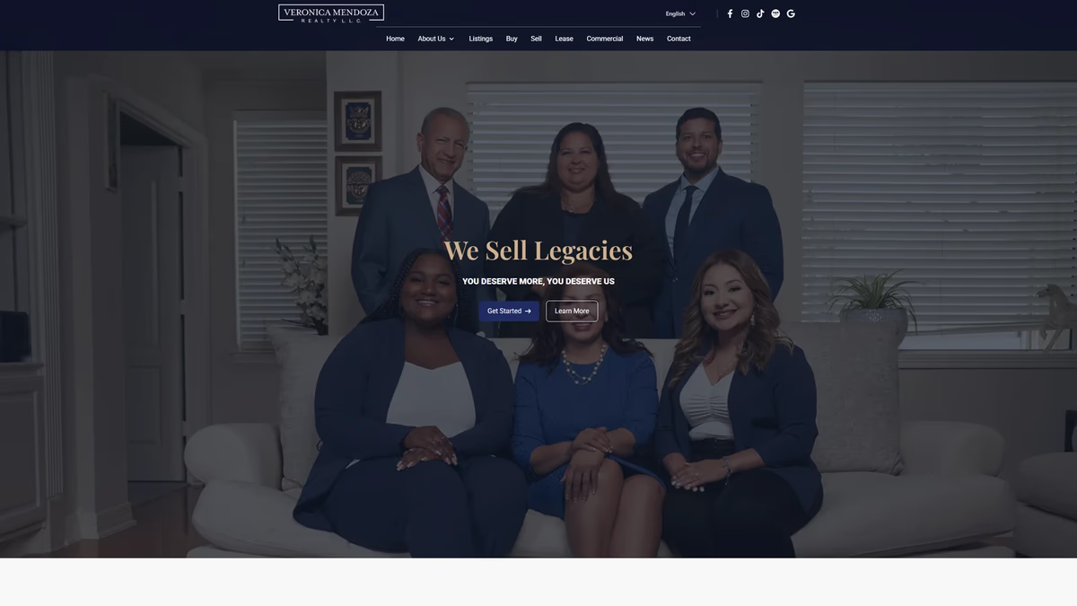
Veronica Mendoza Realty Brand and Website Design
We rebuilt Veronica Mendoza Realty from a low-resolution logo and a generic brokerage template into a custom digital platform that reflects the professionalism and community trust the business had already earned.
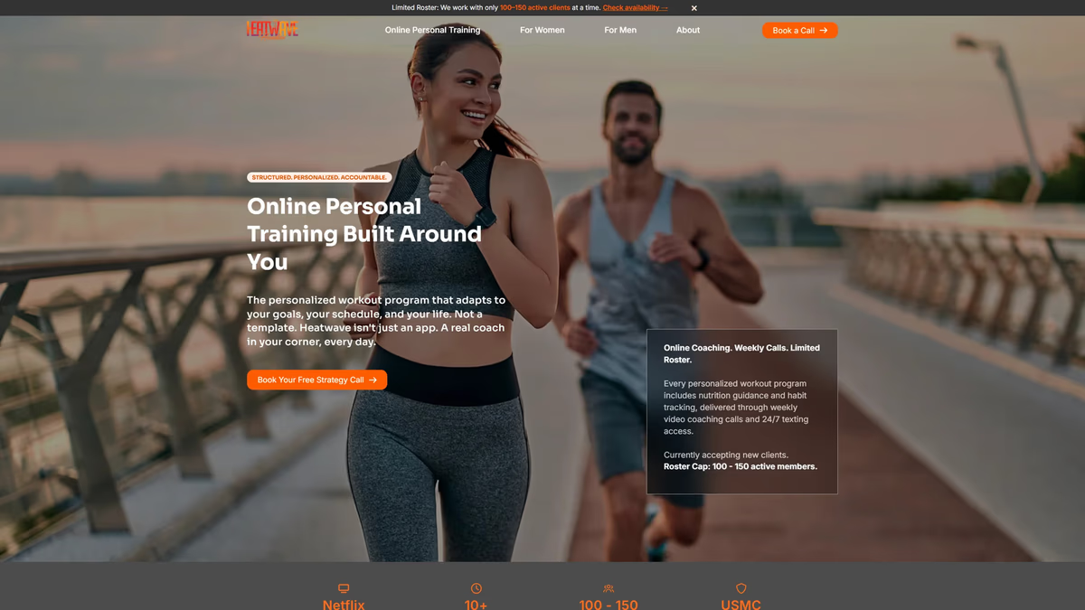
Heatwave Houston Brand and Website Design
We rebuilt Heatwave Houston from a low-resolution logo file into a production-ready brand system and a full website designed to convert Instagram traffic into real client relationships.