Arena Cafe Brand Design
We gave Arena Cafe a cohesive visual identity and print system that unified every customer touchpoint inside a Houston commercial office building, turning a fragmented cafeteria into a recognizable, welcoming workplace fixture.
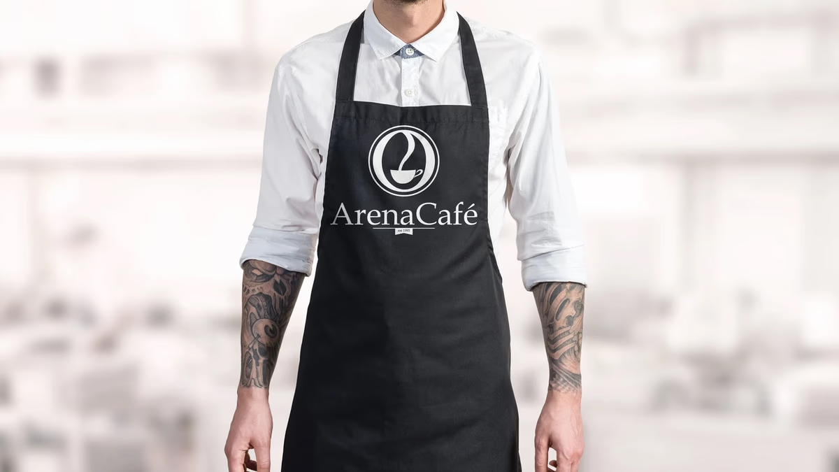
Table of Contents
Overview
Arena Cafe was a cafeteria operating inside a commercial office building in Houston, serving primarily employees who interacted with the space every day. Unlike destination cafes or street-level restaurants, the business ran on a built-in recurring audience with easy access to nearby alternatives.
That dynamic made brand recognition especially important. Employees encountered the cafe repeatedly throughout each workweek, which meant every inconsistent flyer or mismatched sign compounded over time. The opportunity was not reinvention but refinement: give the space a coherent visual identity that felt established, warm, and worth returning to.
Challenges
Arena Cafe’s materials had grown reactively over the years rather than from a deliberate system. Menus, signage, flyers, cups, and apparel all carried different visual treatments with no consistent thread between them. The result was a cafeteria that functioned well operationally but felt fragmented from a brand standpoint.
Because the audience was made up of repeat visitors rather than one-time customers, that fragmentation had an amplified effect. Every touchpoint the brand got wrong was seen again the next day, and the day after. The challenge was to bring everything into alignment without introducing unnecessary complexity or repositioning the business as something it was not.
Objectives
- Create a cohesive and recognizable cafe identity built for daily familiarity
- Unify visual language across all customer-facing touchpoints
- Develop a warmer and more welcoming atmosphere throughout the space
- Establish a print system reusable for ongoing menus and promotions
- Improve perceived professionalism without changing the business model
Solutions
We built the identity around a circular mark combining a stylized letter form with a coffee cup silhouette. The mark was designed to read clearly at a distance, scale cleanly across small print and large signage, and communicate the nature of the business immediately.
Typography leaned classic rather than corporate. Serif letterforms paired with warm neutral tones reinforced familiarity and comfort, matching how employees actually experienced the space. The inclusion of “est 1993” grounded the brand in longevity and established the cafe as a permanent part of the building rather than a vendor convenience.
The system was applied consistently across every customer-facing surface: aprons, signage, menus, flyers, cups, and business cards. Each piece was designed within the same visual rules so the entire environment read as intentional.
The brand identity
Brand applications
The identity extended into the physical environment through signage, cups, and aprons. Each application carried the same mark, the same type treatment, and the same tonal warmth. The signage mockup below shows how the weathered wood texture and circular mark read together in a cafe setting.
Print and promotional design
A large portion of the project was building a structured print system for ongoing use. Menus were redesigned with clearer hierarchy so dense information stayed readable without sacrificing the visual identity. Promotional flyers for smoothies and featured specials introduced more energetic layouts while still reading as part of the same brand family.
Business cards completed the print system, giving staff a professional touchpoint consistent with the rest of the identity.
Deliverables
- Logo design and brand identity system
- Environmental signage design
- Staff apron branding
- Coffee cup design
- Menu design
- Promotional flyer design (smoothie, featured specials)
- Business card design (front and back)
Results
Arena Cafe gained a significantly more cohesive and recognizable visual identity throughout the building environment. Instead of feeling like a collection of disconnected materials, the cafe developed a more established and professional presence.
The unified system reinforced familiarity for employees interacting with the space daily. Small environmental details, including branded cups, aprons, menus, and signage, collectively improved the perception of quality throughout the cafeteria. The reusable print structure simplified future promotional efforts, allowing the cafe to advertise specials without fragmenting the visual identity each time.
Assessment
This project worked because the solution matched the actual business reality. A more aggressive or trend-driven rebrand would have been strategically wrong. Arena Cafe was not trying to become a destination specialty coffee shop. Its success depended on becoming a dependable, welcoming part of employees’ everyday routines.
The strongest result is not any single design asset but the consistency created across the entire environment. Repeated exposure amplifies both good and bad branding decisions. By bringing menus, signage, promotional material, packaging, and apparel into one visual system, the cafe became more recognizable and more professional without changing its business model at all.
For more on the thinking behind this kind of work, our brand design page covers our approach, and our piece on visual brand language goes deeper into how a system like this holds together across varied applications. For other Houston food and beverage work where operational consistency drove the brief, see our 2 Phat Bastard Pies and Atlas Pub case studies.
Related Projects
Sapa and Co Brand and Website Design
We took Sapa and Co from a restaurant condiment to a shelf-ready culinary brand, building a full identity system, bottle label suite, and a custom interactive website that positioned the Houston-based sweet soy sauce as a modern food product.
Uptown Bakes Brand and Website Design
We transformed Uptown Bakes from an apartment-based baking operation into a polished boutique bakery brand with a deep oxblood identity, a custom Shopify storefront, and a cohesive print and packaging system built for events, catering, and everyday presence.
Renovating Resources Brand Design
We built a complete brand identity for Renovating Resources LLC, a Houston residential renovation company, giving them a cohesive visual system built for practical field use across signage, print, and digital applications.