Renovating Resources Brand Design
We built a complete brand identity for Renovating Resources LLC, a Houston residential renovation company, giving them a cohesive visual system built for practical field use across signage, print, and digital applications.
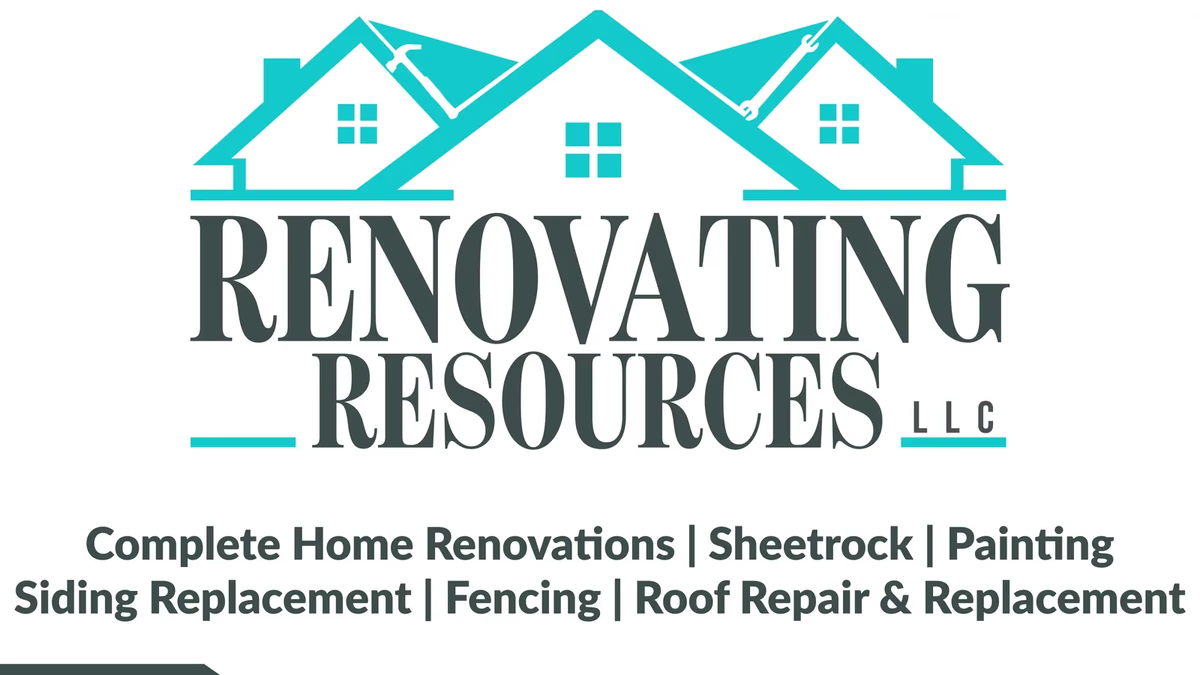
Table of Contents
Overview
Renovating Resources LLC is a Houston-based residential renovation company offering home remodeling, sheetrock, painting, fencing, siding replacement, and roofing services. The company relied heavily on local advertising, referrals, and direct customer interaction to drive new work, making brand recognition and professional presentation critical to growth.
We partnered with Renovating Resources to build a brand identity system that could support everyday field marketing while projecting the credibility homeowners expect before hiring a contractor. The goal was a cohesive visual system built for practical reproduction across signage, print, and digital applications.
Challenges
The residential renovation industry is saturated with visually generic contractor branding. Competing businesses typically relied on outdated logos, inconsistent typography, and low-quality print materials that lacked professionalism and memorability. Renovating Resources needed to stand apart while remaining immediately readable across physical advertising.
A key constraint was balancing industry familiarity with visual simplicity. Construction branding often becomes cluttered through excessive use of tools, houses, icons, and decorative elements, which reduces readability and weakens recognition. Because the company depended on yard signs and business cards as primary marketing tools, the system also had to prioritize visibility and practical reproduction at multiple print scales.
Objectives
- Create a recognizable and trustworthy construction brand identity
- Improve professional presentation across customer touchpoints
- Increase visibility within local residential markets
- Develop a cohesive print system for field marketing
- Ensure readability across signage and small-format applications
- Build a scalable visual system for future growth and advertising
Solutions
We developed a complete visual identity built around a stylized residential roofline structure integrated directly into the company name. The roofline composition immediately communicated renovation and home improvement while establishing a recognizable, clean silhouette. Construction tools were subtly embedded into the roofline to reinforce the hands-on nature of the business without overwhelming the overall mark.
Typography was selected to feel established and dependable. The serif treatment added professionalism and credibility, positioning the company as more trustworthy and experienced than many competing local contractors. The color palette centered around a bright teal accent paired with dark neutral typography, differentiating the company from the overly common reds, blacks, and dark blues dominant across the construction industry while maintaining strong contrast across light and dark applications.
The brand identity
The logo system was engineered to remain legible and scalable from a small business card to a full-size yard sign. Both a full-color version and a white knockout were produced to cover the full range of application backgrounds.
Print design
To support local marketing efforts, we developed print collateral built around the established visual identity system. Both pieces were designed to prioritize fast communication and professional presentation over decorative complexity.
Deliverables
- Logo design (full-color and white reverse)
- Brand identity system
- Typography system
- Color palette
- Business card design (front and back)
- Yard sign design
- Print design assets and marketing collateral
Results
The brand identity gave Renovating Resources a more cohesive and professional visual presence capable of supporting both local marketing efforts and day-to-day operations. The high-contrast print system improved readability and recognition across physical advertising applications, particularly yard signage and business cards where fast communication and visibility were critical.
The identity system was designed to function consistently across print and digital applications, giving the company a flexible visual foundation that could scale into vehicle graphics, uniforms, and an online presence as the business grew.
Assessment
This project succeeded because it remained grounded in practical contractor marketing realities rather than over-designing the brand system. Every piece of the identity was built with real-world usage in mind, particularly outdoor visibility, reproduction reliability, and fast communication. In residential renovation, immediate trust and recognition often matter more than conceptual complexity, and the final system delivered on both.
The teal accent played a meaningful strategic role. Contractor branding frequently defaults to aggressive palettes, making the cleaner teal direction feel more modern and approachable while still maintaining the visibility and professionalism the field demands. For a closer look at the brand strategy behind this project, visit our brand design services page or read Defining Your Brand Identity. Similar construction and home services branding work can be found in our case studies for Fast Hammers Remodeling and Monarch Patio and Outdoors.
Related Projects
Texas Hardwood Flooring Pros Brand Design
We built a practical, market-grounded brand identity for Texas Hardwood Flooring Pros, giving a local flooring contractor a recognizable visual system that communicates credibility and regional positioning across print and business applications.
Fast Hammers Remodeling Brand Design
We stabilized and professionalized the visual identity for Fast Hammers Remodeling, turning low-quality raster files into a scalable brand system built for consistent use across print and digital applications.
Global Air Service Brand and Web Design
We built Global Air Service a modern visual identity and a multi-phase website that positioned the Texas-based HVAC company as a credible, professionally managed service provider in a heavily saturated local market.