Global Air Service Brand and Web Design
We built Global Air Service a modern visual identity and a multi-phase website that positioned the Texas-based HVAC company as a credible, professionally managed service provider in a heavily saturated local market.
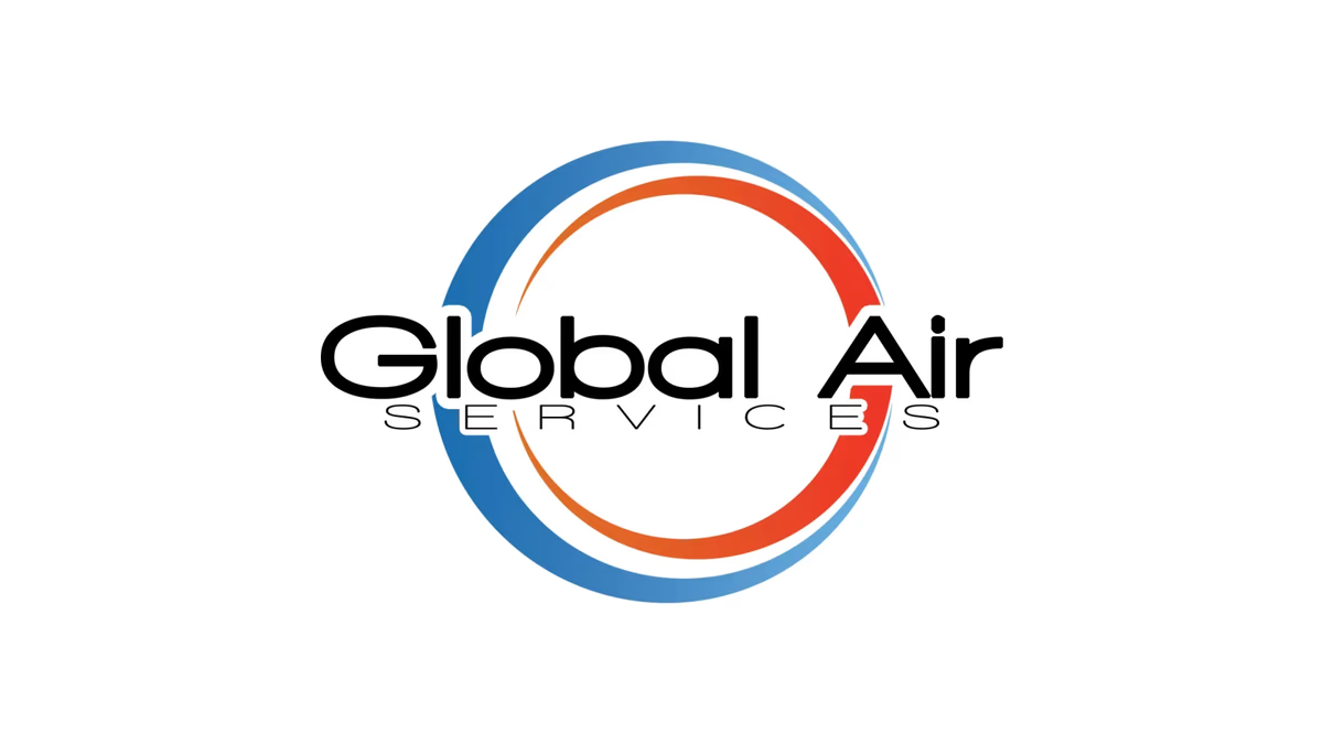
Table of Contents
Overview
Global Air Service is a Texas-based HVAC company specializing in residential and commercial heating, cooling, air quality, repair, installation, and maintenance services. The company serves homeowners and businesses that need reliable climate control systems, emergency repairs, and long-term HVAC support.
The engagement with Global Air Service evolved over multiple years and phases, beginning during early freelance operations prior to the formal launch of Desque. What started as a branding and website project gradually expanded into a long-term digital partnership covering infrastructure management, CRM implementation, hosting, email systems, DNS configuration, technical support, and ongoing digital consultation. The project ultimately became less about isolated creative deliverables and more about building a scalable and reliable digital foundation capable of supporting a growing service business.
Challenges
Prior to engagement, Global Air Service lacked a cohesive digital presence capable of positioning the company competitively within the HVAC market. The business operated in an industry where many competitors relied on outdated visual identities, inconsistent marketing, generic service messaging, and fragmented customer experiences. The original digital presence lacked the professionalism and technical structure necessary to support long-term scalability, operational consistency, and customer trust.
As the company expanded, additional friction emerged across multiple areas: fragmented marketing direction, disconnected platforms, lack of centralized oversight, weak brand governance, and limited scalability. The company also experienced increasing fragmentation across digital channels as multiple independent sales representatives created separate websites and social media accounts tied to the parent brand, weakening overall cohesion across branding, messaging, and search visibility.
Another major challenge involved operational consistency across systems and vendors. Multiple transitions between internal and external marketing personnel resulted in shifting strategies, disconnected execution, and long-term scalability concerns across the company’s digital ecosystem. Traditional promotional content and sales-driven messaging also conflicted with evolving consumer behavior patterns where trust, authenticity, and educational content increasingly influenced decision-making.
Objectives
The engagement focused on creating a stronger and more scalable digital foundation capable of supporting both immediate credibility and long-term business growth. Primary objectives included modernizing the company’s visual identity, improving professionalism and customer trust, creating a stronger online presence, and building a more cohesive customer experience.
As the relationship evolved, additional objectives expanded toward improving website performance, modernizing technical architecture, improving platform reliability, reducing infrastructure friction, consolidating systems, and improving long-term maintainability.
Solutions
A complete visual identity system was developed to position Global Air Service as a modern, trustworthy, and technically capable HVAC company while avoiding the overly aggressive or outdated aesthetics commonly seen throughout the industry. At Desque, we centered the logo system around a dual-ring circular symbol designed to represent airflow and circulation, heating and cooling balance, system continuity, movement and reliability, and operational efficiency.
The color system used cool blue tones paired with warm orange gradients to subtly communicate climate control without relying on literal industry cliches such as flames or snowflakes. Typography was selected to balance technical precision with approachability, with rounded geometric forms that softened the industrial nature of the HVAC industry while maintaining a clean and corporate appearance appropriate for both residential and commercial audiences.
For the website, two generations were delivered. The original site established the core digital presence: mobile responsiveness, service visibility, lead generation pathways, and search discoverability. The Version 2 redesign was rebuilt using a modern static architecture rather than a traditional WordPress environment, significantly improving security, performance, reliability, and long-term maintainability. The redesign also emphasized trust-driven presentation through authentic operational imagery, technician photography, and credibility-based messaging aligned with how homeowners evaluate service providers today.
CRM systems were implemented to support lead intake, customer organization, sales workflows, and operational efficiency. Infrastructure responsibilities extended to hosting management, domain ownership, DNS configuration, business email systems, platform security, and ongoing maintenance support.
The brand identity
The full logo system delivered primary, reverse, standalone icon, and wordmark lockups so the brand holds up across service vehicles, uniforms, digital advertising, and print collateral. The dual-ring symbol works equally well at favicon scale and at signage scale.
Deliverables
- Logo design, dual-ring icon mark, and full brand identity system
- Color palette and typography system tuned for residential and commercial service environments
- Primary, reverse, standalone icon, and wordmark lockup variations
- Website design and development, Version 1
- Website design and development, Version 2 on modern static architecture
- CRM setup and configuration for lead intake and customer organization
- Hosting infrastructure, DNS configuration, and domain management
- Business email setup and security management
- Technical maintenance and performance optimization
- Mobile optimization across both website versions
- Content structure and ongoing technical support
Results
Global Air Service gained a significantly more professional and modern visual identity capable of competing more effectively within a crowded HVAC market. The branding system established stronger trust signals while differentiating the company from smaller or visually outdated competitors commonly found within the industry.
The Version 2 website provided a faster, more reliable, and more scalable platform compared to the original implementation. Modern development architecture improved website performance, maintainability, reliability, security, mobile usability, and Lighthouse scores. The transition away from older CMS dependency also reduced technical overhead and improved long-term operational stability.
Assessment
This project is a strong example of how branding and infrastructure work together in service industries like HVAC, where customer confidence is built as much through operational professionalism as through visual design. The dual-ring symbol communicates the core product concept without any literal industry cliches, and the blue-and-orange color system does the same for climate control.
The deeper value of the engagement came through long-term operational integration rather than any single creative deliverable. The project reinforced the importance of treating brand design and web infrastructure as interconnected business assets rather than isolated scopes of work. For service companies where customers evaluate legitimacy before they ever make contact, that kind of cohesive foundation is often the deciding factor. Our post on defining your brand identity covers the thinking behind systems like this, and our piece on designing for small business speaks directly to the performance and simplicity tradeoffs we navigated through both website versions. For another Houston-based contractor brand where trust-first design drove the work, see our Fast Hammers Remodeling case study.
Related Projects
Renovating Resources Brand Design
We built a complete brand identity for Renovating Resources LLC, a Houston residential renovation company, giving them a cohesive visual system built for practical field use across signage, print, and digital applications.
Fast Hammers Remodeling Brand Design
We stabilized and professionalized the visual identity for Fast Hammers Remodeling, turning low-quality raster files into a scalable brand system built for consistent use across print and digital applications.
Texas Hardwood Flooring Pros Brand Design
We built a practical, market-grounded brand identity for Texas Hardwood Flooring Pros, giving a local flooring contractor a recognizable visual system that communicates credibility and regional positioning across print and business applications.