Deadlocked On Esports Media Brand Identity
We built Deadlocked On a faction-inspired brand identity designed to feel native to the Deadlock game universe, scaling from streaming overlays and social platforms to apparel and environmental installations.
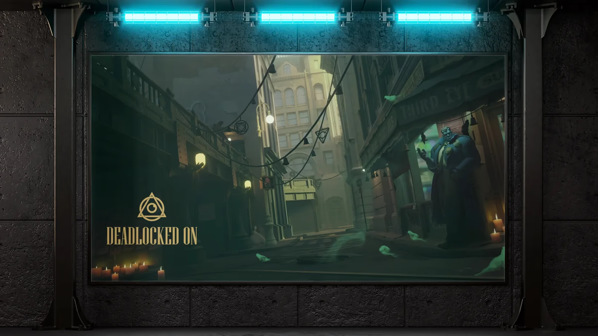
Table of Contents
Overview
Deadlocked On is a dedicated esports and gaming media platform built around Valve’s title Deadlock. The brand serves as a centralized source for competitive coverage, patch note analysis, gameplay breakdowns, tournament reporting, and long-form video content centered on the evolving Deadlock ecosystem. The project was positioned to capture early market share within the game’s competitive scene by establishing a recognizable media identity before the ecosystem matured.
What separated this brief from standard esports work was the positioning intent. Deadlocked On wanted to feel embedded within the Deadlock universe, not layered on top of it. That required a visual language capable of carrying atmosphere and symbolism, while remaining functional across streaming platforms, social media, apparel, tournament graphics, and environmental marketing.
Challenges
Most esports branding follows predictable patterns: aggressive mascots, neon palettes, generic cyberpunk systems, or trend-driven typography that reads instantly outdated. That approach would have weakened the brand’s authenticity and reduced its long-term recognizability.
The identity also needed to function across a wide range of surfaces at the same time. YouTube thumbnails, tournament graphics, streaming overlays, gaming setup integrations, apparel, and environmental installations each carry different size, contrast, and legibility requirements. Designing a mark that held up across all of them without becoming generic was the core design problem.
And because the platform’s credibility depended on feeling lore-adjacent rather than externally branded, any visual decision that felt disconnected from the game’s atmosphere would undercut the whole positioning.
Objectives
The brief asked for a recognizable gaming media identity aligned with the atmosphere of Deadlock, built on symbolic geometry rather than literal illustration. The visual system needed to scale across esports and media applications, differentiate the brand from conventional gaming aesthetics, and support future merchandise and tournament branding. The goal was an identity that could grow with the community rather than one that expired with a visual trend.
Solutions
At Desque, we built the identity around symbolic geometry and faction-inspired iconography. The logo combines three primary elements: a triangular structure, a circular enclosure, and a central spiral core. Each contributes to the emotional register of the brand.
The triangle introduces structure, hierarchy, and tension. The circular form reinforces continuity and movement. The spiral became the emotional center of the mark, introducing obsession, mystery, focus, and psychological tension.
Rather than resolving the composition into clean symmetry, we preserved intentional overlaps and interruptions throughout to maintain visual energy. The result is a mark readable as an eye, a portal, a seal, a lock, a vortex, or a faction emblem. That interpretive range became one of the strongest aspects of the identity, because it encourages audience engagement without requiring a literal explanation.
The brand design process also addressed the typography system. Niagara Regular was selected as the primary display typeface for the wordmark due to its condensed proportions and ceremonial presence. Franklin Gothic Book was selected as the supporting typeface to provide editorial structure and readability for long-form media use.
The palette was kept intentionally restrained: muted gold for prestige and hierarchy, deep green as the emotional anchor reinforcing mystery and sci-fi atmosphere, and soft charcoal and off-white support tones to preserve depth across both dark and light applications.
Building a visual system with this kind of symbolic range is a core part of how we approach defining your brand identity. The thinking behind using symbolic mark-making to create recognition without literal explanation is something we also cover in depth in visual brand language.
Logo exploration
Before landing on the final mark, we explored several directions for the symbol system, each testing a different balance of geometry, atmosphere, and faction energy. The exploration phase was used to pressure-test the core iconographic concept across multiple compositions before committing to the final mark structure.
Concept 1: initial symbolic geometry exploration.
The brand identity
The final identity system includes the primary iconic mark, a secondary mark variant, and a full set of wordmark and lockup combinations across light, dark, and primary colorways. Every element was built to hold up whether the brand appears at thumbnail scale in a YouTube feed or at full scale on an environmental installation.
Primary iconic mark: triangle, circle, and spiral core in the gold palette.
Brand applications
We tested the identity across the full range of surfaces the platform was designed to inhabit. The mockup set covers environmental installations, gaming hardware integrations, digital interfaces, and apparel, each demonstrating how the mark transitions from flat logo use into an immersive, world-adjacent presence.
Deliverables
- Logo design, iconic mark, and full lockup system across four colorways
- Wordmark system in primary, secondary, light, and dark variants
- Brand color palette: muted gold, deep green, soft charcoal, and off-white support tones
- Typography system pairing Niagara Regular with Franklin Gothic Book
- Environmental mockups including billboard and holographic projection concepts
- Gaming environment and streaming setup integration applications
- Esports jersey and branded merchandise concepts
Results
Deadlocked On launched with a visual identity that separated it clearly from conventional esports branding. The symbolic mark system gave the platform recognizable iconography that did not depend on a mascot or literal game reference, positioning it as a credible media entity within the Deadlock ecosystem. The identity scaled without degradation from thumbnail to billboard, and the holographic and environmental mockups demonstrated that the mark could read as a native extension of the game’s visual world rather than an external brand overlay.
The restrained palette and ceremonial typography reinforced the platform’s editorial positioning, giving Deadlocked On a presence closer to a faction insignia than a gaming channel logo.
Assessment
This project succeeded because the identity prioritized atmosphere and symbolic storytelling over trend-based esports aesthetics. Most gaming brands optimize for aggression, noise, and immediate visual impact. Deadlocked On instead focused on immersion, mystery, faction-based symbolism, and emotional tension. That decision increased the uniqueness and longevity of the system.
The strongest aspect of the work is the symbolic flexibility of the mark itself. The emblem does not lock into one literal meaning, allowing it to function as a faction emblem, a media insignia, a competitive symbol, or an in-universe organizational mark depending on the surface. The environmental applications validated that range: once integrated into gaming and holographic contexts, the brand began to feel less like a logo and more like part of a believable fictional world. That distinction is what elevated the project beyond standard gaming branding.
For other Desque projects built around strong symbolic identity systems, see our Aros Gaming and Epic Modeling Agency case studies.
Related Projects
Aros Gaming Brand Identity and Sponsorship System
We built Aros Gaming a scalable esports identity that grew from a single DOTA 2 pubstomp operation into a multi-city, multi-game community network with the visual credibility to attract real sponsors.
Anthony Mata Brand Design
We built a minimal, monogram-based brand identity for Houston music producer Anthony Mata, creating a flexible personal mark with a hidden narrative that travels from social profile to live event.
JR Investments Brand Design
We designed a complete brand identity system for JR Investments, an urban real estate investment firm specializing in residential redevelopment, balancing residential warmth with investment-grade credibility.