Pokeology Brand and Website Design
We built Pokeology a full brand identity, website, menu system, and marketing collateral that introduced Houston to a fresh poke concept and gave the restaurant a visual foundation strong enough to grow from a bar pop-up into a standalone dining destination.
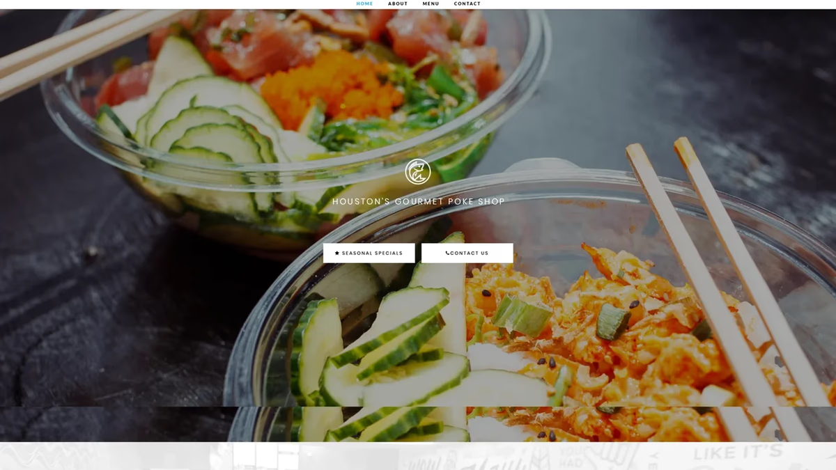
Table of Contents
Overview
Pokeology was a Houston-based poke restaurant concept created to bring fresh, customizable poke bowls to a market where the category was still largely unfamiliar. The business launched inside a bar in Rice Village, placing the brand in front of nightlife and casual dining audiences who were not necessarily searching for poke.
That environment created an interesting design problem. Pokeology needed to educate customers quickly, feel approachable enough to attract first-timers, and build enough recognition to compete for repeat visits. As the concept grew beyond its launch location into a standalone restaurant presence, the brand, website, menus, and marketing collateral all had to mature with it.
Challenges
When Pokeology launched in July 2016, poke had been gaining momentum on the coasts but had not yet become a familiar food option in Houston. Many potential customers did not know what a poke bowl was, how it was ordered, or why it was different from other casual dining options.
The launch setting added a layer of complexity. Operating inside a bar meant Pokeology shared space with an environment not built around the restaurant concept, making it harder to establish a distinct, ownable identity from day one. The brand needed to stand out on its own, even without the benefit of a dedicated street-level location.
Several brand problems needed to be solved at once: communicate a new food category clearly, create a name and visual system that felt modern and scalable, support both casual discovery and intentional search behavior, and build consistent recognition across signage, menus, social channels, and digital touchpoints. The project was not simply about making a restaurant look polished. It required a full customer-facing ecosystem that could educate, attract, and retain customers while the business itself was still evolving.
Objectives
The engagement focused on building a brand and digital foundation strong enough to support launch, early growth, and eventual expansion.
Primary objectives included creating a distinctive and memorable restaurant brand, establishing a name and visual identity that could scale across locations, making poke feel accessible to customers unfamiliar with the category, and building a digital presence that supported pre-launch awareness and customer education. We also needed to create marketing collateral for in-person discovery and repeat visits, support social media and content needs as the brand grew, and improve search visibility as the Houston market caught up with the trend.
Solutions
Naming and brand foundation. The name Pokeology gave the restaurant a memorable and ownable identity. It connected directly to the food category while giving the brand a slightly more conceptual feel than a purely descriptive restaurant name. Because the exact social handles were not available, the handle EatPokeology was used across platforms, keeping the name intact while making the call to action natural for food and social discovery.
Identity system. The visual identity was built to feel fresh and modern without relying on generic food-service tropes. The logo, color palette, and typography were designed to work across every touchpoint: signage, menus, social posts, and digital. The tuna icon became a versatile brand asset that could appear as a standalone graphic in tight spaces.
Website. The website introduced the concept, displayed the menu, and supported pre-launch and ongoing customer education. It was maintained and expanded over time to better support search discovery, menu updates, media coverage, and restaurant information as the business grew.
Menus. Two distinct menu generations were designed as the concept evolved. The first menu introduced the signature bowls with individual bowl cards for each item. The second menu system matured the visual language into a more polished restaurant-quality format.
Print and marketing collateral. A broad range of print materials was produced to support in-person discovery and community awareness: standing signs, business cards, EDDM direct mail pieces, a grand-opening banner, and promotional inserts.
Social media and press support. Pokeology attracted attention from local food media and content creators during its growth period. We helped support the brand’s visual readiness for press, media coverage, and photography-driven promotion on social channels.
Investor deck. A visual pitch deck was produced to support business development and investor conversations as Pokeology explored growth beyond its first location.
Logo exploration
Concept direction 1.
The brand identity
Menus
Menu v1: signature bowls overview.
Print work
Table standing sign insert, front.
Investor campaign
Social media
Grand opening post.
The website
Website
Home
Investor deck
Deliverables
- Naming support
- Logo design
- Brand identity system
- Brand guidelines
- Website design
- Custom website development
- Landing page design
- Menu design (v1 and v2)
- Print collateral (signage, business cards, EDDM mailer, banner, door hangers)
- Social media content and templates
- Investor deck design
- SEO/GEO foundations and ongoing maintenance
Results
Pokeology launched during a period when poke was still new to Houston and grew into one of the more recognizable poke concepts in the city during its run. The brand attracted coverage from local food media and content creators, and the visual system held together across every channel from in-restaurant signage to press coverage and social feeds.
The website and SEO work supported ongoing customer education as the Houston poke market matured, helping Pokeology remain discoverable as direct competition increased. The investor deck supported business development conversations as the team explored future growth.
Assessment
Pokeology is one of the most complete engagements in our portfolio. It started as a brand problem in an unconventional setting and grew into a full ecosystem covering identity, web, print, menus, social media, and investor materials. The challenge of introducing a new food category to a market that did not yet know it needed poke required both clarity and confidence in the design work, and we were glad to be part of building that foundation from day one.
If you are building a food and beverage concept that needs to stand out before the category has caught on in your market, our brand design and web design services were built for exactly that kind of work. For a deeper look at how identity systems come together, read our guide on defining your brand identity. You can also see how we approached a similar Houston food concept with 2 Phat Bastard Pies and Arena Cafe.
Related Projects
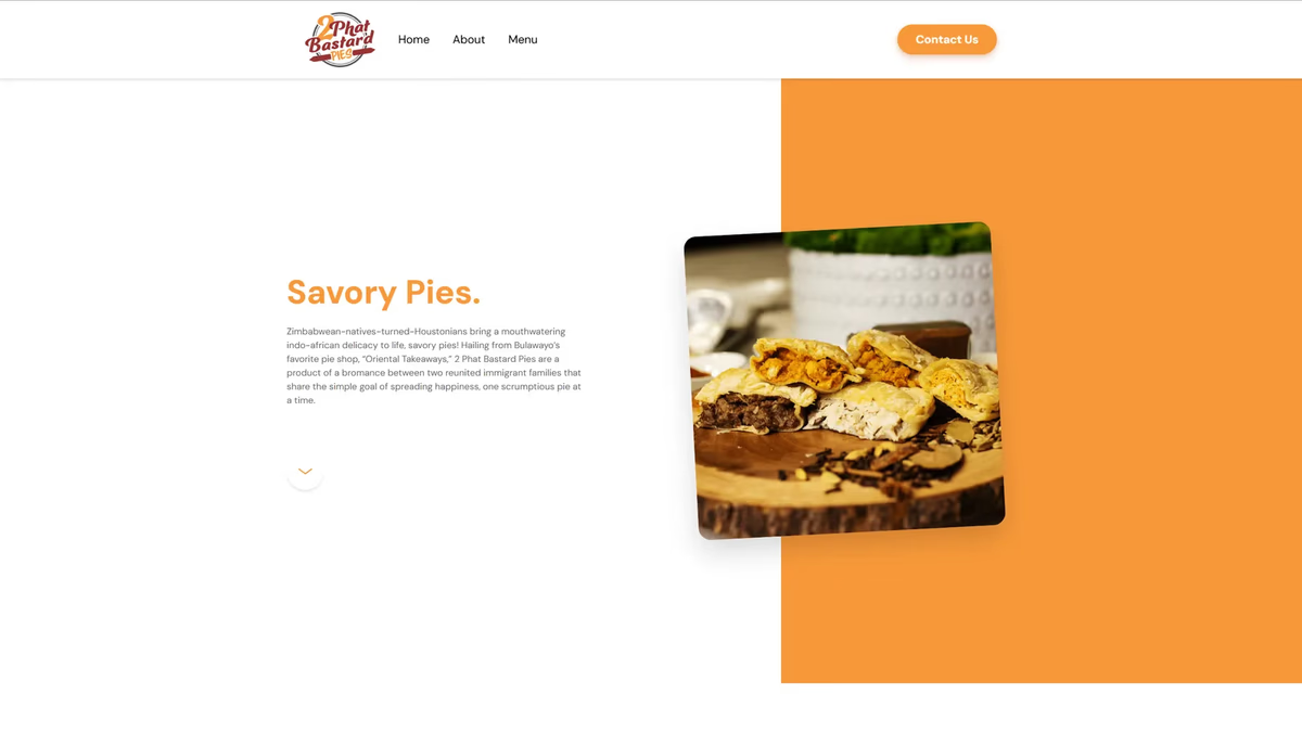
2 Phat Bastard Pies Brand and Website Design
We built 2 Phat Bastard Pies a bold brand identity and a Webflow website that introduced Houston to a one-of-a-kind savory pie concept rooted in Indo-African flavor.
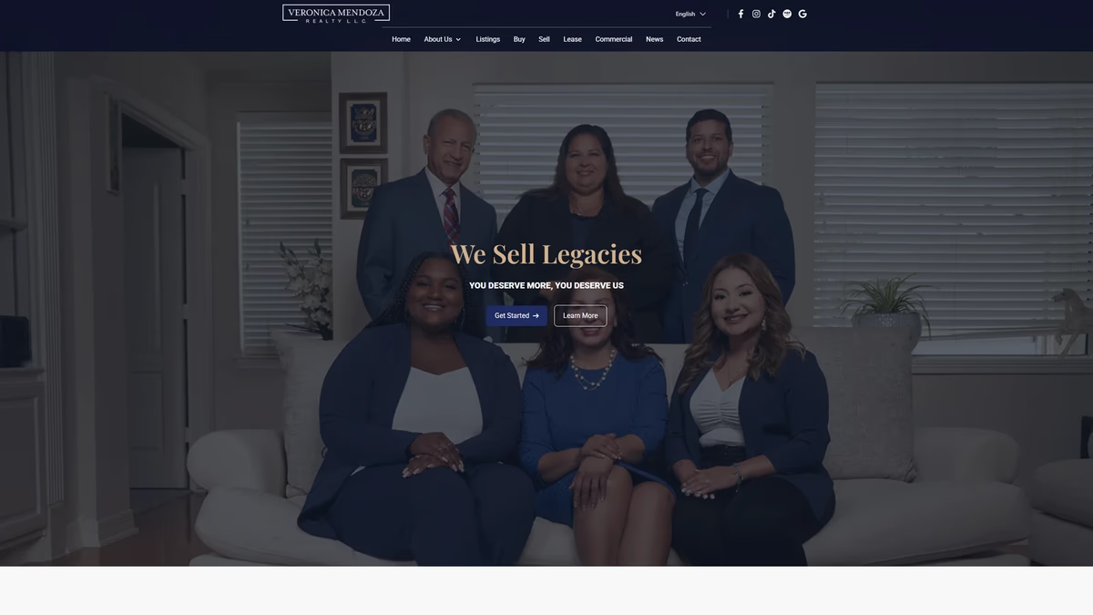
Veronica Mendoza Realty Brand and Website Design
We rebuilt Veronica Mendoza Realty from a low-resolution logo and a generic brokerage template into a custom digital platform that reflects the professionalism and community trust the business had already earned.
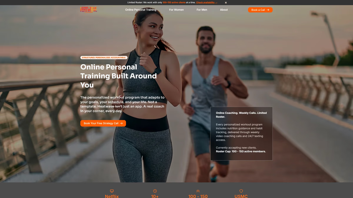
Heatwave Houston Brand and Website Design
We rebuilt Heatwave Houston from a low-resolution logo file into a production-ready brand system and a full website designed to convert Instagram traffic into real client relationships.