Standing Planted Publishing Brand Design
We built Standing Planted Publishing a heritage-rooted brand identity centered on a custom Victorian monogram, crown motif, and ornamental system that positioned the imprint as a premium literary presence rather than a generic modern publisher.
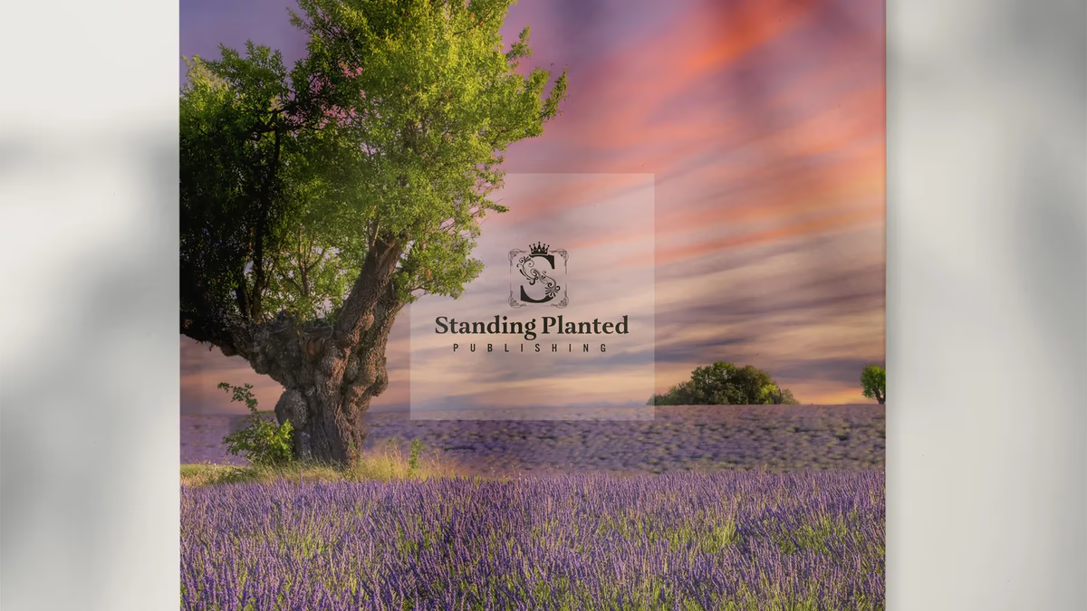
Table of Contents
Overview
Standing Planted Publishing is a boutique book publisher focused on literary storytelling and premium publishing presentation. The company was built around themes of permanence, heritage, authorship, and emotional storytelling rather than corporate publishing aesthetics.
Unlike larger publishers that lean into minimalism or mass-market neutrality, Standing Planted wanted an identity rooted in legacy and craftsmanship. A central influence was a decorative Victorian-style stamp inherited from the owner’s grandmother, a piece carrying both visual and emotional significance that the client wanted honored in the final system.
Challenges
The core challenge was translating deeply personal visual references into a functional brand without allowing the identity to become visually overwhelming or dated. The heirloom stamp carried intricate ornamental language and decorative framing, but directly replicating those elements risked producing something that felt like antique clip art rather than a professional publishing imprint.
The brief also introduced multiple symbolic directions at once: Victorian ornamentation, floral motifs, prestige symbolism, literary sophistication, and specific requests for a crown, purple as the primary color, and strong ornamental detailing. Without careful restraint, the identity risked becoming overcrowded, difficult to scale, and disconnected from professional publishing standards.
Objectives
- Create a distinctive boutique publishing identity
- Preserve and reinterpret the emotional language of the inherited Victorian stamp
- Establish a premium literary brand presence across print and digital applications
- Balance decorative elegance with readability and functional structure
- Develop a flexible logo hierarchy for varied publishing contexts
- Build a timeless identity rooted in heritage and storytelling
Solutions
We approached this as a translation project, not a recreation. Rather than reproducing the grandmother’s stamp directly, we abstracted its visual language into a more structured publishing identity. The ornamental curves and Victorian floral motifs were preserved conceptually while being reorganized into a cohesive monogram system.
At the center of the identity is a custom “S” monogram representing Standing Planted. We intentionally integrated the floral ornamental linework into the structure of the letterform itself rather than applying it separately. This allowed the decorative language to feel unified with the mark rather than decorative afterthought.
The surrounding ornamental border references antique stamp framing and heirloom publishing marks. A crown element above the monogram reinforces prestige, elevated storytelling, and legacy. The result reads more like a literary seal or imprint than a conventional logo.
For the typography system, we paired Aria Text G2 in the primary wordmark, selected for its editorial sophistication and serif structure, with Alternate Gothic No3D for supporting text and the “PUBLISHING” designation. The condensed sans-serif introduced hierarchy and modern restraint that prevented the identity from tipping into visual excess.
Purple was chosen as the primary color for its associations with creativity, authorship, and artistic expression. A muted sage secondary grounded the system and created visual balance against the stronger ornamental forms. Supporting neutrals gave the palette flexibility across embossing, book covers, and digital environments.
The brand identity
Primary full lockup, horizontal.
The iconic mark
The standalone “S” monogram functioned as a publishing seal for embossing, covers, and imprint usage. We developed it across multiple colorways to ensure flexibility across every application context.
Primary iconic mark.
Wordmark system
A simplified typography-only version was created for cleaner layouts, environmental applications, and digital scalability. This tier of the hierarchy let the identity operate cleanly in contexts where the full ornamental mark would be too visually heavy.
Brand applications
The identity was presented through editorial and tactile mockups demonstrating how the ornamental system performed in physical environments. Embossed leather, hardcover publishing contexts, and environmental branding all reinforced why the identity was designed for texture and materiality from the start.
Brand mockup, application view 1.
Publishing and editorial presentations
The system was built to perform in tactile, print-heavy contexts. Hardcover books, embossed leather covers, small-format logo marks, and environmental signage each tested the identity in a different way. The ornamental depth that could feel excessive on screen translated into visual richness in physical media.
Deliverables
- Logo design and brand identity system
- Custom “S” monogram design
- Full ornamental wordmark and lockup system
- Logo variations across primary, light, dark, and alternate colorways
- Typography system (Aria Text G2 and Alternate Gothic No3D)
- Brand color palette (purple primary, sage secondary, supporting neutrals)
- Brand presentation deck
- Editorial and publishing mockups
- Embossing mockups for tactile applications
- Brand usage variations and hierarchy documentation
Results
Standing Planted Publishing gained a highly recognizable and emotionally distinctive publishing identity rooted in heritage and literary presentation. The branding established a boutique publishing presence that differentiated the company from more generic or corporate publishing aesthetics.
The final system communicated permanence, elegance, and literary sophistication across every tier of the logo hierarchy. The identity performed particularly well in tactile and print-oriented environments, including book covers, embossed leather, and editorial spreads, where texture and materiality enhanced the visual richness of the ornamental language.
The multi-tier logo structure gave the imprint flexibility across contexts while maintaining consistency. The wordmark could operate cleanly in minimal digital layouts; the full ornamental lockup carried the brand in formal publishing applications; the iconic mark stood alone as a publishing seal.
Assessment
Standing Planted Publishing is a strong example of emotionally driven identity work rooted in personal symbolism rather than trend-based minimalism. The project’s greatest strength came from translating heritage-inspired visual language into a functional publishing system without directly replicating antique source material. Committing fully to the literary and heirloom-inspired direction, rather than compromising toward contemporary minimalism, was the right call.
What made it work was restraint in the right places. The serif typography and muted sage secondary stabilized the more expressive ornamental elements and kept the system from tipping into visual chaos. That same tension between expression and structure is what we cover in defining your brand identity and visual brand language. For more on how we approach this kind of work, see our brand design service. For another Desque project where brand identity carried the weight of a distinctive creative direction, see our Antonio Bernal Photography case study.
Related Projects
Antonio Bernal Photography Brand Design
We built a minimal, monogram-based brand identity for Antonio Bernal Photography, designing a custom abp mark and spaced wordmark system that positions the studio in an editorial market rather than the crowded freelance photography space.
Anthony Mata Brand Design
We built a minimal, monogram-based brand identity for Houston music producer Anthony Mata, creating a flexible personal mark with a hidden narrative that travels from social profile to live event.

Aros Gaming Brand Identity and Sponsorship System
We built Aros Gaming a scalable esports identity that grew from a single DOTA 2 pubstomp operation into a multi-city, multi-game community network with the visual credibility to attract real sponsors.