Bleu Vibes Brand Identity
We built Bleu Vibes a refined coastal brand identity designed to position a beachwear concept closer to lifestyle fashion than to mass-market swimwear.
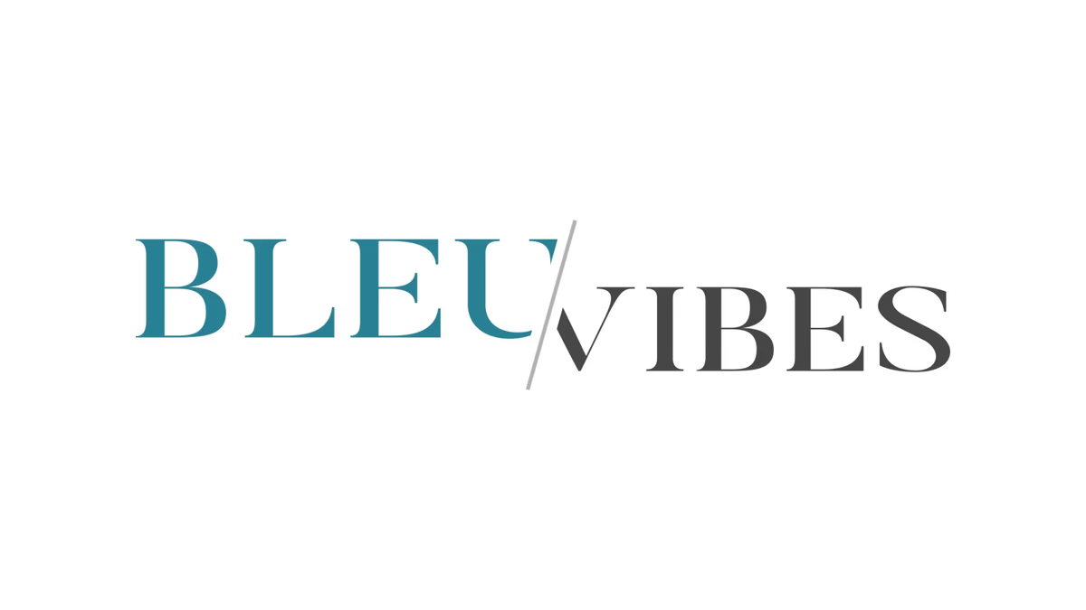
Table of Contents
Overview
Bleu Vibes was a beachwear e-commerce concept built around a clear idea: the swimwear market was visually saturated, trend-driven, and relying on the same loud tropical aesthetics. The founders wanted to build something different. A brand positioned closer to lifestyle fashion, with restrained visual language, a more elevated tone, and a long-term identity flexible enough to expand into accessories and coastal lifestyle products.
The project started in late 2018, while the business was still in early R&D and product sampling phases. Branding needed to establish credibility and a cohesive visual foundation before a full product ecosystem existed.
Challenges
The beachwear and lifestyle apparel market is one of the more visually repetitive categories in fashion branding. Competitors lean on aggressive tropical imagery, oversized decorative typography, and trend-chasing aesthetics that work for mass-market volume but age quickly and do not invite the kind of loyalty that builds a lasting brand.
Bleu Vibes needed to solve a few specific problems at once.
- The identity had to feel fashion-oriented and elevated without appearing inaccessible or luxury-priced.
- It had to be flexible enough to grow into accessories, travel products, and a broader coastal lifestyle category without ever feeling like a swimwear brand that overgrew its original scope.
- It needed to establish legitimacy in early-stage development, before a complete product line existed to do that work visually.
Objectives
Our goal was to give Bleu Vibes a brand presence that could hold its own in a crowded market by doing the opposite of what most competitors were doing: restraint over noise, editorial clarity over trend saturation, timelessness over seasonal pivot.
More specifically, we set out to build a typographic identity system that read as fashion-forward, a color palette grounded in a coastal sensibility without relying on clichesd beach iconography, and a secondary brand mark compact and versatile enough for product tags, packaging, apparel, and social profiles.
Solutions
We approached the Bleu Vibes identity as a typography-first system. At Desque we designed a split wordmark where “BLEU” and “VIBES” each carry distinct visual weight: “BLEU” rendered in a calm ocean teal and “VIBES” in a structured charcoal gray, separated by a diagonal divider that introduces rhythm and movement without relying on illustration or decoration. The two halves read as a unit while each carries its own character.
The diagonal separator became the connective tissue of the system. It reappears in the secondary brand mark, a BV monogram built from the same typographic styling and diagonal logic, which gave the identity a second anchor that could operate independently of the full wordmark. That kind of scalable mark structure was essential because the brand needed to live on surfaces where the wordmark would not always fit: product embroidery, packaging stamps, profile imagery.
The color palette kept things tight. Ocean teal paired with neutral charcoal gray. The teal communicates coastal energy without defaulting to the bright aquas or electric blues common to mass-market beachwear. The charcoal grounds the system and adds the visual weight that lifts the identity toward fashion territory. A restrained palette like this also lets photography carry the emotional tone, which was the right choice for a brand that intended photography and lifestyle imagery to do most of the lifestyle storytelling.
The brand identity
The final system centers on two marks: the full wordmark and the BV monogram. Both use the same typographic DNA and both carry the diagonal divider as a structural element, so the marks behave as a family rather than as disconnected assets.
Brand applications
The identity was extended into social media branding, where the wordmark overlay on lifestyle photography demonstrated how the mark would hold up in the brand’s primary digital environment. Poolside and coastal lifestyle imagery carried the emotional weight while the wordmark anchored the visual frame without competing with it.
Deliverables
- Primary wordmark logo design with split teal and charcoal typographic treatment
- Secondary BV monogram mark with diagonal divider, consistent with wordmark structure
- Brand identity system with color palette and typography direction
- Social media branding assets including Facebook cover photo
- Visual direction guidelines for photography, lifestyle imagery, and editorial tone
Results
The Bleu Vibes identity successfully differentiated the brand from the saturated, trend-heavy aesthetic of mass-market beachwear. The split wordmark and monogram gave the concept a visual language that reads as fashion-oriented and refined while remaining approachable enough to work at accessible price points. The minimalist structure was built to scale: apparel, accessories, packaging, e-commerce, and lifestyle marketing all fit within the same system without requiring the identity to be reinvented.
The brand delivered a polished foundation for early-stage product sampling, brand presentations, and vendor communication, giving the concept credibility before a full product line was ready to do that work on its own.
Assessment
Bleu Vibes is a project that required solving the branding problem before the product problem was fully solved. When a business is still in sampling and sourcing, the identity has to project enough confidence and clarity to carry conversations that the product itself cannot yet close. That meant every decision, the typographic restraint, the diagonal separator, the two-mark system, had to be legible and authoritative, not just aesthetically considered.
The thinking behind that kind of brand design work, building a flexible system before a complete product exists, is something we write about in depth in our piece on defining your brand identity and in our look at visual brand language. For another Desque branding project in the fashion and lifestyle space, see the Black Rose Solace case study.
Related Projects
Tailored Attire Brand Identity
We built Tailored Attire a modular, production-ready menswear identity system designed to function across every apparel touchpoint, from embroidered patches to digital channels, without losing cohesion or visual strength.
Nude Addiction Brand Identity
We built Nude Addiction a warm, minimalist fashion identity rooted in tonal restraint, developing a logo system and apparel application suite that positioned the boutique clothing brand around softness, femininity, and understated elegance.
Kreature Look Brand Identity
We built Kreature Look a bold, CMYK-driven brand identity that embedded the company core value proposition directly into its visual structure, separating a print-on-demand apparel startup from generic print shop aesthetics.