Blaze Hookah Distributors Brand Design
We designed a clean, scalable visual identity for Blaze Hookah Distributors, helping a wholesale hookah company present itself with genuine professional credibility inside a market that typically defaults to visual excess.
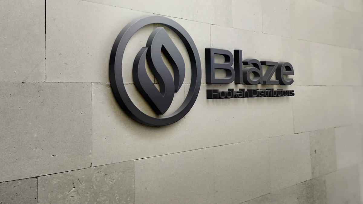
Table of Contents
Overview
Blaze Hookah Distributors was a wholesale-focused hookah distribution company serving smoke shops, lounges, and retail vendors. The company operated inside a highly saturated market where most competitors rely on visual excess to get noticed, making it difficult to stand apart through imagery alone.
The goal was a brand identity that felt modern, recognizable, and commercially credible without leaning into the tired cliches of the smoke and hookah space. The identity needed to function across both B2B and retail-facing environments, from distributor materials and packaging to potential storefront signage.
Challenges
The hookah and smoke distribution market rewards short-term visual noise but punishes long-term scalability. Brands that build on aggressive graphics or heavily stylized typography tend to struggle when it comes time to grow into wholesale or multi-channel distribution.
Blaze came to us with no cohesive visual identity and a clear need for stronger wholesale credibility. The challenge was creating something that felt connected to the industry without becoming a cliche of it. We had to reference heat and smoke symbolically while keeping the system clean enough to reproduce well across packaging, signage, and print.
Objectives
- Create a recognizable and scalable visual identity
- Strengthen professional perception in wholesale environments
- Develop a logo system that works across physical and digital applications
- Balance modern minimalism with industry-relevant visual language
- Establish a foundation capable of supporting future product expansion
Solutions
Rather than using literal smoke illustrations or decorative styling, we developed an abstract flame-inspired symbol built from flowing layered forms. The mark references heat, combustion, and motion while remaining geometric enough to work in professional contexts.
The circular containment structure was a deliberate functional decision. It improves icon recognition at small sizes, simplifies placement on packaging, and gives the mark stronger consistency across dimensional signage applications. The symbol stands on its own without requiring the full wordmark to stay readable.
The typography system used a geometric sans-serif to create visual contrast with the fluid iconography. The pairing avoided both the overly corporate and the excessively lifestyle-oriented, landing in a useful middle ground that works across stationery, distributor materials, and packaging.
The color palette paired deep charcoal tones with layered red gradients. The red references heat and intensity without becoming chaotic, while the darker neutrals ground the system and help it reproduce consistently across print and signage.
The brand identity
Brand applications
The identity system was designed from the start to move across real-world touchpoints without requiring adaptation. Stationery materials used heavy negative space to keep the symbol and typography visually dominant. Packaging mockups explored how the logo held up at varying scales in wholesale product environments.
Deliverables
- Logo design with circular icon mark and full wordmark lockup
- Integrated logo variant with flame symbol embedded in the wordmark
- Color palette centered on charcoal tones and layered red gradients
- Geometric sans-serif typography system
- Stationery design including business cards and letterhead
- Packaging mockups for wholesale product environments
- Environmental signage mockups demonstrating dimensional applications
- Brand presentation assets
Results
The final identity gave Blaze Hookah Distributors a cleaner, more professional visual presence capable of operating inside both wholesale and retail-facing environments. The simplified system performs consistently across print, packaging, signage, and business materials without requiring significant redesign as the company grows.
The icon-based structure creates strong standalone brand recognition, a meaningful advantage in a market where most competitors rely on full wordmarks that break down at small sizes. The restrained palette and geometry also position the company closer to a modern distribution brand than a trend-driven retail shop.
Assessment
This project succeeded because restraint was prioritized over visual excess. In industries like hookah and smoke distribution, there is real pressure to create identities that feel aggressive, luxurious, or heavily stylized. Those approaches may get attention, but they age poorly and rarely scale into wholesale or multi-channel environments.
The flame symbol carries enough industry relevance to feel authentic, but the overall system avoids becoming a cliche of it. Understanding how to build that kind of balance is something we write about directly in our pieces on visual brand language and brand voice and messaging. For another brand project in a similarly bold retail category, see our work on Black Rose Solace.
Related Projects
Influence Nutra Brand Design
Desque built a complete brand identity for Influence Nutra that positioned a bloodwork-driven supplement subscription service as a trusted wellness partner rather than another aggressive supplement brand.
The Network Realty Brand Design
We built a complete brand identity system for The Network Realty, a Houston real estate brand that needed a distinctive, modern presence to stand out in a relationship-driven and highly competitive market.
Urban Residence Realty Brand Design
We built a compact but distinctive brand identity for Urban Residence Realty, an independently operated real estate agent who needed a recognizable personal brand to stand out in a market full of templated, interchangeable visuals.