Influence Nutra Brand Design
Desque built a complete brand identity for Influence Nutra that positioned a bloodwork-driven supplement subscription service as a trusted wellness partner rather than another aggressive supplement brand.
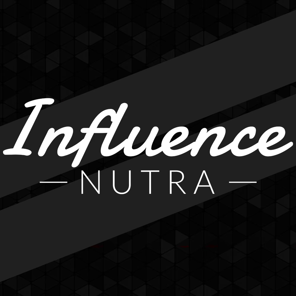
Table of Contents
Overview
Influence Nutra was a personalized nutrition and supplement company built around individualized health optimization rather than mass-market supplementation. Instead of selling generic vitamin stacks, the company operated through a data-driven model: customers submitted bloodwork results alongside detailed health and lifestyle surveys, and Influence Nutra used that information to identify nutritional deficiencies and assemble custom daily supplement packs shipped on recurring 30, 60, or 90-day cycles.
That business model placed the company in a unique position between wellness platform, personalized nutrition service, and subscription health system. Reaching that audience required a visual identity that could carry scientific credibility and consumer approachability at the same time. We built that identity from the positioning outward.
Challenges
The supplement industry is heavily saturated with branding built around hyper-aggressive visuals, bodybuilding culture, and performance-first messaging. Those conventions were a direct mismatch for what Influence Nutra actually offered.
Because your customers were expected to submit personal health information, commit to ongoing supplementation plans, and trust your recommendations over time, the brand needed to reduce friction rather than amplify intensity. The deeper challenge was finding the balance between scientific credibility and accessibility, wellness positioning and legitimacy, personalization and structural clarity. The identity also had to hold together across supplement packaging, subscription-oriented digital environments, social media, and small-scale applications such as favicons and profile imagery, without becoming visually generic.
Objectives
Our primary goal was to create a modern, approachable visual identity that differentiated Influence Nutra from the standard supplement market. We needed to position the brand closer to personalized wellness than bodybuilding culture while maintaining enough structure and credibility to support a recurring subscription business model.
The identity had to be scalable from the start. Packaging-ready logo assets, digital brand materials, and social media applications all had to work from a single coherent visual system. Equally important was avoiding anything that felt overly clinical or pharmaceutical, as that aesthetic carries its own form of intimidation that conflicts with the approachability you needed.
Solutions
We built the visual direction around deliberate restraint. The easiest path would have been louder branding centered on aggressive typography, biotech-inspired aesthetics, or futuristic design language. That direction would have worked against the actual customer experience, which centered on simplifying health management and building trust over time.
The primary logo combined a handwritten script wordmark for “Influence” with structured geometric sans-serif type for “NUTRA.” The handwritten script introduced warmth, personality, and human connection, while the geometric treatment grounded the identity with clarity, balance, and professionalism. Horizontal divider lines stabilized the composition and framed the typography into a clean, controlled lockup. The result avoided looking overly clinical, pharmaceutical, fitness-aggressive, or trend-dependent. Instead, the logo system landed in a visual language that felt modern, trustworthy, wellness-oriented, and subscription-friendly from the outset.
The color palette and overall visual system reinforced that positioning by prioritizing adoption, usability, and consistency over visual shock value. Every decision was made to reduce intimidation and make personalized supplementation feel integrated into everyday life rather than reserved for a fitness-specific audience.
The logo system
The final lockup pairs a handwritten “Influence” script with a geometric “NUTRA” sans-serif, stabilized by horizontal divider lines that frame the wordmark into a clean, controlled composition. We delivered it as a primary mark for light surfaces and a reverse mark for dark ones, so the identity holds its character across packaging, digital environments, and social media.
Digital applications
The identity extended into the subscription-oriented digital environments and social channels where most customers first met the brand. On a dark, textured field the reverse lockup keeps the same trustworthy, wellness-oriented register the rest of the system was built around.
Deliverables
- Primary logo system combining handwritten script and geometric sans-serif type
- Secondary logo variations for multi-environment use
- Favicon design optimized for digital applications and small-scale usage
- Brand identity system with full color palette development
- Typography system for consistent hierarchy across print and digital
- Digital brand assets for social media and online marketing
- Packaging-ready logo assets prepared for supplement packaging production
- Social media branding assets covering profile and content formats
Results
The final identity successfully differentiated Influence Nutra from traditional supplement competitors by positioning the brand closer to personalized wellness and guided health optimization. The branding established a cleaner and more approachable perception while maintaining enough structure to feel credible and trustworthy.
The logo system’s combination of script warmth and geometric structure gave the brand a dual register that competitors in the supplement category rarely achieved. A customer encountering the brand through packaging, a social media post, or a subscription confirmation email would receive the same signal: this company is precise, personalized, and approachable.
Assessment
This project was less about creating a visually loud supplement brand and more about correctly aligning perception with the actual business model. Influence Nutra’s strongest differentiator was not the supplements themselves but the personalization system behind them: bloodwork analysis, individualized recommendations, recurring supplement packaging, and long-term wellness optimization. Our work needed to support that positioning without becoming overly clinical or intimidating.
In many ways, the company operated ahead of where the personalized wellness market eventually moved. Today, bloodwork-driven supplementation and optimization platforms have become significantly more normalized across healthcare and wellness industries. The restraint in our visual direction became one of the strongest aspects of the project. Rather than chasing aggressive fitness aesthetics or biotech trends, we focused on accessibility and trust, which aligned more naturally with the customer experience and subscription-based business model.
For a closer look at how those decisions work at a strategic level, our brand design service page covers the process we use to build identities from positioning outward, and our series on defining your brand identity and visual brand language both explore the kind of restraint-versus-statement tradeoffs central to this project.
For other healthcare and wellness brand projects where identity clarity drove the outcome, see our Nuletica and Accubod case studies.
Related Projects
Blaze Hookah Distributors Brand Design
We designed a clean, scalable visual identity for Blaze Hookah Distributors, helping a wholesale hookah company present itself with genuine professional credibility inside a market that typically defaults to visual excess.
Luxy Lashes Brand Design
We refined the Luxy Lashes identity from a low-quality raster file into a production-ready visual system, giving this beauty brand a scalable logo, defined color palette, and consistent typography.
Instinct Athletics Brand Identity Design
We built Instinct Athletics a modern brand identity system grounded in geometric symbolism, athletic discipline, and long-term scalability across apparel, signage, and print.