Divine We Three Brand and Website Design
We built Divine We Three a refined luxury brand identity and a fully designed website that repositioned the boutique wedding planning company as a curated hospitality experience rather than a conventional coordinator.
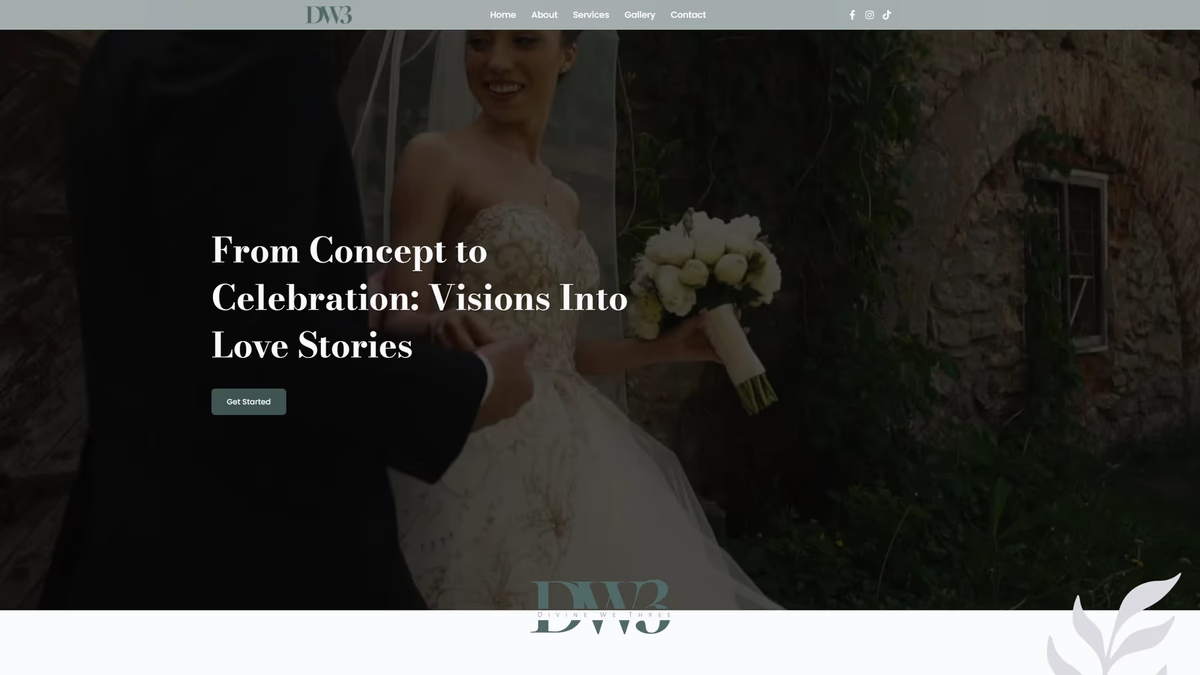
Table of Contents
Overview
Divine We Three is a boutique wedding planning and destination wedding coordination company specializing in curated luxury experiences. Unlike traditional wedding coordinators centered around logistics and operational planning, the company positions itself around emotional experience, hospitality, and destination wedding execution tailored to couples seeking an elevated and stress-free process.
Their services extend beyond event coordination into destination management, vendor curation, honeymoon planning, and personalized guest experiences. The project included a complete visual identity system alongside a fully designed and developed website aligned with the company’s premium positioning.
Challenges
The wedding industry is heavily saturated with repetitive branding aesthetics and templated digital experiences. Many competitors rely on script typography, decorative overload, and generic floral marks that leave brands visually indistinct from one another.
Divine We Three needed to avoid that environment entirely. The brand had to communicate emotional sophistication, calmness, and luxury hospitality without leaning on predictable wedding industry tropes. From a digital perspective, the website also needed to balance emotional storytelling with usability and consultation conversion, since many luxury-oriented wedding websites sacrifice navigability for excessive visual effects. Ensuring the identity remained scalable across website applications, social media, print collateral, invitation systems, and luxury stationery added another layer of complexity to the scope.
Objectives
The goal was to establish a refined luxury brand presence that differentiated the company from conventional wedding planners and positioned it closer to boutique hospitality and curated experiences. That meant creating a cohesive visual identity system capable of improving perceived value and premium positioning across every touchpoint.
On the digital side, we needed to build an emotionally driven but genuinely usable website experience that supported consultation and lead conversion through a calm and approachable presentation. The system also had to be designed for future expansion into marketing, print, and social applications without losing cohesion.
Solutions
At Desque we built the identity around restraint, typography, and emotional sophistication rather than decorative wedding industry clichés. The primary DW3 monogram used oversized high-contrast serif typography with flowing transitions between the letterforms to create elegance, softness, and premium perception. The system intentionally avoided rings, script typography, floral marks, and ornamental excess, leaning instead into editorial-inspired typography and luxury hospitality aesthetics.
The logo system was designed to function across full lockups, iconic marks, social avatars, website headers, print materials, and favicon-scale usage. A muted palette of sage green, dusty rose, powder blue, and soft lavender reinforced emotional calmness and maturity without chasing trend-heavy wedding colors. Typography paired Joly Display Bold with Poppins to balance editorial luxury with contemporary usability.
The brand identity
The final identity system delivers a full logo suite with primary, single-color, and reverse lockups so the brand holds across the website, print materials, social channels, and stationery at any scale.
Iconic marks and avatar
The monogram also scales down into standalone iconic marks and a social avatar, giving the brand a recognizable presence in spaces where the full lockup is impractical.
The website
The website was designed around emotional pacing and aspirational storytelling rather than operational information overload. Large-format photography, spacious layouts, and restrained content structure created a calm and immersive browsing experience centered on trust, emotional projection, and consultation conversion. The site architecture prioritized emotional engagement and brand trust before moving into service understanding, which is how we approach web design for hospitality clients where atmosphere does as much selling as copy.
Website
About
Deliverables
- Custom logo design, DW3 monogram system, and full brand identity
- Full lockup, iconic mark, and avatar logo variations across all colorways
- Brand color palette and typography system (Joly Display Bold and Poppins)
- Mobile responsive website design and development
- Gallery integration, FAQ structure, and consultation-focused contact system
- Service breakdown pages with destination wedding positioning
- Social media branding assets and print mockup presentation
- Brand presentation deck
Results
The final identity system positioned Divine We Three as a significantly more elevated and refined wedding planning brand compared to many traditional competitors. The company gained stronger luxury positioning, improved visual cohesion, and a more boutique hospitality aesthetic that moved the brand away from conventional wedding planning presentation.
The website delivered a cleaner and more emotionally engaging user experience focused on calm navigation, aspirational storytelling, service clarity, and consultation conversion. The simplified structure and spacious layouts reduced friction while allowing photography and emotional tone to guide the browsing experience naturally. The project successfully repositioned the company closer to luxury hospitality and destination experiences rather than generic local wedding coordination.
Assessment
This project is a strong example of how restraint and emotional calibration drive luxury brand perception more effectively than decorative excess. The identity’s success came from typography, spacing, atmosphere, and controlled visual hierarchy rather than from complexity or visual styling. Avoiding common wedding industry design clichés while maintaining emotional warmth and romantic presentation was the central design challenge, and the typography-first approach resolved it cleanly.
For more on the thinking behind identity systems like this, see our piece on defining your brand identity and our brand design services page. For other projects where brand and web came together for a hospitality or lifestyle client, see our Epic Modeling Agency and Crystal LaLlego Art case studies.
Related Projects
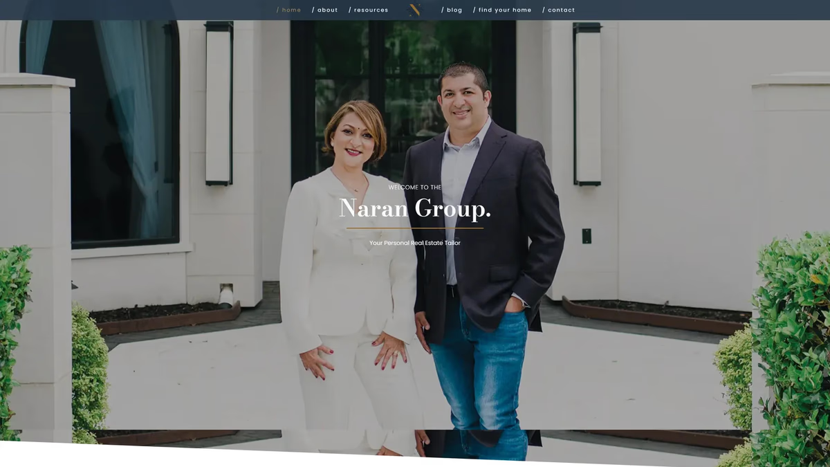
Naran Group Brand and Website Design
We built a complete brand identity and website for Naran Group, a Houston-area luxury real estate team, grounding the identity in personal symbolism and positioning the business as a refined, relationship-driven alternative to generic realtor branding.
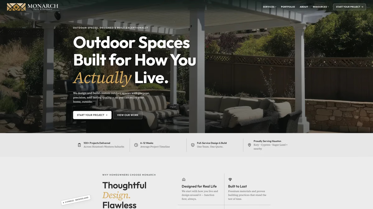
Monarch Patio and Outdoors Brand and Website Design
We built Monarch Patio and Outdoors from the ground up with a brand identity and website designed to earn homeowner trust in Houston's saturated outdoor construction market, shifting the conversation from luxury aesthetics to operational credibility.
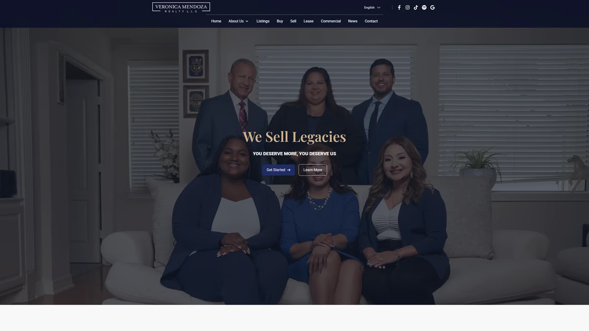
Veronica Mendoza Realty Brand and Website Design
We rebuilt Veronica Mendoza Realty from a low-resolution logo and a generic brokerage template into a custom digital platform that reflects the professionalism and community trust the business had already earned.