iPhone Repair Solutions Brand Design
We gave a Houston device repair shop a complete visual overhaul: a sharper logo system, Spot UV business cards, and direct-response print collateral built to win trust at the point of first contact.
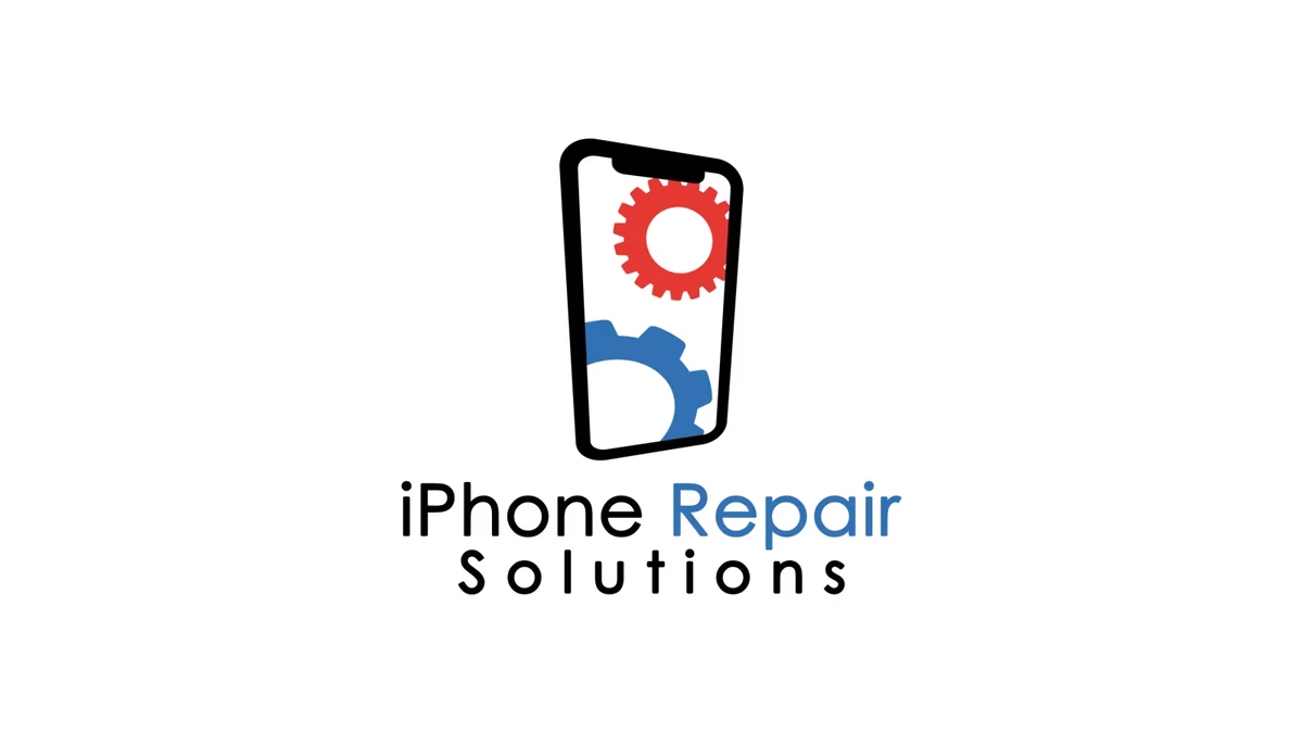
Table of Contents
Overview
iPhone Repair Solutions was a Houston-based electronics repair shop specializing in smartphone, tablet, and general device repair. Operating in a crowded local market where most competitors looked identical, the business competed primarily on speed, affordability, and convenience for customers who needed a fix fast.
As the shop grew its local presence, the original branding was holding it back. Inconsistent visuals and a literal, forgettable mark made it difficult to stand out on a busy commercial strip or in a social media feed. The company needed an identity upgrade that communicated reliability and technical credibility without looking like every other repair counter in town.
Challenges
The existing brand relied on generic repair iconography and inconsistent execution. It lacked scalability (artwork that works on a storefront sign rarely holds up as a social profile image or business card) and it failed to create the kind of first impression that converts a walk-in into a loyal repeat customer.
The local repair market adds a specific constraint: customers are often anxious and in a hurry. Trust signals need to land immediately. A cluttered, unprofessional visual system actively erodes that confidence, while a clean, cohesive one can close the gap between a walk-in and a walk-out with a completed repair.
Objectives
- Modernize the logo into a scalable mark that reads clearly at any size
- Build a complete brand identity system with primary, reverse, and single-color lockups
- Develop print and promotional materials built for fast information scanning
- Extend the brand into social media assets with visual consistency
- Establish a technology-oriented color language: black, white, and blue with restrained red accents
Solutions
The logo system
At Desque we rebuilt the identity from scratch around a tilted smartphone silhouette integrated with gear elements, creating a mark that references both the device and the repair in a single, readable shape. The tilt adds movement and improves recognizability at small sizes, which matters most for profile images and digital ads.
The color palette kept to black, white, and blue for a professional, technology-oriented feel. Red appeared sparingly as an accent to create focal contrast within the icon without overwhelming the composition. Typography choices prioritized clarity and flexibility across both identity lockups and marketing materials.
Social media graphic
The Facebook graphic adapted the identity into a social-ready format, giving the brand a consistent presence across digital advertising and community channels.
Print design
Business cards
The Spot UV business cards were a standout deliverable. Custom motherboard-inspired circuitry patterns ran through the background of each card, reinforcing the technical nature of the business and creating physical texture that made the card memorable in the hand. The gloss contrast from the Spot UV finish let the design stay minimal on the surface while delivering a tactile premium interaction.
Promotional flyers
The flyers were designed around direct-response priorities: pricing, speed, device compatibility, and contact information, all visible within seconds. Bold typography, high contrast, and a structured hierarchy let customers find what they needed without hunting. The dark system with blue accents kept the marketing materials visually consistent with the rest of the brand while avoiding the cluttered, generic look common in the local repair industry.
Deliverables
- Logo design (primary, reverse, single-color lockups)
- Brand identity system
- Business card design with Spot UV finish
- Promotional flyer design (front and back)
- Social media graphics
- Marketing collateral
Results
The redesigned identity gave iPhone Repair Solutions a significantly more polished and consistent public-facing appearance. Print presentation quality improved, the logo scaled cleanly across every application, and the marketing materials gave the business a visual system that looked organized and trustworthy rather than improvised.
The Spot UV cards in particular created a premium interaction point that elevated how the brand felt during face-to-face customer exchanges, something no amount of digital design can fully replicate.
Assessment
This project is a good reminder of what brand design actually does for a local service business. The client did not need a complex, conceptual identity. They needed sharper execution, real consistency, and print materials that worked as hard as the technicians behind the counter. That is exactly what good brand design for small businesses looks like in practice.
The Spot UV business cards and the direct-response flyer system were the strongest pieces of the engagement. By grounding the visual language in the technical reality of device repair (the circuitry patterns, the precise typography, the restrained color palette), Desque gave the brand a coherent story without overcomplicating it. For another example of how we approach technology brand identity, see our work for Applied Matter. To go deeper on why visual consistency drives customer trust, read our guide on defining your brand identity.
Related Projects

Applied Matter Brand Design
We developed a complete brand identity for Applied Matter, a data technology and business intelligence consultancy, built around systems thinking and analytical intelligence rather than generic tech aesthetics.
Exotico Rentals Brand Design
We named and built the complete brand identity for Exotico Rentals, a luxury partnership-based rental company covering exotic vehicles, private aviation, and marine experiences across Miami and Houston.
Valle Express Trucking Brand Design
We built Valle Express Trucking a bold, scalable identity system grounded in fleet-first thinking: a mark that reads clearly on a trailer at highway speed and stands up on screen with equal authority.