Applied Matter Brand Design
We developed a complete brand identity for Applied Matter, a data technology and business intelligence consultancy, built around systems thinking and analytical intelligence rather than generic tech aesthetics.

Table of Contents
Overview
Applied Matter was a data technology and business intelligence consultancy focused on helping organizations consolidate and operationalize fragmented business data across departments. Their work sat at the intersection of analytics, systems thinking, and strategic consulting, supporting department heads and executives rather than simply deploying software.
When we began this project, Applied Matter needed a visual identity that communicated intelligence and systems thinking without falling into the trap of generic technology aesthetics. The goal was to position the company as a strategic partner, not just another CRM or analytics implementation vendor.
Challenges
The data and analytics space was saturated with predictable visual language: literal graph icons, digital grid backgrounds, and cold corporate color palettes that made every company look interchangeable. Applied Matter needed to stand out while still projecting technical credibility.
A second challenge was audience range. The brand needed to speak to both technical teams and executive decision makers simultaneously. Too conceptual, and it would lose credibility with engineers. Too corporate, and it would fail to signal innovation to forward-thinking leadership.
Finally, the identity had to carry the company’s core positioning: that they were in the business of interpretation, not just implementation. That nuance is difficult to communicate visually, and required a conceptual rather than a literal approach.
Objectives
- Develop a modern identity system that differentiated Applied Matter from generic technology competitors
- Communicate interconnected systems, analytical intelligence, and organizational structure through visual form
- Establish credibility with both technical and executive-facing audiences
- Create a clean, scalable identity that could grow with the company across digital and print environments
- Position the brand as consultative and strategic rather than transactional or purely operational
Solutions
We built the identity around the conceptual relationship between raw information and applied intelligence, which the company’s name already encoded. Rather than visualizing analytics literally through dashboard icons or data charts, we focused on representing systems, movement, and connectivity.
The logo symbol draws from molecular structures and connected particle systems. A circular arrangement of varying-sized nodes creates simultaneous associations with data ecosystems, interconnected departments, operational feedback loops, and adaptive systems. The asymmetry introduced by the varying circle sizes gives the mark rhythm and dimensionality, preventing it from feeling mechanically rigid.
For the wordmark, we used a clean geometric sans-serif structure that emphasized strong spacing and precise proportions. A deliberate color split between “Applied” (black) and “Matter” (muted mint green) reinforced the conceptual positioning: taking raw operational matter and applying structure to it to generate meaningful intelligence.
The palette used black, white, and a muted mint green accent. The monochromatic base projected professionalism and analytical clarity while the mint green introduced a layer of innovation and forward-thinking problem solving, differentiating the brand from the blue-heavy technology branding that dominated the industry at the time.
The brand identity
Brand applications
The brand system extended into print through a business card design that prioritized strong typography hierarchy and immediate readability. The cards used soft abstract background treatments with depth and atmosphere to elevate the presentation beyond a standard corporate handout, while keeping contact information clearly accessible for networking and executive-facing environments.
Deliverables
- Logo design (primary, single-color, and reverse variants)
- Brand identity system
- Typography and color palette guidelines
- Business card design (front and back)
- Print-ready and digital brand assets
Results
Applied Matter gained a brand identity that positioned them as a business intelligence and analytics consultancy rather than a commodity IT provider. The visual system established credibility across both technical and executive-facing environments, and the conceptual approach to the logo communicated systems thinking and analytical intelligence without resorting to literal data visualization tropes.
The identity gave the company a more strategic and consultative market presence, which aligned directly with the nature of their services. The overall system remained flexible enough to scale as the company evolved across digital and print touchpoints.
Assessment
For a 2017 technology brand, the identity has held up well because the design decisions prioritized conceptual depth over short-term trends. The strongest element is the circular molecular-inspired icon, which communicates connectivity, operational ecosystems, and adaptive intelligence in a minimal and non-literal form. The geometric wordmark and deliberate two-color split reinforce the company’s core idea without being heavy-handed.
Our approach to brand design on technology projects like this one mirrors the process we explored in Visual Brand Language, where restraint and conceptual clarity consistently outperform trend-driven execution. For another example of technology and consulting-adjacent brand work, see our Axiom Solar Concepts case study.
Related Projects
iPhone Repair Solutions Brand Design
We gave a Houston device repair shop a complete visual overhaul: a sharper logo system, Spot UV business cards, and direct-response print collateral built to win trust at the point of first contact.

Exotico Rentals Brand Design
We named and built the complete brand identity for Exotico Rentals, a luxury partnership-based rental company covering exotic vehicles, private aviation, and marine experiences across Miami and Houston.
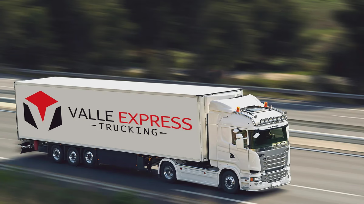
Valle Express Trucking Brand Design
We built Valle Express Trucking a bold, scalable identity system grounded in fleet-first thinking: a mark that reads clearly on a trailer at highway speed and stands up on screen with equal authority.