Valle Express Trucking Brand Design
We built Valle Express Trucking a bold, scalable identity system grounded in fleet-first thinking: a mark that reads clearly on a trailer at highway speed and stands up on screen with equal authority.
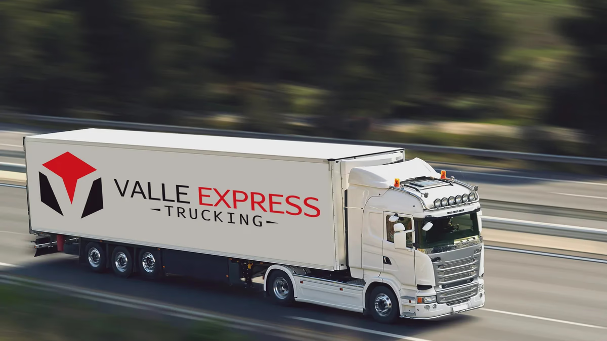
Table of Contents
Overview
Valle Express Trucking is a Houston-based freight and logistics company with decades of operational experience moving cargo across Texas and into neighboring regions. The company handles everything from local deliveries to full tractor-trailer hauls, competing in a market where reliability and professionalism are the primary differentiators, and where most smaller carriers still rely on outdated or inconsistent visual presentation.
When Desque started this engagement in March 2018, the business had no cohesive brand identity. The goal was to build something that would hold up at every scale: a logo that reads from across a parking lot, a color system that commands attention on the road, and a website that earns credibility the moment a prospective customer lands on it.
Challenges
Fleet branding is one of the harder categories in brand design. A mark that looks fine in a PDF can fall apart at trailer scale, where legibility at distance, contrast against a moving background, and production tolerance across vinyl, paint, and digital all create competing constraints. For Valle Express, the additional pressure was a limited budget and timeline, which meant our approach had to be deliberate and economical from day one.
The broader challenge was also representational. Transportation companies of this size often look like they are still operating in 2005: generic fonts, clip-art truck silhouettes, and no consistent color system. Building something modern, credible, and durable within those constraints required starting from a clear point of view about what the brand needed to communicate: movement, structure, and trust.
Objectives
Our scope covered both brand identity and digital presence. On the brand side, the goal was a visual system (mark, palette, typography) that could travel across fleet applications, print collateral, and screen without losing coherence. On the web side, the objective was a clean, professional site that answered the practical questions a potential freight customer or partner would ask first: what do you haul, where do you go, and how do I get a quote.
We also needed to establish foundational assets the company could carry forward independently for years. The brief was clear that this was a one-time, execution-focused engagement rather than an ongoing strategic relationship.
Solutions
Brand identity
The custom “V” icon was built around aggressive angular geometry: a mark that reads as directional and structural, not decorative. The angles reference movement and forward momentum while the symmetry communicates reliability. We intentionally kept the geometry simple so the mark holds at small scale, reproduces cleanly in single-color press applications, and survives the dimensional tolerances of large-format vinyl.
The palette anchors on red, black, and white. That combination has earned its place in logistics and industrial branding because it works: high contrast, strong visibility, and an emotional register of urgency and confidence. Trucking customers respond to clarity, and the palette delivers it.
Typography prioritized readability at distance. The chosen typefaces are wide enough to survive compression, bold enough to read at 65 mph, and restrained enough to stay professional across print and screen.
Fleet applications
The most demanding test of any trucking identity is how it looks on the vehicle itself. We developed fleet mockups to pressure-test the mark and palette at scale before finalizing any production files. The goal was to confirm that the identity held its visual weight across trailer and cab applications, under real lighting conditions, and at the distances a prospective customer would actually encounter the brand.
Website design
The website was built around operational simplicity. Freight customers are time-pressed and direct; they want to know what you haul, where you operate, and how to request a quote without navigating through marketing copy. We structured the site around those three questions and designed the layout to answer them quickly.
Responsive layouts handled mobile and desktop with a clean, professional presentation. Contact forms and quote request functionality were integrated to reduce the friction between a site visit and an actual inquiry. The visual treatment carried the brand red and black palette into the digital environment without becoming heavy, and the site reads as professional and focused, which is exactly what the company needed it to communicate to potential freight partners and customers.
Deliverables
- Logo design and full identity system
- Icon system with primary, compact, and reverse lockups
- Typography direction
- Color palette and usage guidelines
- Fleet mockups for vehicle wrap validation
- Foundational brand assets
- Responsive website design and development
- Service information architecture
- Contact and quote request forms
Results
The project gave Valle Express Trucking a brand presence that matched the operational maturity of the business. The identity travels cleanly across fleet vehicles, digital screens, and print without requiring adaptation, which was the core requirement for a company operating across Texas at this scale.
The website established a lasting digital presence that remained active and functional years after the original launch, continuing to generate customer inquiries and provide an accessible point of contact for freight partners and shippers. That kind of operational durability on a modest scope is the marker of a well-executed foundational engagement. For more on how identity systems like this come together, our Branding Essentials series covers the principles that drive decisions like palette choice, mark geometry, and typography selection.
Assessment
This was a practical, execution-led project: a tight scope, a clear brief, and a clear target. The work succeeded because we stayed honest about what the identity needed to do rather than adding visual complexity for its own sake. Fleet branding rewards restraint; the mark that reads from a distance is almost always simpler than the one that looks impressive at desk scale.
What makes the outcome worth noting is durability. The system held up across years of use, multiple vehicle applications, and the company’s continued digital presence without requiring revision. That staying power reflects how we approach foundational brand work: we design for the environment the brand actually lives in, not the pitch deck version of it.
If you run a transportation, logistics, or service business and need an identity that performs at operational scale rather than just looking good on a PDF, take a look at how we approached Delta Security Force or Chasing Bimmer for similarly demanding application environments.
Related Projects
iPhone Repair Solutions Brand Design
We gave a Houston device repair shop a complete visual overhaul: a sharper logo system, Spot UV business cards, and direct-response print collateral built to win trust at the point of first contact.
The Network Realty Brand Design
We built a complete brand identity system for The Network Realty, a Houston real estate brand that needed a distinctive, modern presence to stand out in a relationship-driven and highly competitive market.
Urban Residence Realty Brand Design
We built a compact but distinctive brand identity for Urban Residence Realty, an independently operated real estate agent who needed a recognizable personal brand to stand out in a market full of templated, interchangeable visuals.