Exotico Rentals Brand Design
We named and built the complete brand identity for Exotico Rentals, a luxury partnership-based rental company covering exotic vehicles, private aviation, and marine experiences across Miami and Houston.
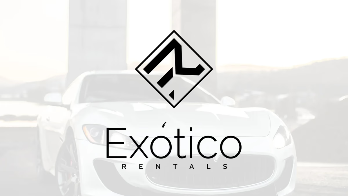
Table of Contents
Overview
Exotico Rentals is a luxury rental company built around a partnership model spanning exotic vehicles, private jets, yachts, speed boats, jet skis, and motorcycles. The business launched in Miami, FL and later expanded operations to Houston, TX. Rather than owning inventory directly, Exotico operates through curated partnerships with owners and operators, creating a unified access point for high-end experiential rentals across multiple categories.
When the company came to Desque, they needed more than a logo. They needed a name, a complete visual identity, and a brand system capable of holding its own across vehicles, aviation, marine applications, apparel, and print collateral.
Challenges
Building a brand for a multi-category luxury rental business presents a specific set of tensions. The identity has to feel premium and cohesive across categories that are visually and experientially distinct from one another. An exotic car, a private jet, and a yacht each carry their own aesthetic weight. A brand mark that looks at home on all three cannot be generic, but it also cannot over-index on any single category.
A few specific constraints shaped the scope.
- The company name did not yet exist. Desque named the brand, which meant the identity and the name had to develop together rather than the name arriving first.
- The partnership model meant the brand would appear alongside owner-operated assets rather than on company-owned inventory. Consistency and adaptability were both essential.
- The audience operates in luxury territory where brand presentation is taken seriously. Anything that felt approximate or off-category would undercut the positioning before the product could prove itself.
Objectives
The goal was to give Exotico Rentals a complete brand identity that could scale across every category in their portfolio and every surface their clients would encounter, from vehicle wraps and aviation interiors to digital and social.
Specifically, we set out to create a name that conveyed the brand’s character without locking it to a single category, a mark system with enough geometric precision to feel engineered and enough elegance to feel luxury, and a black-and-white palette that communicated timelessness and exclusivity without relying on color as a crutch. Every application had to work in print, on vehicles, on water, and in digital environments.
Solutions
We began with the name. Exotico draws from the Spanish word for exotic, which gave the brand a cultural dimension that felt natural for a Miami launch while remaining clear and accessible to an English-speaking audience. The name carries aspiration without pretension and works across every category the company serves.
At Desque, we built the visual identity around a custom “ER” monogram and a geometric mark rooted in diagonal framing and angular forms. The geometry was intentional: the diagonals communicate speed, velocity, and forward movement, which connects across vehicles, aviation, and marine categories without favoring any one of them. The mark reads as engineered, which reinforces the precision the audience expects from a luxury service provider.
The palette is pure black and white. In luxury brand design, a monochromatic system communicates confidence. It says the brand does not need color to make its case. It also ensures the identity reproduces cleanly across every surface and environment the rental categories require, from matte vehicle wraps to gloss printed collateral.
Typography was set in a thin minimalist sans-serif with aggressive spacing and editorial proportions. The spacing treatment amplifies the sense of exclusivity and gives every application a composed, intentional quality.
The brand identity
The identity pairs a geometric “ER” monogram with the Exotico Rentals wordmark, giving the brand a refined, scalable mark for vehicle applications, apparel, and digital headers.
Deliverables
- Brand naming: “Exotico” developed and validated alongside the visual identity
- Custom “ER” monogram and geometric brand mark
- Horizontal wordmark lockup system
- Pure black-and-white color palette with application standards
- Thin minimalist sans-serif typography with spacing specifications
- Logo application suite across vehicles, aviation, marine, apparel, and digital
- Print collateral design system
- Brand identity standards for consistent reproduction across all partnership surfaces
Results
Exotico Rentals launched in Miami with a brand identity that could hold its own against established luxury names in the rental and experiential categories. The geometric mark and monochromatic palette gave the company a visual language that works at scale, from large-format vehicle graphics to small-format print and digital placements. The naming and identity system together delivered a coherent luxury positioning that the business could expand into Houston and beyond without rebuilding from scratch.
The brand was strong enough to support consistent application across the partnership model, where inventory and environments vary but brand presence needs to stay stable.
A black-and-white brand system in a luxury context is a statement of confidence. It says the mark is enough.
Assessment
Exotico Rentals is a good example of what naming and brand design look like when they develop together rather than sequentially. The name shaped the identity direction and the identity reinforced the name, which is a more cohesive outcome than inheriting a name and designing around it.
We cover the principles behind this kind of brand design work in our series on visual brand language and in our post on defining your brand identity, which walks through how a mark system earns its authority across different contexts. For other brand identity projects where we built a complete identity system from the ground up, see our Chasing Bimmer and Doc Holliday’s case studies.
Related Projects
Crystal Lallego Art Brand Design
We built Crystal Lallego Art a signature-based identity system that frames the artist without competing with the work, anchored by a bold orange palette that travels from canvas to print to digital.
iPhone Repair Solutions Brand Design
We gave a Houston device repair shop a complete visual overhaul: a sharper logo system, Spot UV business cards, and direct-response print collateral built to win trust at the point of first contact.

Sweat Social Brand Design
We built the complete brand identity for Sweat Social from the ground up: naming strategy, logo system, color palette, merchandise, and event marketing, positioning a Houston Pilates pop-up as a lifestyle-first wellness community.