What We Do: UI/UX Design for Houston Business Sites
Desque plans every step a customer takes on your website, from landing on the page to reaching out.
 Trung Nguyen
Table of Contents
UI/UX design is the thinking that happens between the discovery call and the build. UX is how your website works, meaning what a visitor sees first, where they go next, and what they need before they’ll call. UI is how that experience looks and reads.
I do both on every website, so it isn’t a separate service you add on. It isn’t about making pages look nice, and it isn’t only about removing friction. The job is to understand who’s using your site and what they’re trying to do, then design the path from there to what your business needs them to do.
A five-page service site needs a lot less of this than an app with several kinds of users, so the work scales with the project. Each part has its own heading in the table of contents.
What’s included
| Sub-service | What it is | When |
|---|---|---|
| Audience and goals | Who’s using the site and what they’re trying to do | Before design |
| Research | The evidence behind each decision, or an honest best guess | Before design |
| Site structure | How your information gets grouped, ordered, and trimmed | Before design |
| User journeys | The path from page to page toward the action you want | Before design |
| Wireframes | Plain layouts that settle structure before visuals | Design |
| High-fidelity design | The finished look of every page | Design |
| Responsive design | How every page works on a phone, tablet, and desktop | Design |
| Interaction and states | What buttons, forms, and menus do when someone uses them | Design |
| Accessibility | Readable type, clear contrast, and usable controls | Design |
| Reusable components | Consistent parts your pages are built from | Design |
| Design review during the build | The built site checked against the approved design | Development |
How I make the calls
These are the rules behind the decisions in every section below.
- I design for the 51% — the site has to work for most of the people who’ll use it. Your personal preference, and the other 49%, can’t decide every call.
- Common sense isn’t universal — you know your services, terms, and processes by heart. A first-time visitor doesn’t, so what feels obvious to you can make no sense to them.
- Less friction isn’t always better — sometimes slowing someone down helps, like a confirmation screen, a qualifying question, or a warning before a mistake.
- Pretty isn’t the goal — a site that wins design awards can still fail at its job. The goal’s a site your customers understand that has a real chance to pay for itself.
- UX comes first, but UI still matters — bad UX can’t be fixed by making it prettier, and a clear path that looks cheap still loses trust.
Before anything’s drawn
Audience and goals
Before there’s a layout, there are the people using the site. I work these out in discovery, and the design connects the answers.
- Who’s using it — and why they came to your site.
- What they’re trying to do — and what they need to know before they’ll move forward.
- What might stop them — the confusing step, the missing answer, the term they don’t know.
- What your business needs — the call, the quote request, or the order.
- Who they are — a site for seniors shouldn’t behave like a gaming site, with tiny text and fast carousels.
Research
The best decisions come from real information, and I use it when it exists. Most small businesses don’t have clean data at this level, though, and I won’t pretend they do.
- Data you already have — Google Analytics, Search Console, past conversion numbers, or heatmaps and session recordings.
- When there isn’t any — industry research, proven patterns, what you know about your customers, and my professional judgment.
- Deeper research when it’s worth it — interviews and usability testing, added when the project and budget call for them. Our post on usability testing shows how a basic test runs.
- Evidence or assumption — I’ll always tell you which one a decision rests on.
Structure and paths
Site structure
This is where I spend most of my time. Most businesses don’t have too little information. They know so much about their own business that they want all of it on the site, and it isn’t organized for someone seeing it for the first time.
- Grouped the way customers look — the sitemap and menu follow how visitors search for things, not how your departments are set up.
- First, second, deeper, or gone — what belongs up front, what can wait, what can sit a click deeper, and what should come off entirely.
- One main goal — the structure keeps pushing toward the action your site exists for.
- Room for the words — when a headline has to carry an important message, the layout makes room for it instead of forcing it into a box. How the words get written is in our post on copywriting that sells the service.
User journeys
I design the whole path, not isolated pages. A typical journey runs from the homepage to a service page, then to proof, the call to action, the form, and the confirmation.
- A reason for every page — each one has a job and a clear next step.
- Diagrams when they help — complex projects get formal user-flow diagrams, while a simple site’s path is clear enough to solve directly.
- Where conversions break — when visitors can’t tell where to go or what to do next, that’s a UX problem, and it’s fixed in the path.
The design
Wireframes
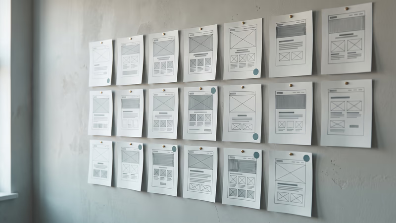
Each project gets wireframed before the real design starts. A wireframe strips out the colors and photos, which leaves everyone looking at content, order, and function.
- What gets solved here — hierarchy, layout, how each page works, and what each page needs to do.
- As simple as it needs to be — anything from gray boxes to more detailed layouts, depending on the project.
- Presented, not emailed — I walk you through the reasoning, and you approve the direction before we move on.
- Up to two rounds of changes — changing a wireframe is fast and cheap, and changing a finished design isn’t.
High-fidelity design
Once the wireframes are approved, the visual layer goes on. That’s the type, color, buttons, menus, forms, cards, images, spacing, and icons.
- Your brand, translated — if you’ve got a full brand system, I carry it into the website. If you only have a logo, the site gets its own colors and type without pretending your whole brand got rebuilt. The full brand work is in our post on brand design for Houston businesses.
- Real words, not placeholder text — the copy and the design get developed together, because real content changes the layout.
- Presented and approved — you see how the design supports the experience, and you sign off before the build starts.
- Up to two more rounds of changes — on top of the two at the wireframe stage.
Responsive design
Every layout’s planned for phones first, then widened for tablets and desktops. Responsive design isn’t the desktop page shrunk down.
- What changes by device — menus, text size, buttons, forms, spacing, and which content comes first.
- Built to flex — there are too many screen sizes to design each one, and the site adapts smoothly between sizes instead of only at a few set widths.
- Made for thumbs — tap targets sized for real fingers. Our post on touch-friendly interfaces covers the details.
Interaction and states
UX doesn’t stop at a still screenshot. Buttons, forms, and menus all behave differently depending on what someone’s doing, even on a simple marketing site.
- Every state that’s needed — hover, focus, loading, success, error, disabled, empty, and form validation.
- Animation with a reason — motion gets used when it helps someone understand the page, not to impress other designers.
- Prototypes when they’re useful — most interactions are explained straight to our developers, and an unusual one gets an interactive prototype so everyone sees how it should behave.
Accessibility
Accessibility is part of good design from the start. It’s never something checked at the end. We’re not a specialized accessibility-compliance agency and don’t promise formal certification, but we follow current practices and avoid obvious barriers.
- Contrast and readable type — color pairs, font size, weight, and hierarchy chosen so text stays easy to read.
- Usable controls — forms, buttons, and menus that are clear to understand and work for everyone.
- Fit to the audience — a site for older visitors needs different choices than one for a young, technical crowd. Our post on accessible color and typography goes deeper.
Reusable components
Bigger projects get built from reusable parts. That keeps every page consistent and makes new pages quicker to add. Small sites don’t need a giant formal design system, so the system matches the project.
- Built properly in Figma — components set up to adapt, so a change in one place carries through.
- Documentation when someone will use it — detailed spacing and style rules get written when your own product or development team needs them.
From design to the built site
Design review during the build
In most cases, our team builds what I design, which removes the usual handoff problems between a designer and a developer. The goal isn’t a beautiful design file. It’s a site that works the way it was designed.
- Built from the design file — our developers work straight from the approved Figma file, and they can ask me questions as they go.
- Checked against the design — the built site gets reviewed against what you approved, including how it responds on every screen and how each interaction behaves.
- Handoff when needed — if your own developers build it, I walk them through the design and answer their questions.
How a UI/UX project runs
The steps are the same on every project, and you approve each stage before the next one starts.
- Discovery — your business, your customers, and what the site needs them to do, because every later decision points back to it.
- Structure and paths — the sitemap, the menu, and the journeys, so every page has a job before it has a look.
- Wireframes — the layout of each page, presented with the reasoning, with up to two rounds of changes.
- High-fidelity design — the finished look, presented and approved with up to two more rounds, while changes are still quick to make.
- Build and review — our team builds from the approved design, and I check the result against it.
Once the build starts, big design changes aren’t regular revisions anymore. We’ll still fix our own mistakes, typos, responsive issues, and reasonable small adjustments.
The Sapa and Co case study shows an online store where the bottle follows the shopper down the page, an interaction designed to keep the product in view.
If you’d like to talk through how your site should work, book a call with me. Since UI/UX is part of every website we build, the web design service page covers it along with the rest of the process.
Frequently asked questions
What’s the difference between UI and UX?
UX is how a website works. It covers the structure, the order of information, and the path a visitor takes to call or buy. UI is the look of it, like the type, color, buttons, and forms.
You need both. A good-looking site with a confusing path still loses customers, and a clear path that looks cheap still loses trust.
Do I pay for UI/UX design separately?
No. It’s part of how every website we build gets designed, so it comes with every website package. A UI-only or UX-only project for an existing site or app can be quoted on its own, but most clients want the whole site.
Will you test my website with real users?
Only when the project and budget call for it. Most sites are designed from the data you already have, like Google Analytics, plus industry patterns and the discovery call.
When a decision rests on an informed guess instead of evidence, I’ll tell you which one it is.
What’s a wireframe, and why does it come first?
A wireframe is a plain gray layout of each page, with no colors or photos. It lets us settle what goes where before anyone gets attached to how it looks, and moving a box in a wireframe takes minutes instead of days.

Creative Director & Co-Founder
Leads creative direction: brand systems, visual identity, and the web design behind every site we ship. Makes Houston businesses look memorable, not just polished.
Continue in series: What We Do
More from the blog
Related Posts
I Use AI Every Day as a Designer. I Still Don’t Let It Design For Me.
See how I use AI for discovery, research, wireframing, validation, and QA while keeping creative judgment and final design decisions authentic.
Trung Nguyen

Desque is now on DesignRush
DesignRush now lists Desque. What the agency directory is, how businesses use it to compare web design agencies side by side, and how to get the most out of a short list.

Fredy Rodriguez

Best Houston web design agencies for AI search in 2026
Best Houston web design agencies for AI search, ranked on four measurements: structured data, crawler access, mobile speed, and a real AI search service.
Fredy Rodriguez