Mobile-First Design: Touch-Friendly Interfaces
Touch interfaces fail differently than desktop ones. Sizing rules, thumb zone principles, and navigation patterns that determine mobile conversion.
 Fredy Rodriguez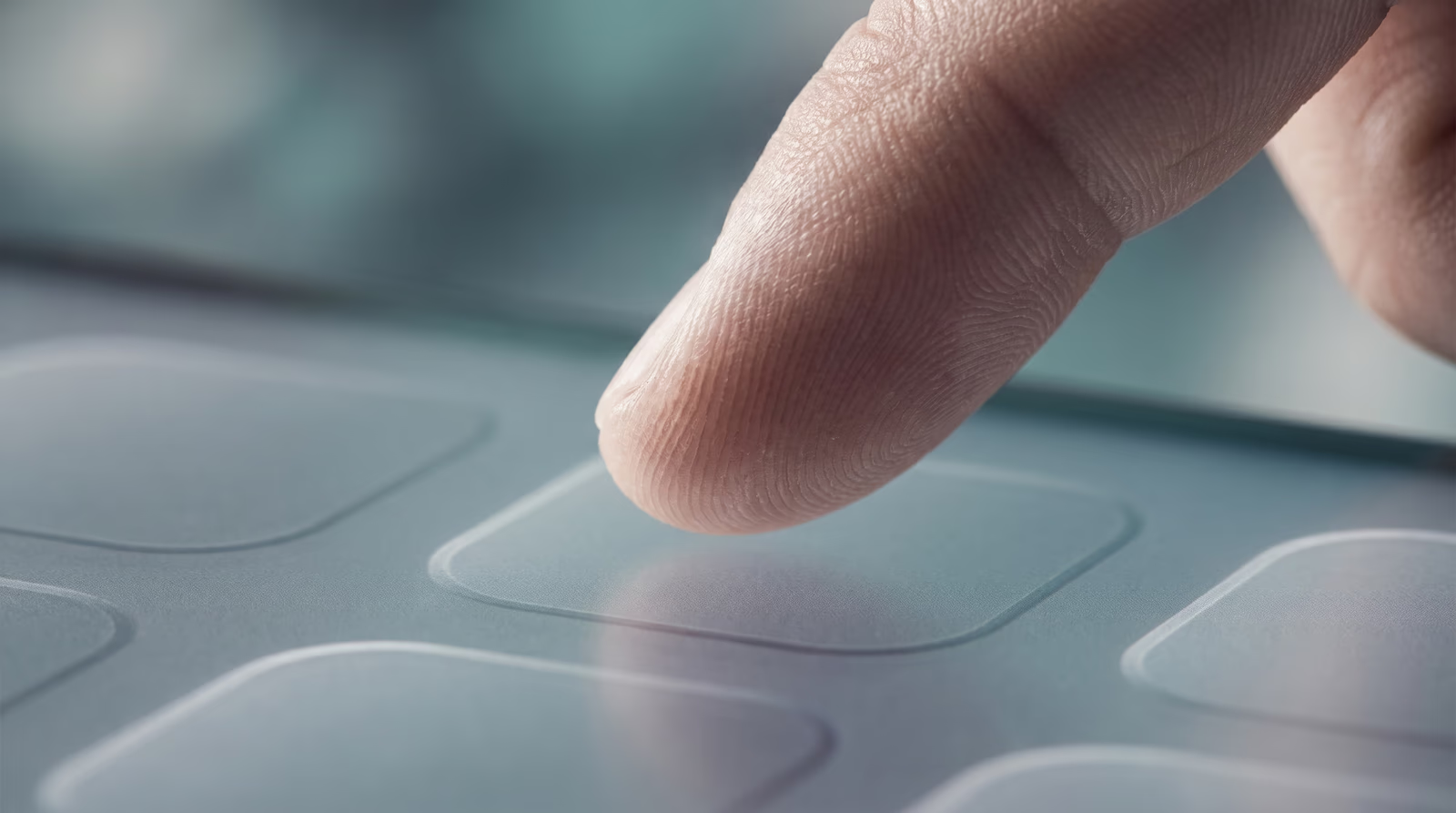
Table of Contents
The mobile-first design philosophy covered in part one of this series establishes why mobile takes priority. This post covers what mobile ux design principles look like in practice: touch targets, thumb zones, navigation, and forms.
A mouse cursor is a precise point. A fingertip covers roughly 10mm and lands 1-2mm off the intended target about half the time. That imprecision is a physical constraint of the medium, and the design has to account for it.
Why touch has different failure modes
There are two distinct problems in touch interface design. The first is a target that is too small to hit reliably. The second is targets that are too close together, so the user hits the right button but triggers the wrong one beside it. Both failures feel like user clumsiness. Both are design failures.
Around half of smartphone users hold their device in a single hand at any given moment, which limits which parts of the screen they can reach without repositioning their grip.
Touch target sizing: the numbers that matter
Three authoritative sources have published specific minimums, and they converge on the same practical answer.
Apple Human Interface Guidelines set the minimum touch target at 44x44 points. Google Material Design specifies 48x48 density-independent pixels with at least 8dp of spacing between adjacent targets. The W3C WCAG 2.5.5 criterion sets 44x44 CSS pixels as the enhanced standard.
In practice: build interactive elements to a minimum of 48x48 CSS pixels and keep at least 8px of clear space between any two tappable elements. If an icon button sits at 24x24px visually, the touchable padding around it must extend the total hit area to 48x48.
Icons without labels are a common miss. A row of icon-only navigation buttons looks clean on desktop and creates a guessing game on mobile. Labels are not optional when the icon’s meaning is not immediately obvious.
Designing for thumb zones
A right-handed user holding their phone in their right hand has three screen regions: a comfortable lower zone the thumb sweeps naturally, a stretch zone in the upper corners, and a hard-to-reach zone in the top-left corner.
Bottom navigation bars and floating action buttons consistently outperform top navigation because they sit in the thumb’s natural path. For a Houston restaurant with a bottom nav showing Menu, Location, and Order, a customer can complete the task at the counter without repositioning their hand.
Put your primary CTA, main navigation, and contact action in the lower viewport. Push secondary links and informational labels toward the top. Every pixel of persistent chrome at the top reduces visible content area and pushes interactive elements farther from the thumb zone.
Mobile navigation patterns for small business sites
The hamburger menu has become a reflex for mobile navigation, but it is not always the right choice. Nielsen Norman Group’s quantitative research found that hiding navigation behind a hamburger icon cuts content discoverability almost in half and increases both task time and perceived task difficulty compared to visible navigation.
Hiding navigation makes sense when the site has 12 or more pages and there is no practical way to show them all. For a small business site with five to eight destinations, visible navigation is almost always better: a bottom bar with icons and labels, or a short persistent row of text links in the header.
If you do use a hamburger, make the icon large enough to tap (44px minimum hit area), place it where the thumb reaches it, and consider pairing the three-line icon with the word “Menu” so its function is not ambiguous to first-time visitors.
Forms on mobile: where conversions die
Contact forms and quote request forms are where mobile friction plays out most directly for small business sites. Mobile users are significantly more likely to abandon a task when a site is not optimized for mobile, and form interactions are among the most common drop-off points.
Set the correct HTML input type on every field. A tel input opens a numeric keypad. An email input shows the @ symbol on the first keyboard layout. A number input removes letters entirely. A generic text input forces users to switch keyboard modes manually for every non-alpha field.
Never disable autocomplete or autofill. These browser features exist to reduce typing on mobile. Blocking them to “ensure data accuracy” trades a marginal accuracy gain for a major usability cost.
Use a single-column form layout. One column, full width, is the baseline. Position error messages directly below the field that triggered them. When a user is scrolled to the middle of a form on a small screen, a top-of-page error is invisible until they scroll back up.
Gesture support: add carefully
Gestures are shortcuts, never sole paths. If a swipe is the only way to delete an item, users who do not discover the gesture cannot delete items. Always pair a gesture with a visible alternative. Keep standard system gestures consistent with platform conventions.
Mobile UX design: the combined effect
Touch targets, thumb zones, navigation placement, and form inputs each add or remove a small amount of friction. The failures rarely look catastrophic in isolation. But a form with wrong input types, a navigation bar at the top of a long page, and buttons spaced 4px apart adds up to a mobile experience where visitors give up before they convert.
Testing with actual mobile users is the most reliable way to find which friction points matter most on your specific site.
The next part of this series covers progressive web apps, which build on these interface fundamentals to deliver app-like speed and reliability in the browser.
If you want an outside eye on your site’s current mobile UX, my team reviews what is costing you conversions and what to prioritize.
Touch optimization is not a finishing pass. Tap targets get sized and spaced for a thumb rather than a cursor, menus get tested one-handed on a real phone, and the primary action stays inside the natural reach zone. If you are building or rebuilding for mobile-first, my team’s web design service covers touch optimization as a baseline requirement, not an add-on.
Frequently asked questions
What is the minimum touch target size for mobile design?
Apple Human Interface Guidelines set the minimum at 44x44 points. Google Material Design sets it at 48x48 density-independent pixels with at least 8dp of spacing between adjacent targets. WCAG 2.5.5 specifies 44x44 CSS pixels as the enhanced (AAA) target. In practice, aim for 48x48 CSS pixels on interactive elements and never let two tappable elements sit closer than 8px apart.
How do I design for thumb zones on mobile?
The thumb zone is the area a user can comfortably reach without shifting their grip. On a standard smartphone held in one hand, the comfortable zone covers roughly the lower two-thirds of the screen. Place primary actions, navigation, and form submit buttons in that zone. Reserve the top of the screen for secondary actions, labels, and content that does not require a tap.
What is the best mobile navigation pattern for a small business site?
For most small business sites with five to eight primary pages, a visible bottom navigation bar or a persistent sticky header with text links outperforms a hamburger menu. Nielsen Norman Group research found that hiding navigation cuts content discoverability almost in half. If your page count is low enough to show labels, show them. Reserve the hamburger for sites with deep content hierarchies where visible navigation is not practical.
How do I make forms easier to complete on mobile?
Use a single-column layout, set the correct input type for each field (tel for phone numbers, email for addresses, number for quantities), and never disable autocomplete or autofill. Place inline error messages directly below the field they reference, not at the top of the form where a thumb-scrolled view may not show them. Keep forms as short as the task allows.

Technical Director & Co-Founder
Runs the data-and-code side of Desque: SEO, GEO, AEO, PPC, copywriting, and the engineering behind every site we ship. Builds in Go and TypeScript.
Continue in series: Mobile-First Design
More from the blog
Related Posts
Mobile Optimization
Most of your visitors will see your site on a phone first. Here is what mobile optimization actually involves and how to check whether your site passes.
Fredy Rodriguez

Web development in 2026: what actually changes for your Houston business
A practitioner-level look at which web trends require action now and which can wait, written for Houston SMB owners, not designers.
Fredy Rodriguez

Custom Development Benefits
A custom-built website pays off when your requirements genuinely exceed what a template can deliver: here is exactly when that is.
Fredy Rodriguez