Mint Crate Brand and Website Design
We built Mint Crate from the ground up as a curated monthly shisha subscription brand, establishing the name, visual identity, ecommerce platform, and social media presence that helped the company secure approximately 50 orders on launch day.
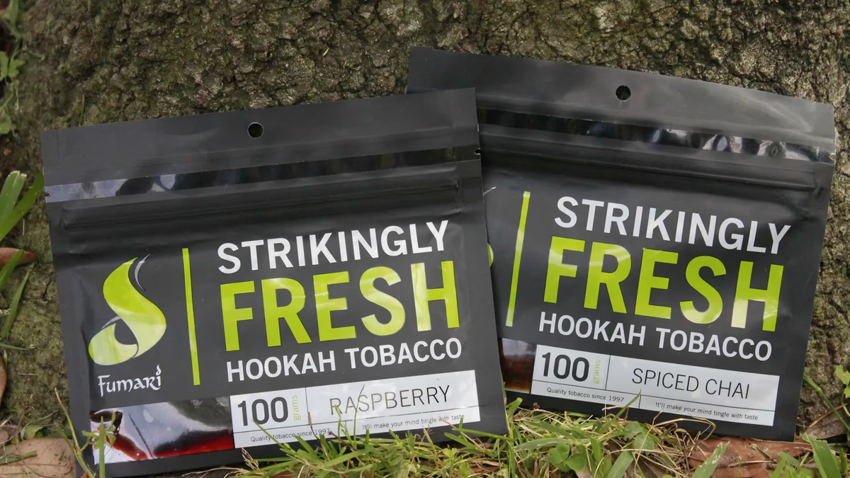
Table of Contents
Overview
Mint Crate was a subscription-based shisha delivery service built around curated monthly flavor boxes. Customers completed a flavor preference intake, and Mint Crate used those preferences to build a personalized monthly shipment rather than running a standard ecommerce storefront. The model positioned the brand as a guided discovery experience for hookah enthusiasts, not a shelf of products to scroll through.
The project launched in March 2015, at a point when subscription commerce was still an emerging category with few established playbooks. Desque was brought in to develop everything from the brand name and visual identity through the ecommerce platform, social media graphics, packaging concepts, and launch advisory.
Challenges
The original business name was “Hookah Holics,” a direct-category label that communicated the product clearly but created long-term positioning problems. It felt novelty-driven rather than premium, and the ceiling on brand equity was low. Renaming was a prerequisite for any meaningful brand work.
Beyond naming, subscription commerce itself introduced operational complexity in 2015. Recurring ecommerce tooling, personalized onboarding flows, and subscription fulfillment workflows were still immature at the time, and the right frameworks required experimentation. The company also needed to establish immediate trust, because subscription models ask customers to pay before they experience the product.
The launch scope required cohesion across brand, web, social, print, and packaging simultaneously, all within the resource constraints of an early freelance engagement.
Objectives
- Rename and reposition the business with a more scalable, memorable brand identity
- Build trust around a new subscription model unfamiliar to most consumers
- Introduce a flavor discovery experience as the core product differentiator
- Establish clear subscription tier differentiation and pricing structure
- Develop a WooCommerce ecommerce platform with recurring purchase support
- Create cohesive branding across web, social, and print
- Support pre-launch awareness and early customer acquisition
Solutions
The most consequential decision was the name change. We proposed “Mint Crate” as a replacement for “Hookah Holics.” The reasoning was straightforward: “mint” referenced one of the most universally recognized hookah flavors, while “crate” reframed the purchase as a curated delivery rather than a transaction. Together, the name created softer, more approachable positioning with room to grow beyond a single product category.
The visual identity leaned into green tones tied to mint freshness. The logo system used all-lowercase typography to reinforce the approachable, subscription-culture tone. The wordmark incorporated a hookah illustration in place of the letter “i,” with the mint leaf above shaped to suggest smoke rising from the device. Explanatory language was included beneath the mark to orient consumers still unfamiliar with the subscription model.
For the ecommerce platform, we designed and developed a WooCommerce site with subscription package structures, flavor preference intake flows, and recurring purchase functionality. Package architecture was built around consumption volume, flavor variety, and pricing psychology to create clear upsell paths while keeping entry tiers accessible. Print collateral, thank-you cards designed for handwritten personalization, and packaging concepts rounded out the full-scope delivery.
Photoshoot
Product photography was directed as part of the launch package to support both social media and ecommerce presentation. The shoot captured product packs and lifestyle pairings across multiple setups to give the brand a consistent visual library from day one.
Curated product selection shot for ecommerce and social.
Social media
Social media content was designed to build early community engagement within hookah enthusiast audiences before and after launch. The content mixed branded promotional posts for specific shisha brands, giveaway campaigns, and a Facebook presence anchored by a custom cover photo and profile setup.
Instagram promo for Fumari, one of the featured monthly brands.
Deliverables
- Logo design and brand identity system
- Ecommerce website design and WooCommerce development
- Subscription package architecture and pricing structure consultation
- Social media assets and promotional graphics
- Giveaway campaign graphics
- Business card and thank-you card design
- Packaging design concepts
- Product photography direction
- Marketing and launch advisory
Results
The Mint Crate name created measurably stronger long-term positioning than the original “Hookah Holics” direction, moving the brand away from novelty framing toward a more premium and scalable identity aligned with subscription culture.
Pre-launch advisory and positioning work helped the company secure approximately 50 orders on launch day, providing immediate validation for the concept. The social media content and giveaway campaigns built early community engagement within niche hookah enthusiast audiences, establishing a following before the first shipments went out.
Assessment
Mint Crate was a full-stack brand launch at a time when subscription commerce was still finding its form. The work covered naming, identity, ecommerce, social, print, packaging, and launch strategy in a single engagement, and the underlying business logic was considerably stronger than what was common in freelance ecommerce projects of that period. The decision to reposition away from enthusiast-literal naming toward a curated, experience-oriented brand identity is what gave the business its longest-lasting strategic asset.
The project also reflects honest constraints of the era and the early-career phase in which it was built. Some visual decisions lean more functional than refined, and certain graphic choices read as products of 2015 design trends. That transparency is part of what makes the work worth showing: the strategic thinking outpaced the production tools available at the time, and the concepts explored here, including personalized onboarding, curated discovery, and subscription tier segmentation, became standard practices in modern direct-to-consumer brands.
For clients building a subscription or ecommerce brand from the ground up, our brand design services cover identity through launch collateral end to end. We explore how visual identity and brand naming decisions shape long-term scalability in our series piece on defining your brand identity. For related work in food and beverage brand identity, see Arena Cafe and 2 Phat Bastard Pies.
Related Projects
Global Air Service Brand and Web Design
We built Global Air Service a modern visual identity and a multi-phase website that positioned the Texas-based HVAC company as a credible, professionally managed service provider in a heavily saturated local market.
Sabor Tapatio Brand and Website Design
We built Sabor Tapatio a bold, merchandise-ready visual identity and mobile-first website for a Texas food truck specializing in traditional Jalisco-style birria tacos.
Sapa and Co Brand and Website Design
We took Sapa and Co from a restaurant condiment to a shelf-ready culinary brand, building a full identity system, bottle label suite, and a custom interactive website that positioned the Houston-based sweet soy sauce as a modern food product.