Stay Haven Brand Identity
We gave Stay Haven a brand identity that communicates dignity and stability, repositioning a transitional housing initiative away from generic, utility-first competitors.
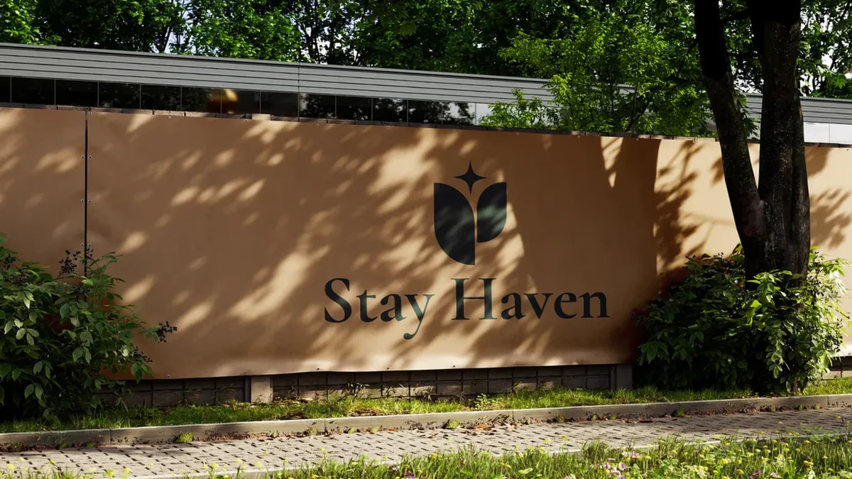
Table of Contents
Overview
Stay Haven is a residential housing initiative offering small rental properties to people who need stability, structure, and a fresh start. The model is hospitality-inspired and built around transitional living: dignified, grounded spaces for residents rebuilding different parts of their lives. The founders carry Catholic values that shaped the philosophy behind the project, though the brand was never meant to wear those values literally.
Challenges
Transitional and affordable housing has a look, and it works against everyone in the category. Competitors lead with affordability and utility, which reads as generic and emotionally disconnected. Stay Haven needed to stand apart without overcorrecting into the wrong territory.
- Communicate structure, trust, and emotional safety without feeling corporate or institutional.
- Avoid the two easy traps: looking like luxury real estate, or looking like a nonprofit.
- Embed the founders’ values symbolically rather than literally, so the brand stays welcoming and grows with new properties.
The scope was never just a logo. It grew into positioning strategy, symbolic development, and an environmental brand system.
Objectives
We wanted Stay Haven to feel like a place of care and restoration the moment someone encounters it. That meant an identity that signals dignity and belonging, holds up across future properties and investor materials, and carries the founders’ philosophy without leaning on overt religious imagery.
Solutions
We treated this as a brand-strategy project first. Before any mark, we worked through positioning at Desque: who Stay Haven serves, how it should feel, and what separates it from the rest of the category. That clarity drove every visual decision that followed.
The centerpiece is the symbol. We developed a mark that reads as floral, sanctuary, and shield at once, built around a vertical negative-space spine. It carries the founders’ values quietly, through structure and symbolism, rather than through literal references. From there we built the full identity system: logo, brand mark, color palette, typography, environmental applications, and brand guidelines so the look stays consistent as the initiative expands.
Color did a lot of the emotional work here, which is why we think carefully about palette decisions on every brand. We unpack that thinking in our piece on the psychology of color.
Deliverables
- Positioning strategy and symbolic development
- Logo design and iconic brand mark
- Brand identity system with color palette and typography
- Environmental brand applications
- Brand guidelines
Results
Stay Haven moved from a transactional rental perception toward a hospitality-inspired residential brand. The identity communicates dignity, care, and restoration without the luxury or nonprofit signals that would have muddled the message. The symbolic mark gives the founders’ philosophy a home in the design, and the brand architecture is built to scale across future properties, investor presentations, and on-site environments.
The brand says what the founders wanted to say, without ever having to spell it out.
Assessment
This was a project where strategy mattered more than decoration. Getting the positioning right first let the symbol carry real meaning, and the result is a housing brand that feels human. The work draws on the same brand-system fundamentals we cover in defining your brand identity and visual brand language, and it reflects how we approach brand design for early-stage companies. For a brand-and-web project in a different market, see our Ally Piñon case study.
Related Projects
Champion House Buyers Brand Design
We built a foundational brand identity and print collateral system for Champion House Buyers, a Houston wholesale real estate company competing in a market where visual credibility separates legitimate buyers from the noise.
The Network Realty Brand Design
We built a complete brand identity system for The Network Realty, a Houston real estate brand that needed a distinctive, modern presence to stand out in a relationship-driven and highly competitive market.
Urban Residence Realty Brand Design
We built a compact but distinctive brand identity for Urban Residence Realty, an independently operated real estate agent who needed a recognizable personal brand to stand out in a market full of templated, interchangeable visuals.