Lyt Solar Brand Design
We built Lyt Solar a bold, scalable brand identity that positioned the renewable energy company as a modern infrastructure brand rather than another generic solar provider.
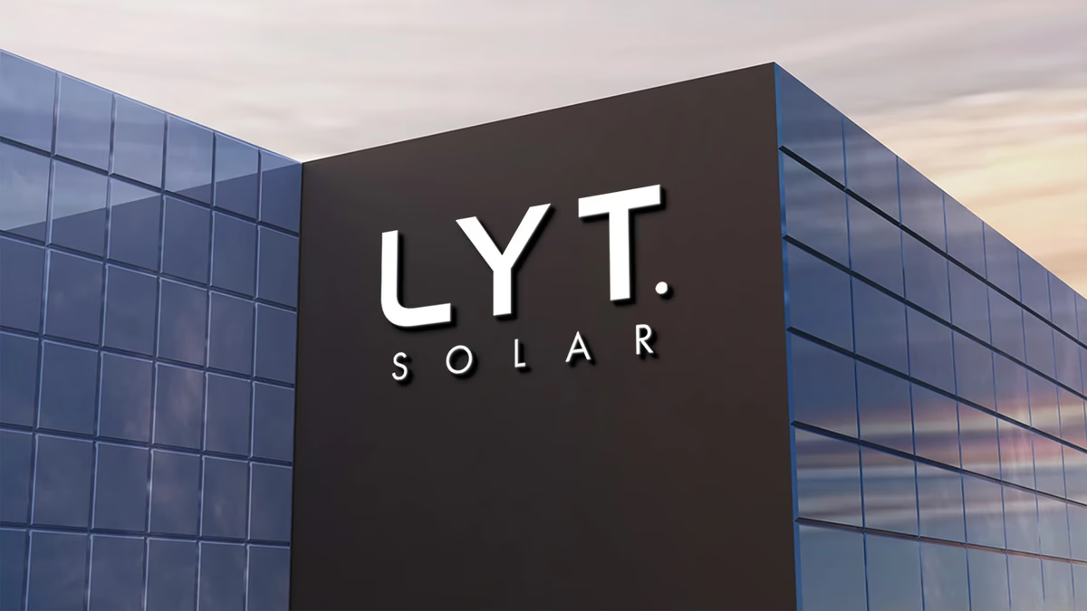
Table of Contents
Overview
Lyt Solar is a renewable energy company serving both residential and commercial clients in the solar installation and sales market. Operating in a sector crowded with look-alike brands, the company needed a visual identity capable of establishing trust, modernity, and long-term credibility across both digital and physical environments.
Unlike many solar companies that default to environmental cliches or overly technical utility aesthetics, Lyt Solar sought a cleaner, more future-facing presence. The goal was to align the brand more closely with modern infrastructure, architecture, and technology rather than generic eco-marketing.
Challenges
The solar industry is heavily saturated with repetitive branding. Many competitors rely on generic sun iconography, predictable green palettes, utility-style typography, and overly corporate visual systems that all blur together at a glance.
Lyt Solar faced a specific challenge: create an identity that feels modern without becoming trend-driven, stands apart from local competitors, scales effectively across industrial and digital environments, and appeals to both commercial and residential audiences simultaneously. A second layer of difficulty involved balancing technological sophistication with approachability. The branding needed to feel engineered and structured while remaining visually accessible and commercially versatile.
Because the identity would be applied heavily across environmental and physical touchpoints such as architectural signage, packaging, and apparel, scalability and application consistency were critical considerations from the start.
Objectives
- Establish a visual identity that signals modern infrastructure thinking rather than commodity solar
- Differentiate from the predictable blue-green-sun visual language dominant in the sector
- Build a system that performs equally well at architectural scale and at reduced digital sizes
- Create a mark with strong silhouette recognition for industrial applications
- Develop brand assets covering corporate, packaging, apparel, signage, and digital environments
Solutions
Logo system
We designed the Lyt Solar logo system around geometric precision and controlled proportion. The primary mark uses a heavier “LYT.” structure to establish confidence and visual authority, while the more open “SOLAR” typography beneath introduces refinement and breathing room into the composition. The period following “LYT.” functions as a deliberate visual anchor, reinforcing a sense of intentionality and conviction within the mark.
A major focus throughout development was ensuring the identity maintained strong silhouette recognition at reduced sizes, a requirement driven directly by the industrial and architectural application contexts the brand would live in.
Color strategy
The palette combined black, white, and a muted mint green accent. The monochromatic base established professionalism and analytical clarity, while the mint green introduced a softer layer of innovation and adaptability. This differentiated the identity from the blue-heavy technology branding common in the solar sector at the time, subtly suggesting optimization, growth, and forward-thinking problem solving without overwhelming the overall system.
Brand applications
With the core identity established, we extended the system across the full range of touchpoints the client required: architectural signage, packaging, corporate stationery, apparel, and digital interfaces.
Interior illuminated signage on stone wall.
Deliverables
- Primary logo system (vertical stacked, horizontal, and single-color lockups)
- Reverse and monochromatic logo variants for dark and industrial surfaces
- Color palette and typography guidelines
- Corporate stationery suite (letterhead, business cards, folder)
- Branded apparel (polo shirt)
- Product packaging system
- Architectural and environmental signage concepts
- Digital brand application guidelines
Results
Lyt Solar gained a visual identity that positioned the company as more modern, premium, and technologically mature compared to many competitors within the renewable energy sector. The branding successfully differentiated the company from generic solar industry aesthetics while maintaining strong commercial accessibility.
The identity system functions cohesively across every required touchpoint, from large-format architectural signage down to small-scale apparel and digital interfaces, demonstrating the scalability designed into the system from the start.
Assessment
Lyt Solar is a strong example of how brand design strategy can separate an energy company from a crowded commodity market. The decision to anchor the identity in geometric precision, a restrained monochromatic palette, and architectural-scale thinking gave Desque a clear direction that avoided every visual cliche in the solar sector. The period in “LYT.” is a small detail with a large cumulative effect on how the mark reads across contexts. For more on how a strong visual language builds customer confidence, see our post on building trust through web design and the Branding Essentials series.
We recommend this case to anyone evaluating branding partners for energy or infrastructure companies. For a related energy sector identity project, see our work for Axiom Solar Concepts.
Related Projects
Solstack Brand Design
We built Solstack a modular, infrastructure-grade identity system that positioned the solar company as a long-term energy performance partner rather than another commodity installer.
Axiom Solar Concepts Brand Design
We built Axiom Solar Concepts a precision-engineered brand identity that positioned an energy technology startup as an infrastructure and innovation company rather than another residential solar provider.
The Network Realty Brand Design
We built a complete brand identity system for The Network Realty, a Houston real estate brand that needed a distinctive, modern presence to stand out in a relationship-driven and highly competitive market.