Solstack Brand Design
We built Solstack a modular, infrastructure-grade identity system that positioned the solar company as a long-term energy performance partner rather than another commodity installer.
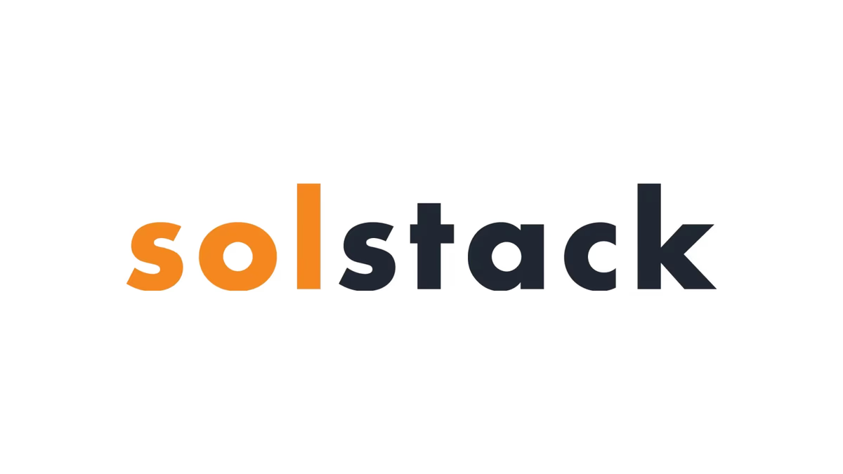
Table of Contents
Overview
Solstack was a solar installation company delivering complete end-to-end solar solutions for residential and commercial properties. Unlike providers focused primarily on installation volume, Solstack emphasized system optimization, intentional panel placement, and long-term performance management through quarterly inspections, monitoring, cleaning, and preventative maintenance.
The company also distinguished itself through a strong commitment to aesthetics. Solstack believed solar installations should not compromise a property’s appearance, which made the visual identity an extension of the company’s core operational philosophy.
Challenges
The renewable energy sector is heavily saturated with predictable branding built around literal sun imagery, environmental symbolism, green-heavy palettes, and generic technology aesthetics. The result is a market where most solar companies become visually interchangeable and struggle to communicate meaningful differentiation.
Solstack needed an identity that reflected technical precision, optimization-focused thinking, and infrastructure-level professionalism without relying on the overused visual cliches that dominate the category. A secondary challenge was balancing engineering credibility with visual accessibility, appealing to residential customers while projecting the confidence of a serious operational partner.
The identity also needed to remain scalable across a broad range of applications, including digital platforms, proposals, service materials, vehicle graphics, uniforms, and future collateral.
Objectives
- Create a modern identity system visually differentiated from generic solar competitors
- Position the company as a long-term solar performance partner rather than a basic installer
- Communicate optimization, reliability, and technical credibility
- Build a scalable visual identity system adaptable across digital and physical environments
- Develop a recognizable icon system capable of functioning independently from the full wordmark
Solutions
Brand strategy
Desque centered the identity direction around the concept of modular energy systems and optimized infrastructure. Rather than leaning into environmental messaging, the strategic focus was on communicating engineered systems, interconnected components, scalability, and long-term operational reliability. This positioning separated Solstack from consumer-oriented solar competitors and aligned the brand closer to infrastructure and performance-based service providers.
The visual language intentionally avoided stereotypical solar imagery, relying instead on abstraction and structure to communicate the industry.
Logo system
The final logo system combines a geometric modular icon with a bold contemporary wordmark. The icon is composed of four staggered rounded forms arranged in an interconnected structure, subtly referencing solar panel configurations, modular infrastructure, and stacked energy layers. The overlapping arrangement creates movement and interaction between components while maintaining a highly minimal structure.
A key feature of the wordmark is the separation between “sol” and “stack” using both color and a vertical structural divider. This detail reinforced readability, hierarchy, and balance while also echoing the broader concept of modular systems and organized infrastructure.
Color system
The palette was intentionally restrained. Orange carries energy, active system performance, and solar activation. Deep navy introduces trust, technical credibility, and infrastructure stability, moving the brand away from environmentally cliche aesthetics. Neutral gray supports the system with balance and reinforces the industrial and operational positioning. Together the palette feels energetic without becoming visually loud or trend-dependent.
Logo exploration
The brand identity
Brand applications
Deliverables
- Logo design (primary lockup, wordmark, icon mark)
- Brand identity system
- Icon system
- Typography system
- Color palette
- Brand applications
- Social media assets
- Marketing graphics
- Mobile mockups
- Logo variations
- Presentation assets
Results
The final identity established a more modern and technically credible market presence compared to traditional residential solar branding. By avoiding generic environmental visuals, the brand achieved a differentiated, infrastructure-oriented appearance that aligned with the company’s operational philosophy.
The modular identity system translated effectively across both digital and physical environments while maintaining strong recognition and consistency. The icon system proved especially versatile due to its simplicity and scalability, performing well across social media, presentation materials, signage, digital applications, and branded collateral.
The branding shifted Solstack’s perception from a standard solar installer toward a more sophisticated energy systems provider, better aligning the visual identity with the company’s actual approach: optimized installation planning, long-term maintenance, performance monitoring, and design-conscious execution.
Assessment
This project succeeded primarily because of restraint. A weaker direction would have leaned into environmental symbolism, futuristic tech aesthetics, or overly literal solar imagery. Instead, we focused the identity on systems thinking, modularity, and infrastructure-level professionalism. The strongest outcome is that the branding communicates optimization without explicitly stating it. The modular icon system reinforces the company’s philosophy of intentional planning, interconnected systems, and long-term performance management.
The concept exploration process also revealed an important strategic insight: many early directions introduced stronger motion and visual energy but lacked longevity and commercial flexibility, drifting toward generic SaaS aesthetics rather than energy infrastructure positioning. The selected solution performed better because it remained simple, scalable, technically credible, and commercially usable while retaining enough uniqueness to stay recognizable.
To explore our brand identity design services or read more about building a cohesive visual system, see Defining Your Brand Identity and Visual Brand Language. For related work in the energy sector, see Lyt Solar and Axiom Solar Concepts.
Related Projects
Lyt Solar Brand Design
We built Lyt Solar a bold, scalable brand identity that positioned the renewable energy company as a modern infrastructure brand rather than another generic solar provider.
Axiom Solar Concepts Brand Design
We built Axiom Solar Concepts a precision-engineered brand identity that positioned an energy technology startup as an infrastructure and innovation company rather than another residential solar provider.
The Network Realty Brand Design
We built a complete brand identity system for The Network Realty, a Houston real estate brand that needed a distinctive, modern presence to stand out in a relationship-driven and highly competitive market.