Axiom Solar Concepts Brand Design
We built Axiom Solar Concepts a precision-engineered brand identity that positioned an energy technology startup as an infrastructure and innovation company rather than another residential solar provider.
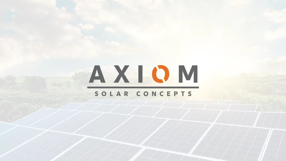
Table of Contents
Overview
Axiom Solar Concepts was an energy technology startup focused on advancing solar panel efficiency through research, engineering, and product innovation. Unlike traditional solar companies built around residential installation, the company’s ambition centered on product development and technological advancement within the renewable energy sector itself.
Because of that positioning, the visual identity needed to reflect precision, innovation, and technical credibility while remaining commercially grounded. We approached this as an engineering problem as much as a design one.
Challenges
The renewable energy industry is saturated with repetitive visual systems. Most companies in the space lean on literal sun graphics, green eco palettes, generic leaf symbolism, and dated tech styling. Axiom was not positioning itself as another installation provider competing on residential sales, so those directions were off the table from the start.
The challenge was creating an identity that communicated innovation, engineering credibility, and technical sophistication without feeling overly futuristic, sterile, or visually disconnected from the energy sector. The system also needed enough abstraction to feel proprietary while remaining commercially usable across real applications.
Objectives
- Create a modern identity aligned with advanced energy technology rather than residential solar
- Develop a recognizable visual anchor capable of scaling across future applications
- Establish stronger technical and engineering credibility in the market
- Differentiate the company from common solar industry branding patterns
- Build a timeless system that would not rely on short-lived design trends
Solutions
At Desque we explored several directions during the concept phase, including angular technology-inspired marks, industrial geometric systems, abstract energy symbols, and stylized letterform explorations. As the project evolved, the strongest path emerged through simplification and restraint.
The final system centered around transforming the “O” in AXIOM into the defining visual anchor of the brand. This decision made the identity feel integrated and intentional rather than relying on a disconnected standalone icon. The segmented “O” represents solar motion, energy transfer, orbital movement, and continuous energy cycles.
The color strategy leaned on orange as the emotional and energetic core. Rather than functioning as a traditional environmental color, it represented solar energy, heat, activation, and power generation. Against darker applications, the orange behaves almost like captured sunlight. Graphite gray balanced the system with infrastructure, engineering professionalism, and industrial reliability.
Typography was approached with restraint. Bold geometric sans-serif letterforms reinforced precision and technical confidence without leaning on heavily stylized treatments that age poorly. Supporting type for “Solar Concepts” introduced wider spacing and lighter weight beneath the primary AXIOM mark, creating breathing room and a more refined presentation.
Logo exploration
Before arriving at the final mark, we pushed several directions for the identity, testing angular technology forms, abstract energy symbols, and letterform-integrated concepts. The concept sheet below captures the range of thinking across the exploration phase.
The brand identity
The final system reduced everything to a single defining element: the segmented “O” embedded directly within the AXIOM wordmark. We delivered a full logo suite including the primary full-color lockup, the reverse lockup for dark industrial environments, the standalone icon, and the wordmark for contexts requiring maximum legibility at small scale.
Deliverables
- Logo design with full brand identity system
- Iconography development centered on the segmented “O” visual anchor
- Typography system and hierarchy specification
- Color palette with application rules across light and dark environments
- Brand direction documentation for future applications
- Logo variations including primary, reverse, icon, and wordmark formats
- Concept exploration across multiple identity directions
- Mockup presentation assets for industrial and digital contexts
Results
The final identity positioned Axiom Solar Concepts closer to an advanced energy technology company than a standard solar installation provider. The branding established a stronger sense of innovation, engineering credibility, and technical sophistication while avoiding the generic visual patterns common within the solar industry.
Embedding the icon directly within the wordmark created a highly cohesive system capable of functioning across both standalone and full-brand applications. The visual hierarchy remained clean, scalable, and adaptable across mobile environments, presentations, industrial branding, and digital applications.
The restraint in the visual language also improved longevity. By relying primarily on geometry, spacing, and contrast rather than gradients or excessive styling, the identity maintained a more timeless and scalable feel suited to the company’s long-term engineering ambitions.
Assessment
This project stands out because the branding was built around the company’s ambition rather than its industry category. Many renewable energy companies visually position themselves around environmental friendliness first. Axiom leaned into engineering, infrastructure, and technological advancement, and that distinction fundamentally changed the direction of the identity system.
The strongest decision was simplifying the brand around a single defining visual anchor: the segmented “O.” Earlier explorations pushed into more aggressive geometric and futuristic directions, but the final system succeeded because it balanced abstraction with restraint. The icon carries most of the identity’s emotional weight while the typography acts as supporting structure, creating a cleaner and more mature system overall.
The project also demonstrates a strong understanding of environmental context. The branding performs best within darker, industrial, and high-contrast applications where the orange functions almost like a concentrated energy source within the system. If you’re working through how a brand design system should anchor around a single visual element, our piece on visual brand language covers that thinking directly. For a similarly precision-driven identity built for a technical B2B positioning, see our Applied Matter case study.
Related Projects
Solstack Brand Design
We built Solstack a modular, infrastructure-grade identity system that positioned the solar company as a long-term energy performance partner rather than another commodity installer.
Lyt Solar Brand Design
We built Lyt Solar a bold, scalable brand identity that positioned the renewable energy company as a modern infrastructure brand rather than another generic solar provider.
The Network Realty Brand Design
We built a complete brand identity system for The Network Realty, a Houston real estate brand that needed a distinctive, modern presence to stand out in a relationship-driven and highly competitive market.